TEAMSON KIDS
GRAPHIC DESIGNER
SKILLS
CAMPAIGN & CONTENT DESIGN
MOTION & VIDEOS
LIFESTYLE ART DIRECTION
BRAND & DIGITAL
TOOLS
ADOBE ILLUSTRATOR, ADOBE PHOTOSHOP, ADOBE PREMIERE PRO, AI TOOLS
Teamson is a global e-commerce furniture brand selling across the US, Canada, and European markets through major retail platforms including Amazon, Target, Walmart, and Wayfair.
As the sole graphic designer on the Global Marketing team, I develop visual content for Teamson Kids’ product line, spanning Amazon A+ content, lifestyle imagery, product graphics, and website assets. My focus is on translating product features into visuals that speak directly to parents and families, balancing play value, safety communication, and brand consistency across international platforms.

KIDS COMMERCIAL MARKETING
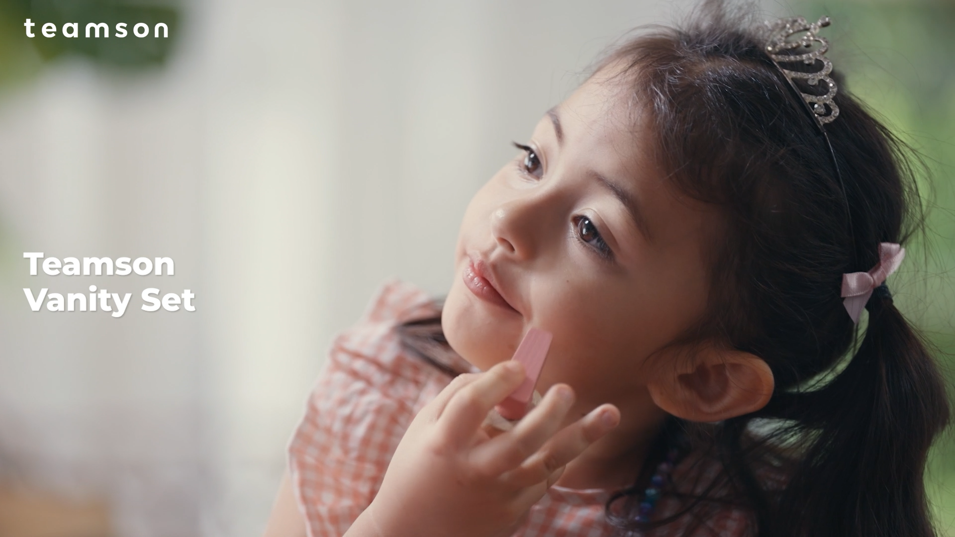
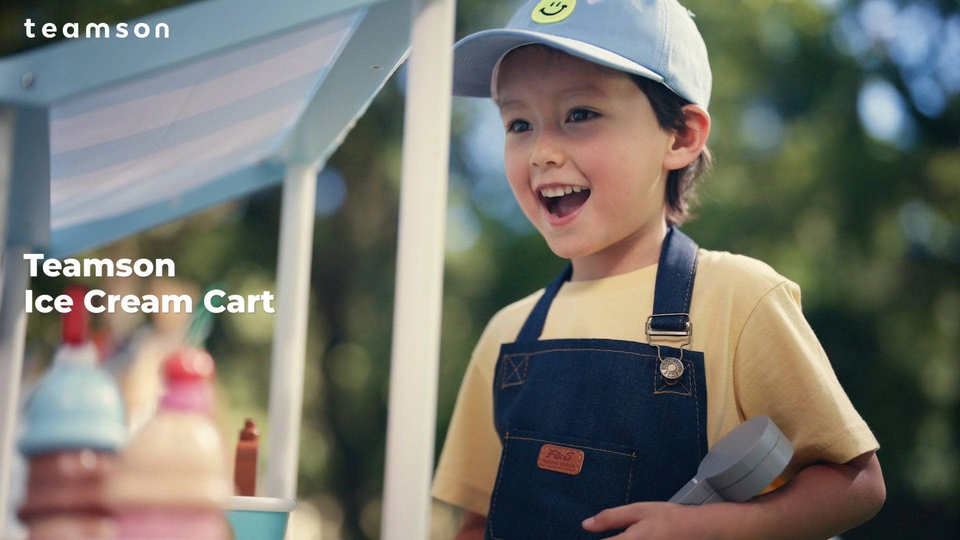
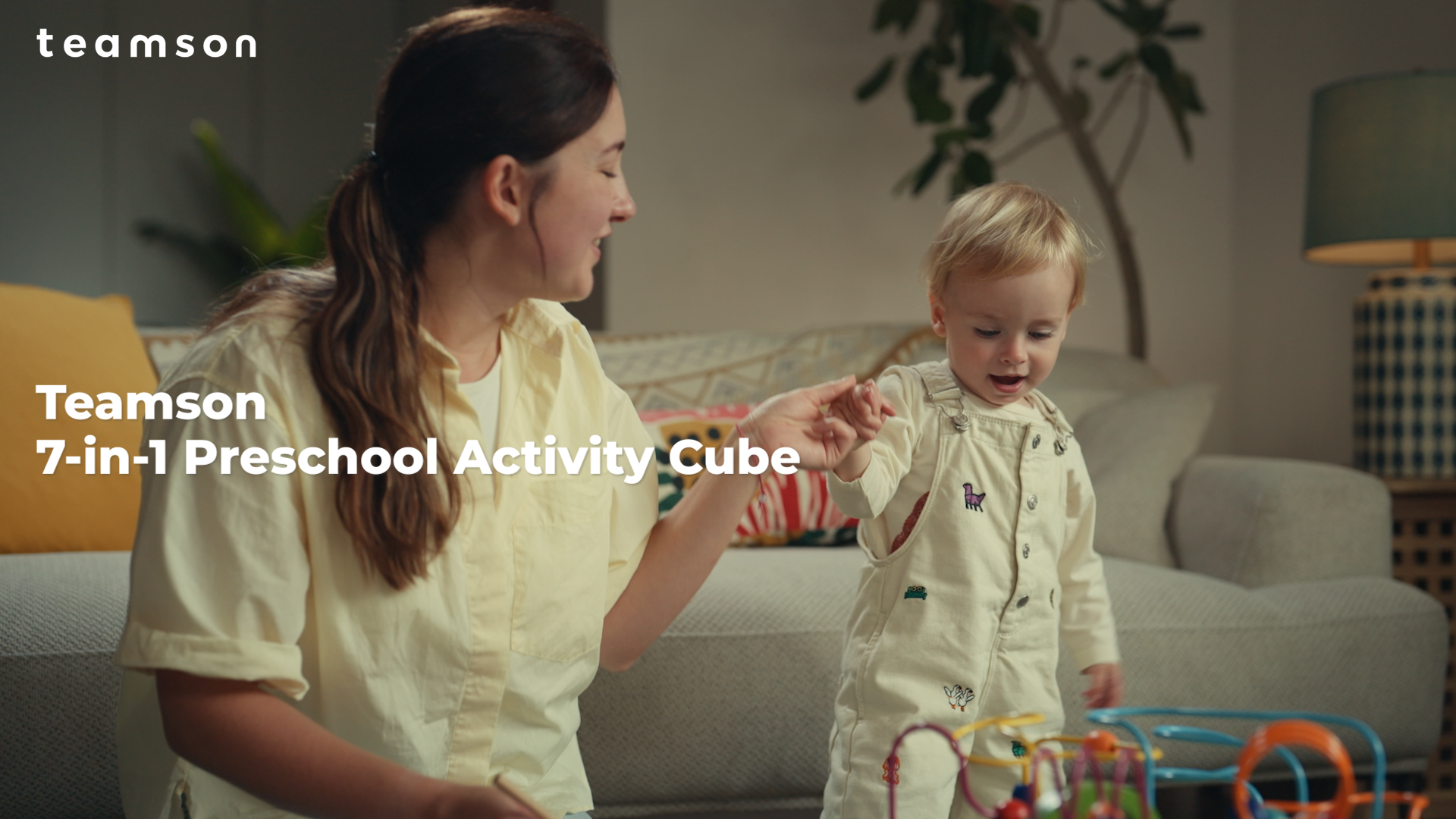
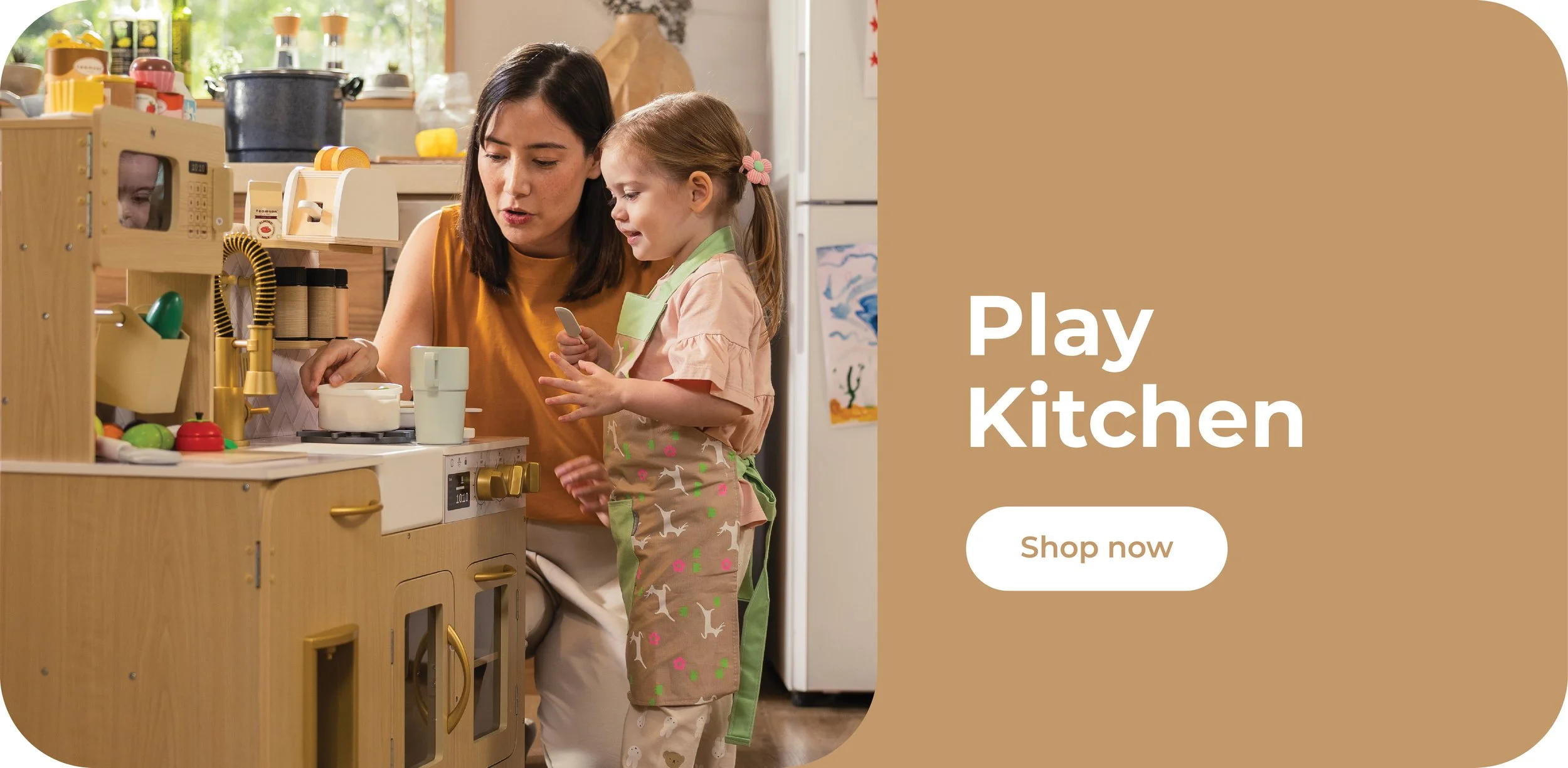
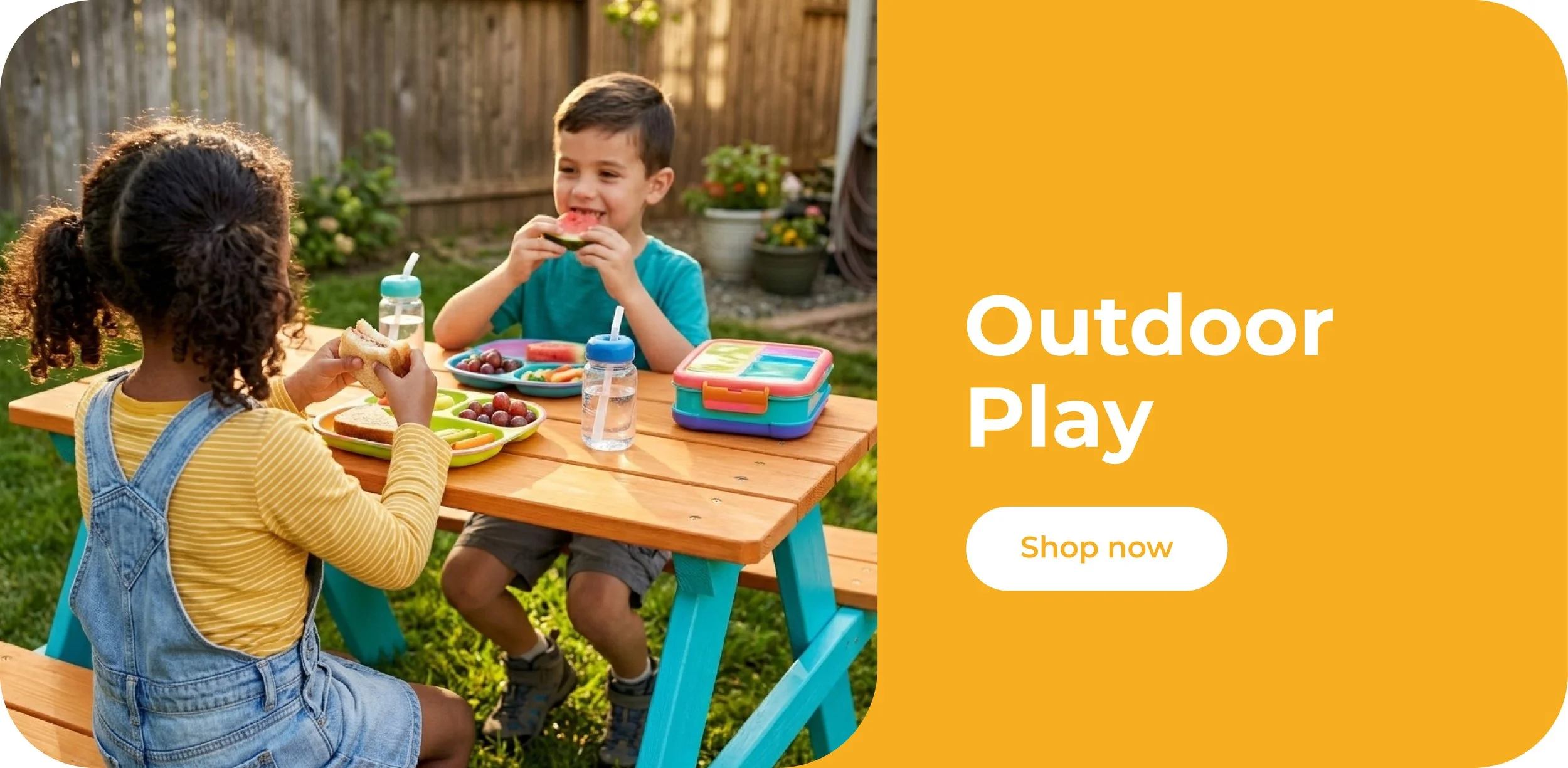
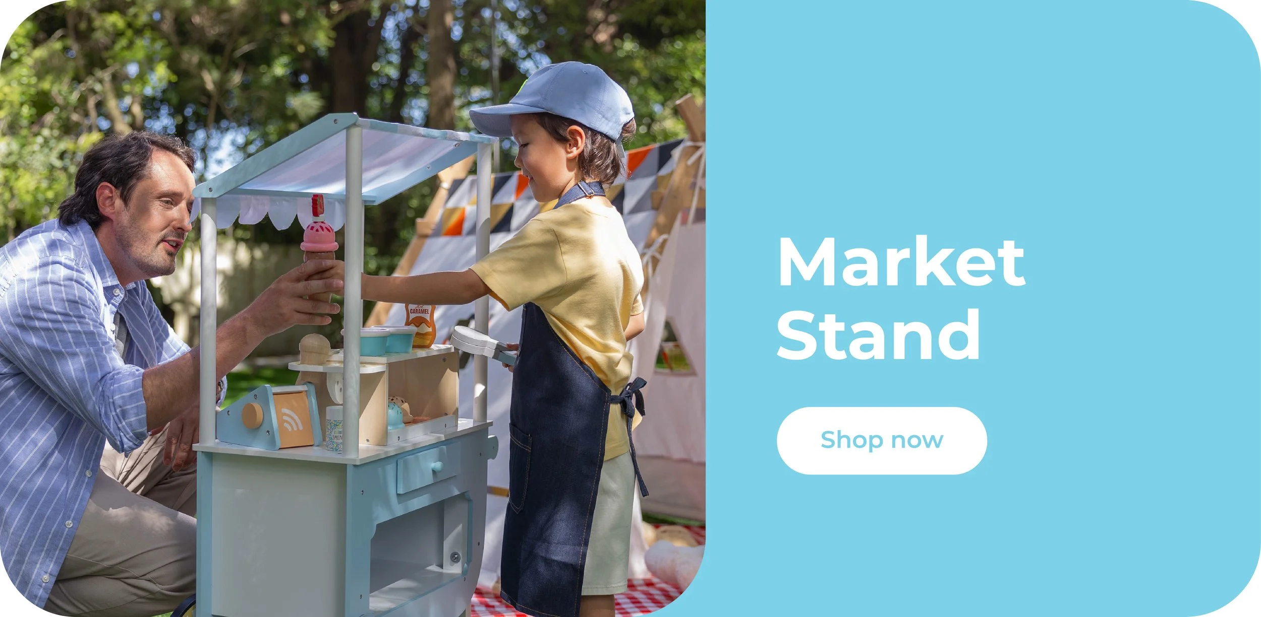
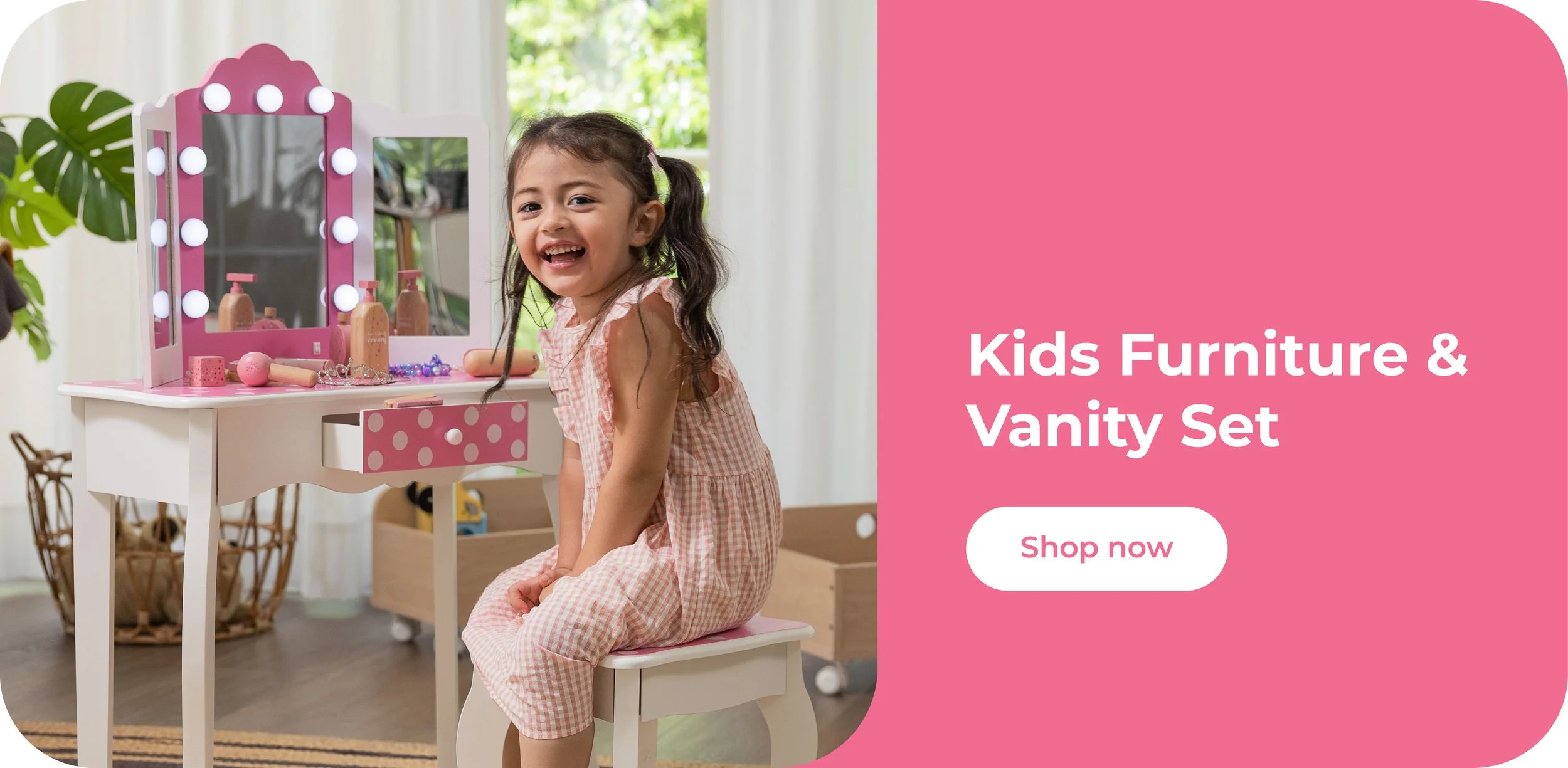
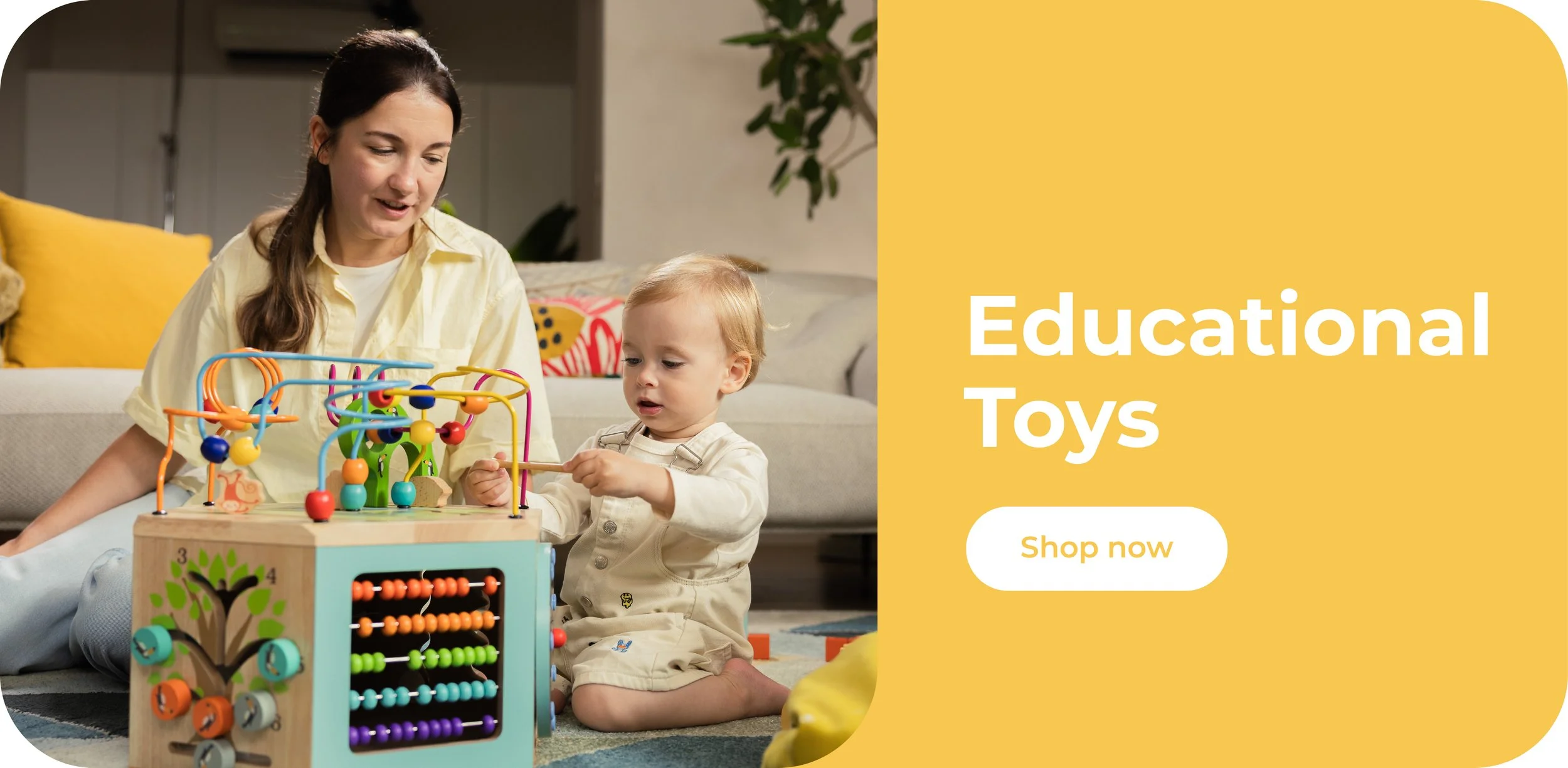
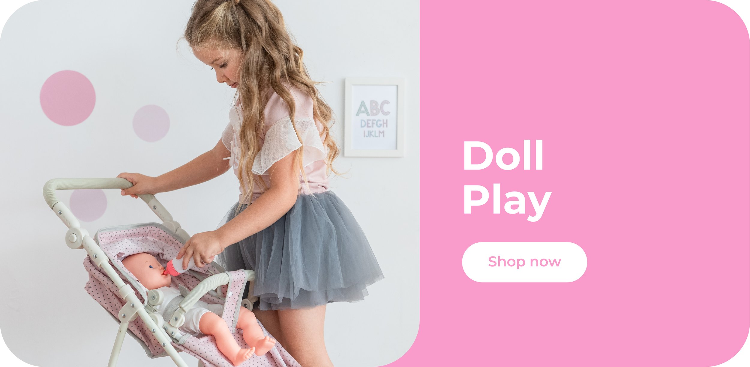
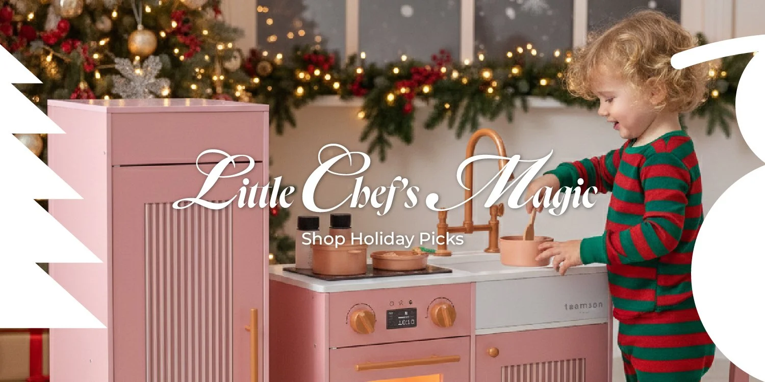
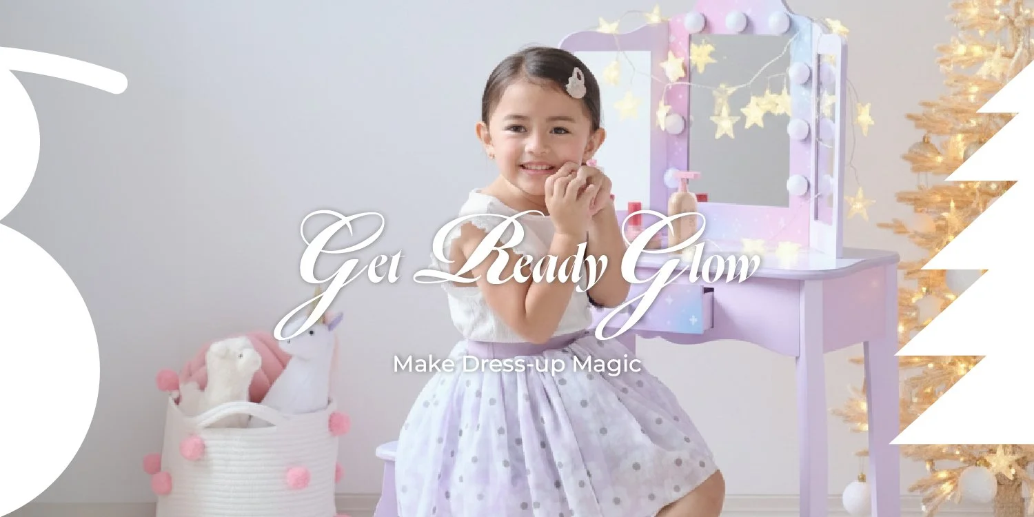
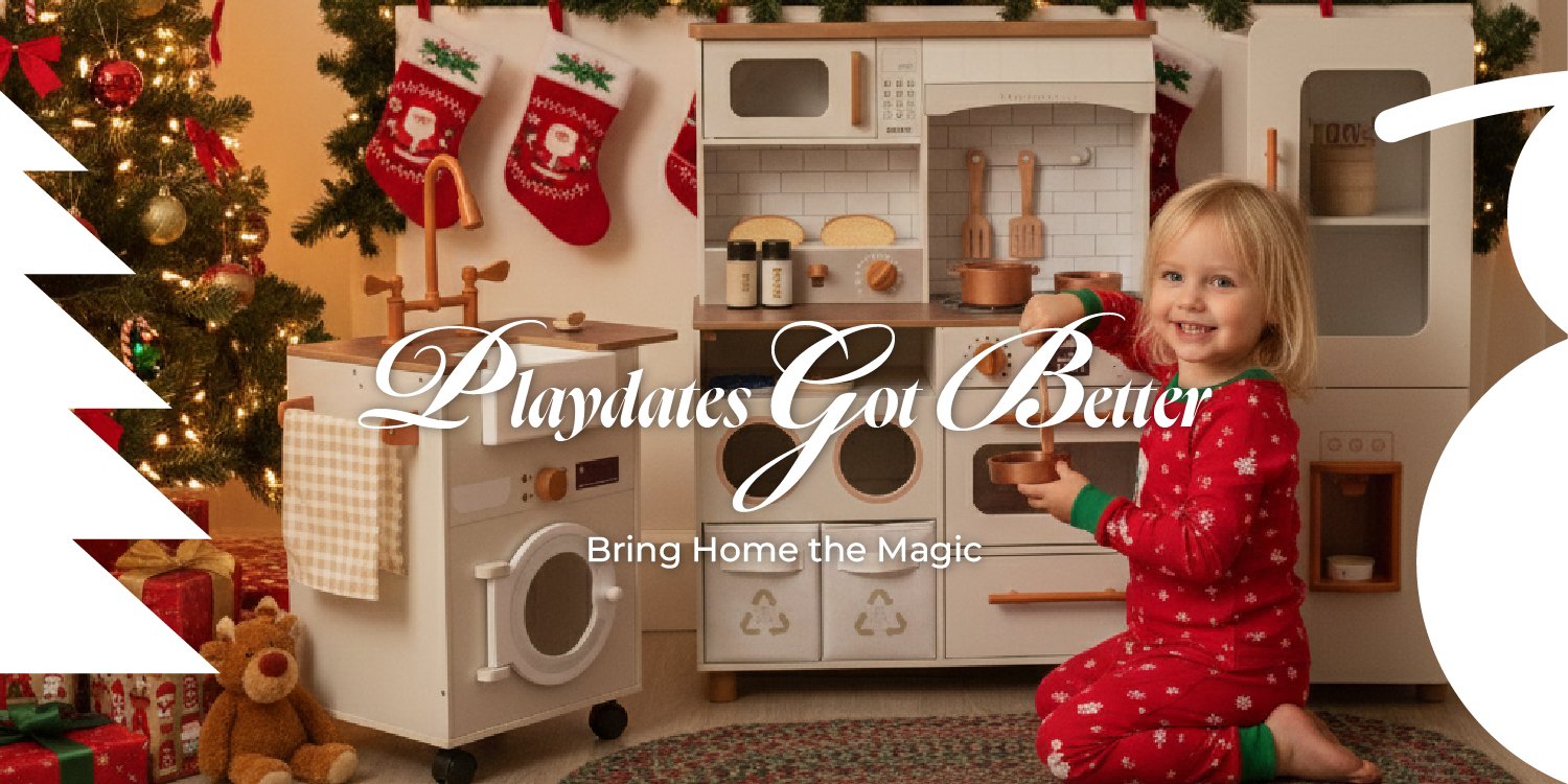
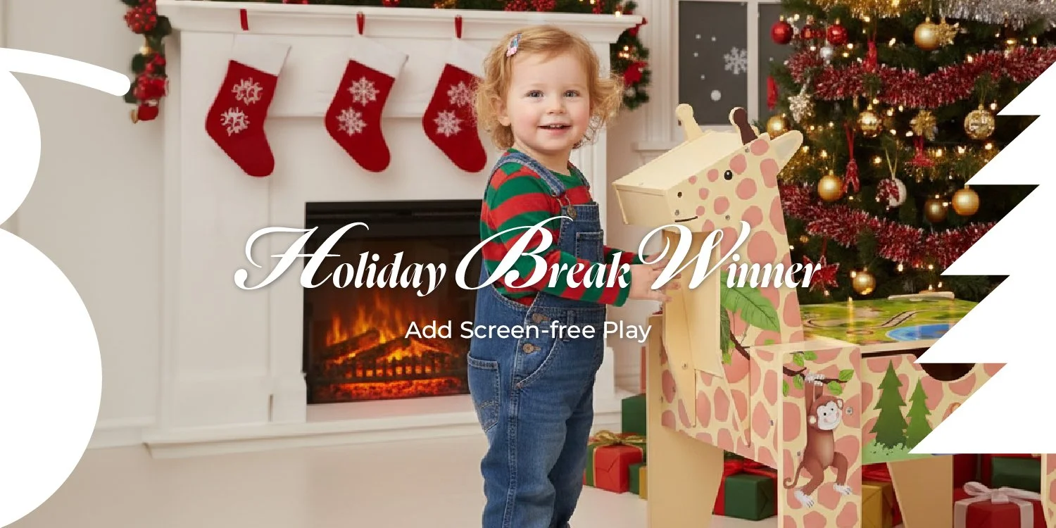
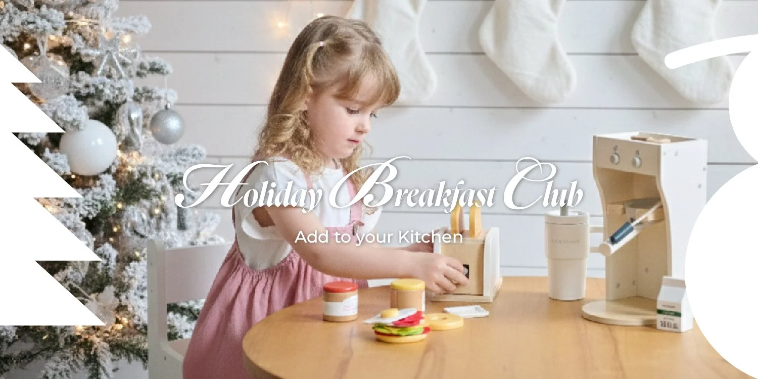
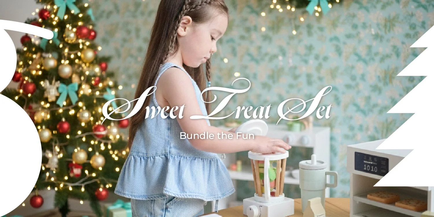
Teamson shifted its focus toward its kids brand by launching a new commercial marketing campaign aimed at reaching a wider audience of families. The campaign captures the interaction between children, parents, and the products themselves, spanning four categories: play kitchens, vanity table sets, pretend play market stands, and educational toys. They each target a different demographic based on age and interests.
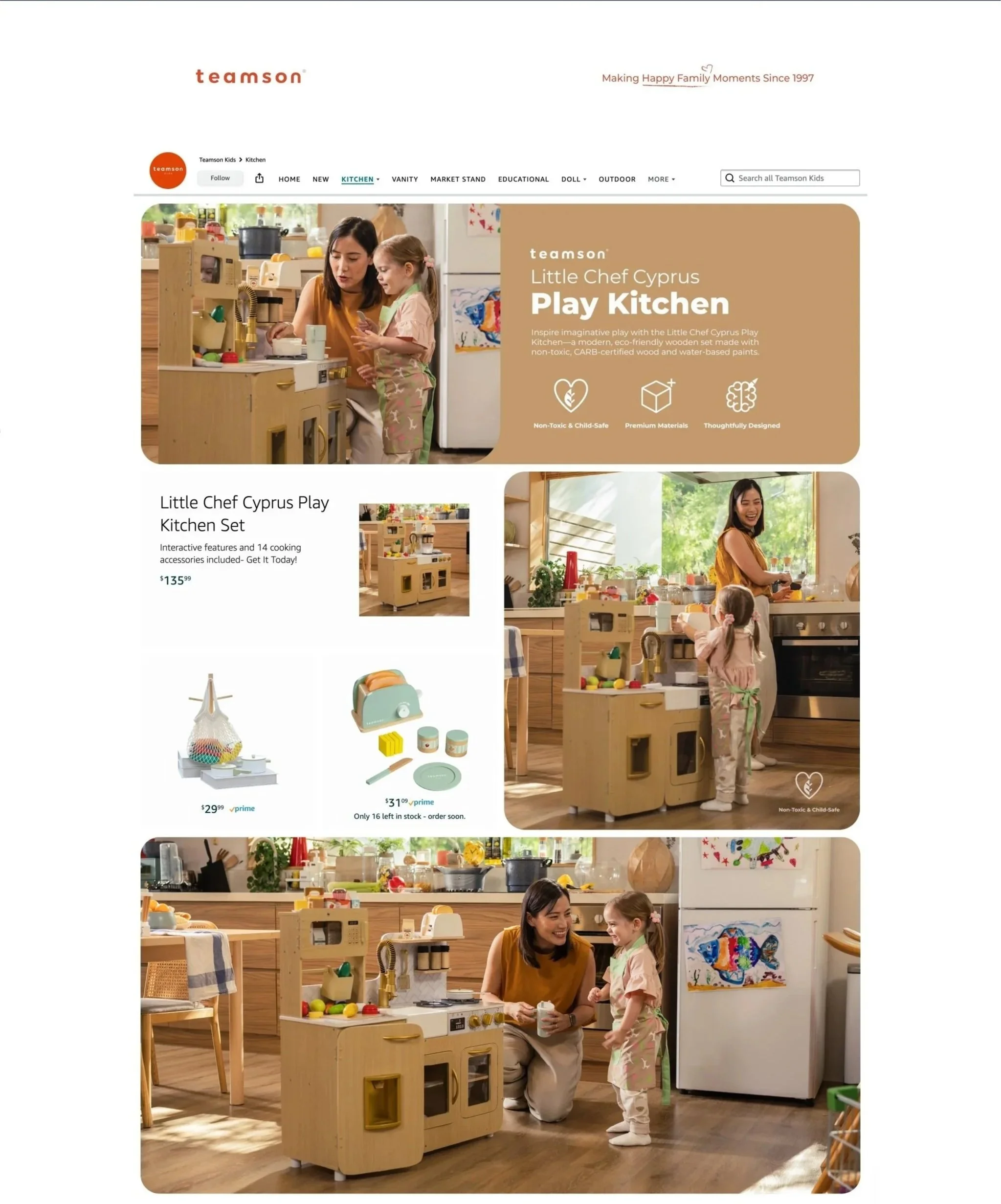
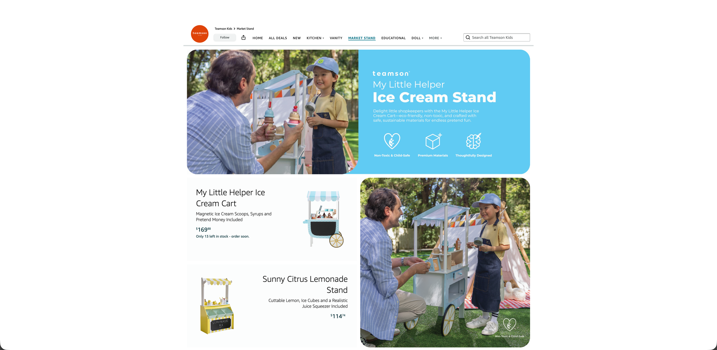
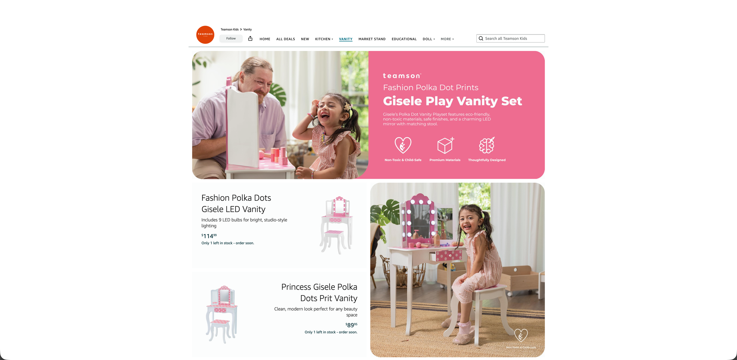
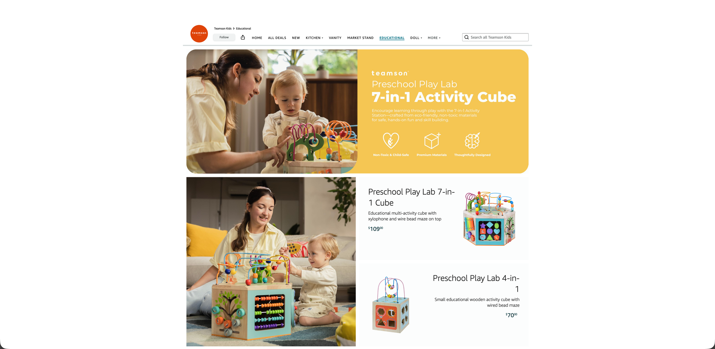
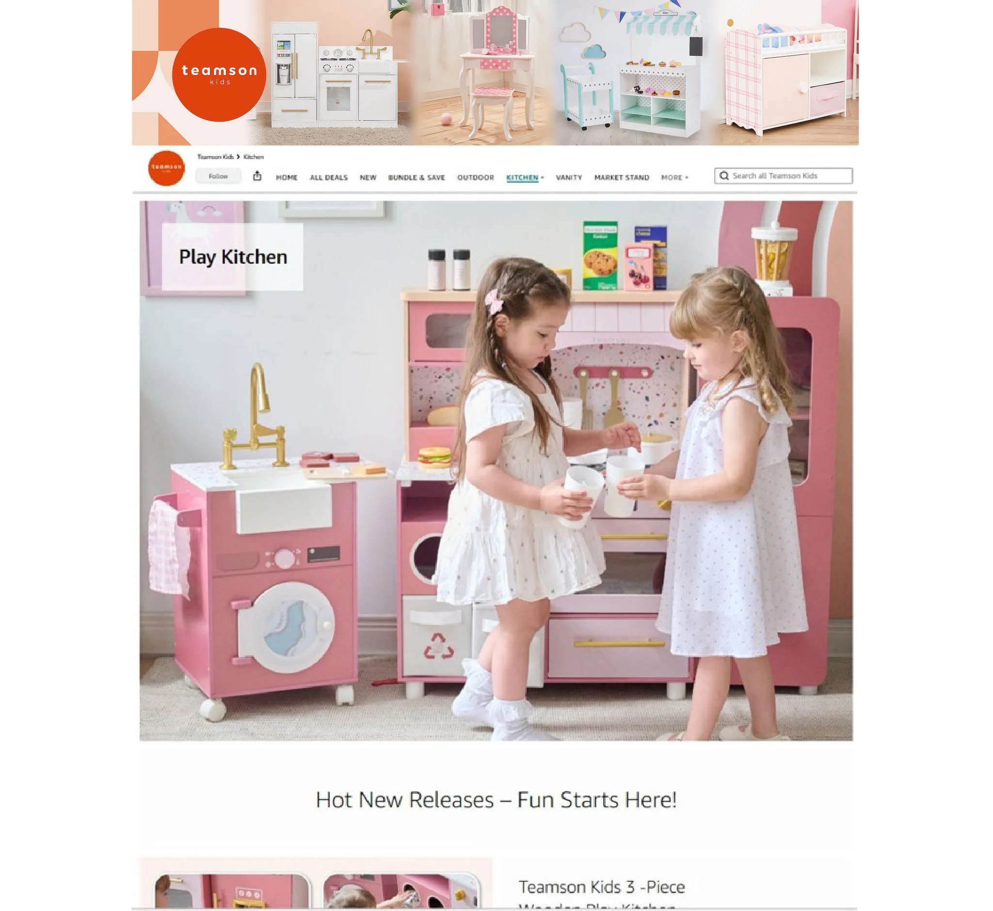
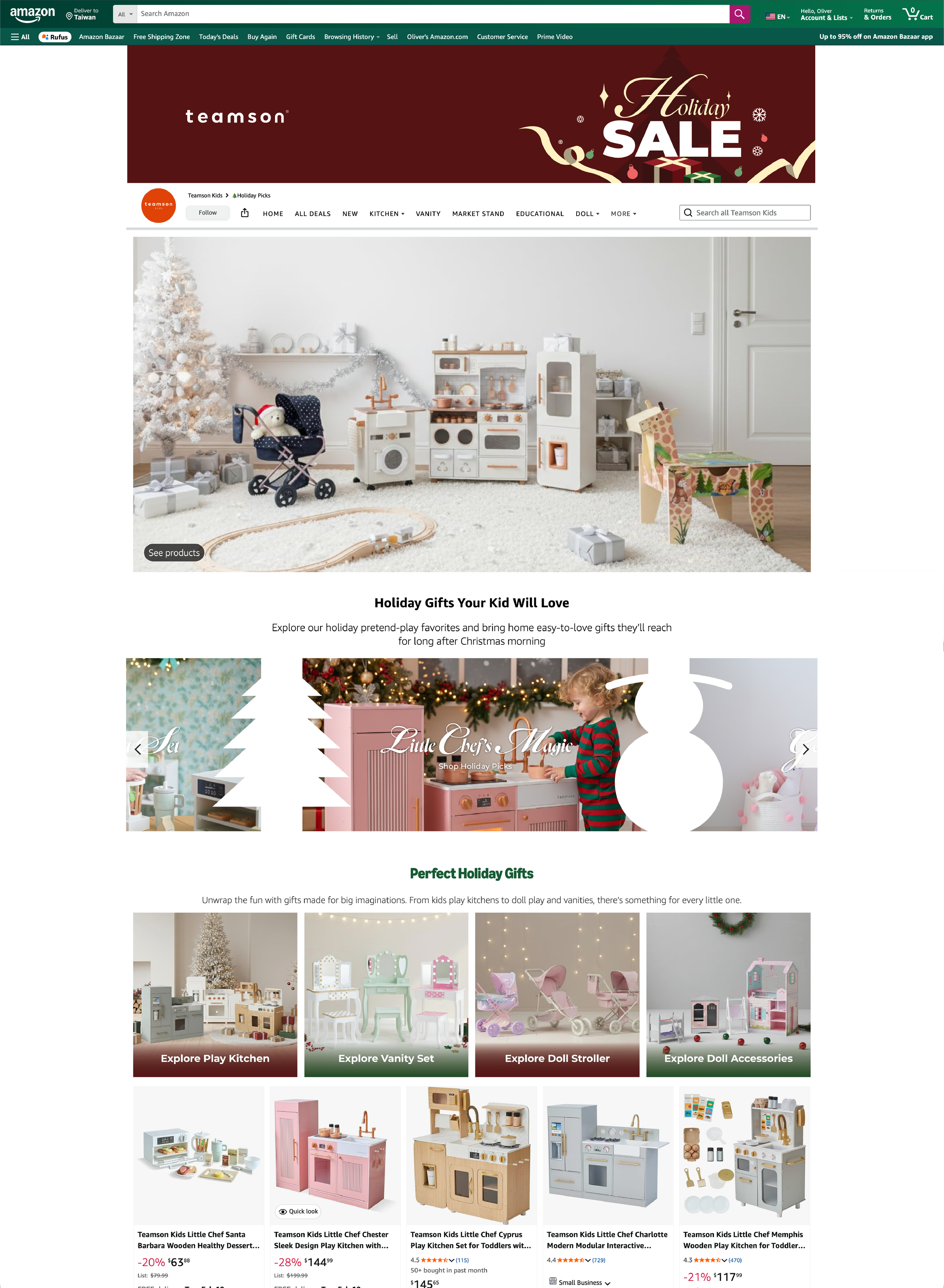
AMAZON STOREFRONT PAGE REFRESH
The kids’ storefront and category pages needed a full visual overhaul — from the homepage hero down to individual category layouts. The redesign focused on improving navigation clarity, strengthening visual cohesion, and creating a browsing experience better suited to the brand's audience.
CATEGORY PAGE REFRESH
BEFORE
AFTER
Refreshed the category page using video shoot footage to highlight kid lifestyle moments, increase product interaction, and update featured products
Introduced a color system across categories to improve navigation clarity and create a more inviting, child-friendly browsing experience
The existing category page lacked optimization, with an oversized hero image that pushed all remaining content below the fold
Neutral color palette failed to engage customers browsing through categories
KID’S HOMEPAGE REFRESH
BEFORE
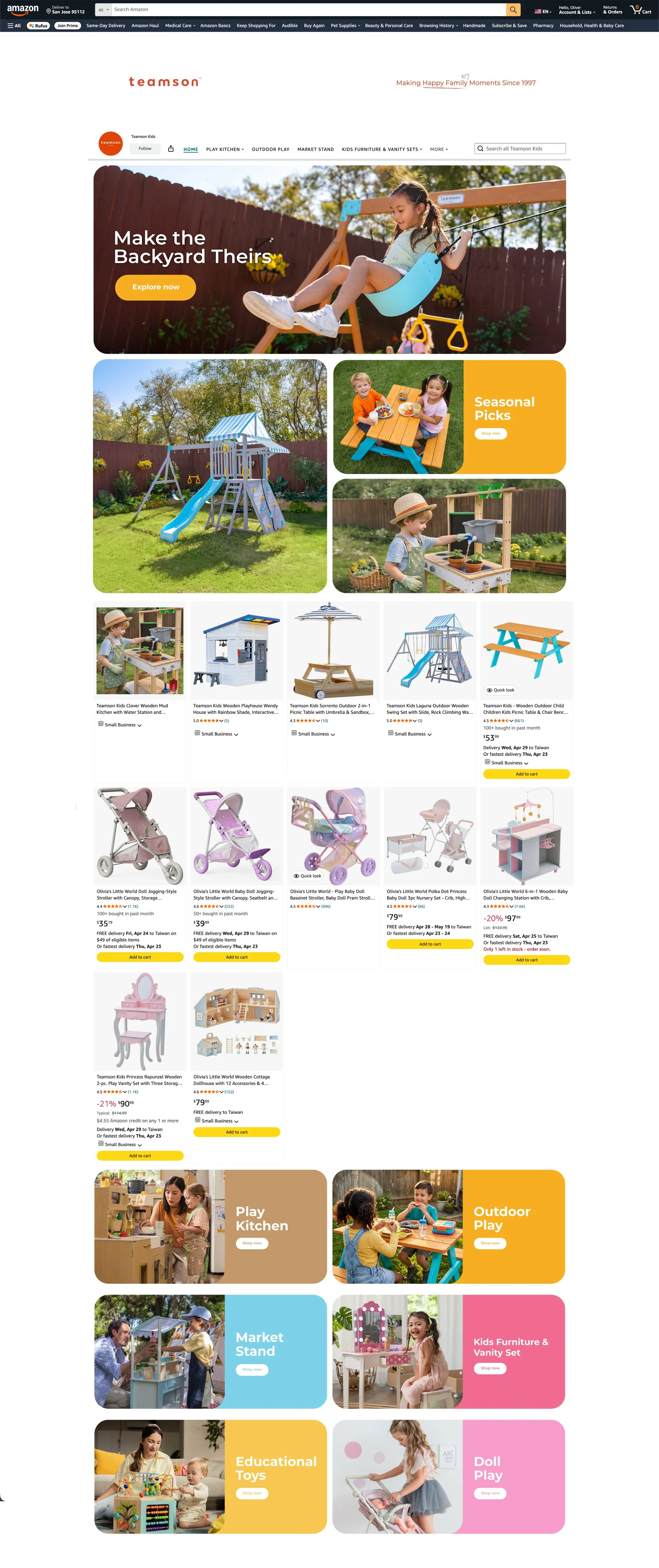
AFTER
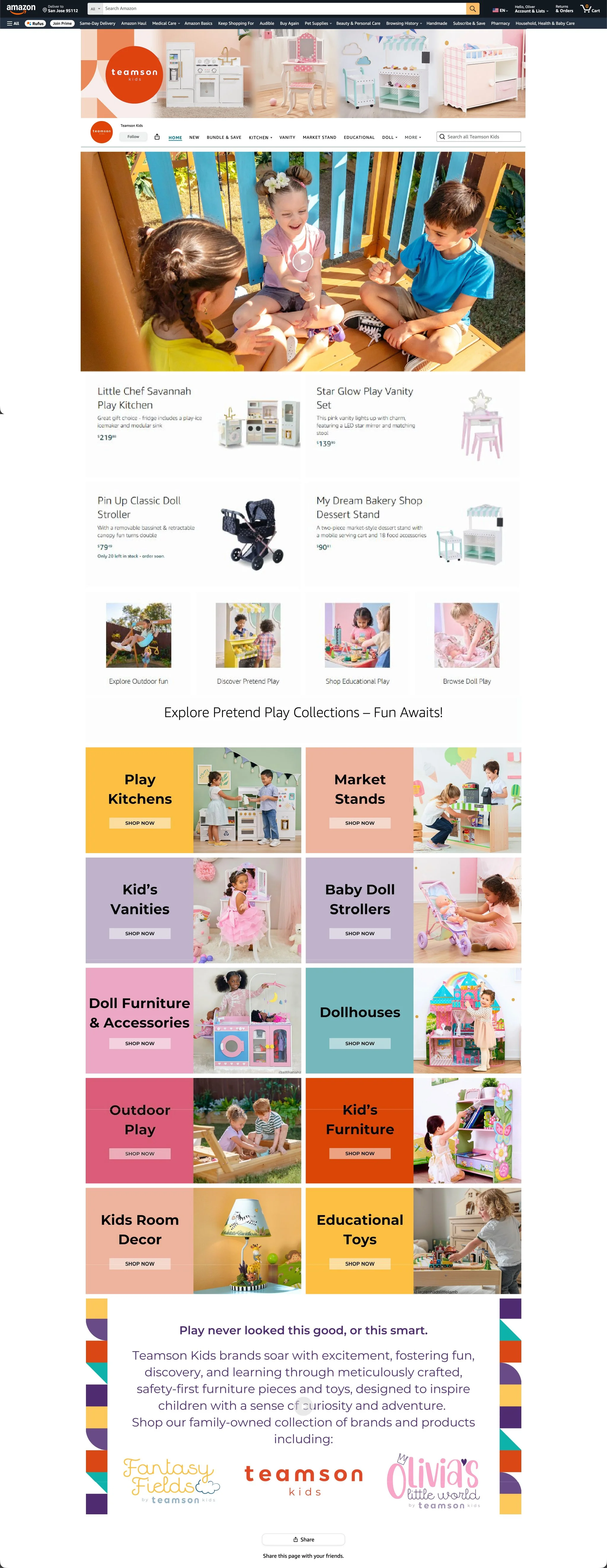
Collaborated with the sales and product teams to align the hero section with the sales calendar, prioritizing seasonal and new product launches with clear imagery and minimal text
Applied rounded corner styling to images to reinforce the brand's visual direction
Consolidated category sections to match the updated navigation bar and align with the redesigned category pages
The homepage hero section lacked focus, with no clear connection between the featured video and the rest of the page content


HOLIDAY SALE CAMPAIGN


AMAZON A+ CONTENT REFRESH
The existing A+ content used a uniform layout across products with no clear navigation or direction. Redesigned the layout with updated imagery to create a more focused customer experience and better utilize the space on the product page
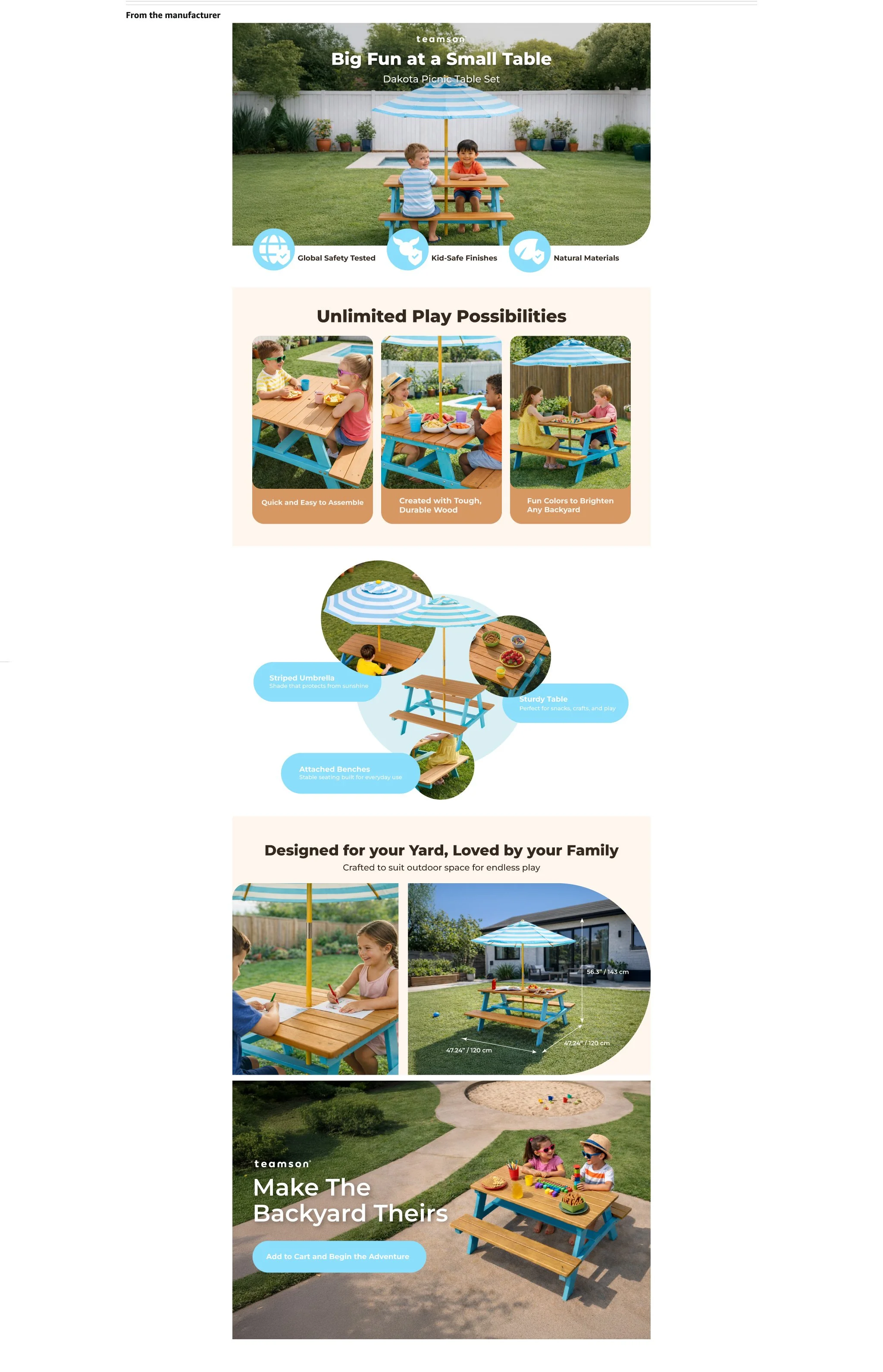
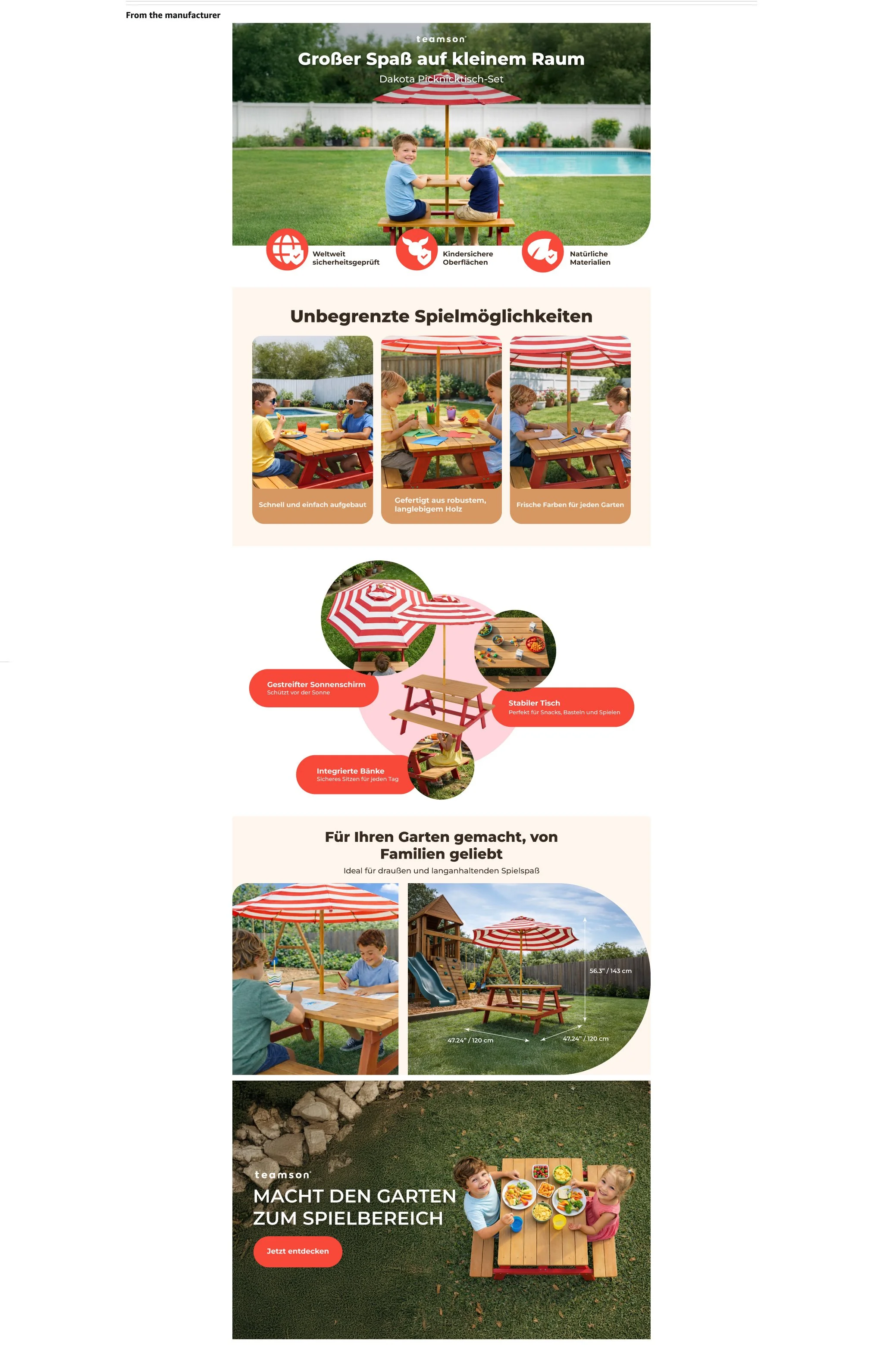
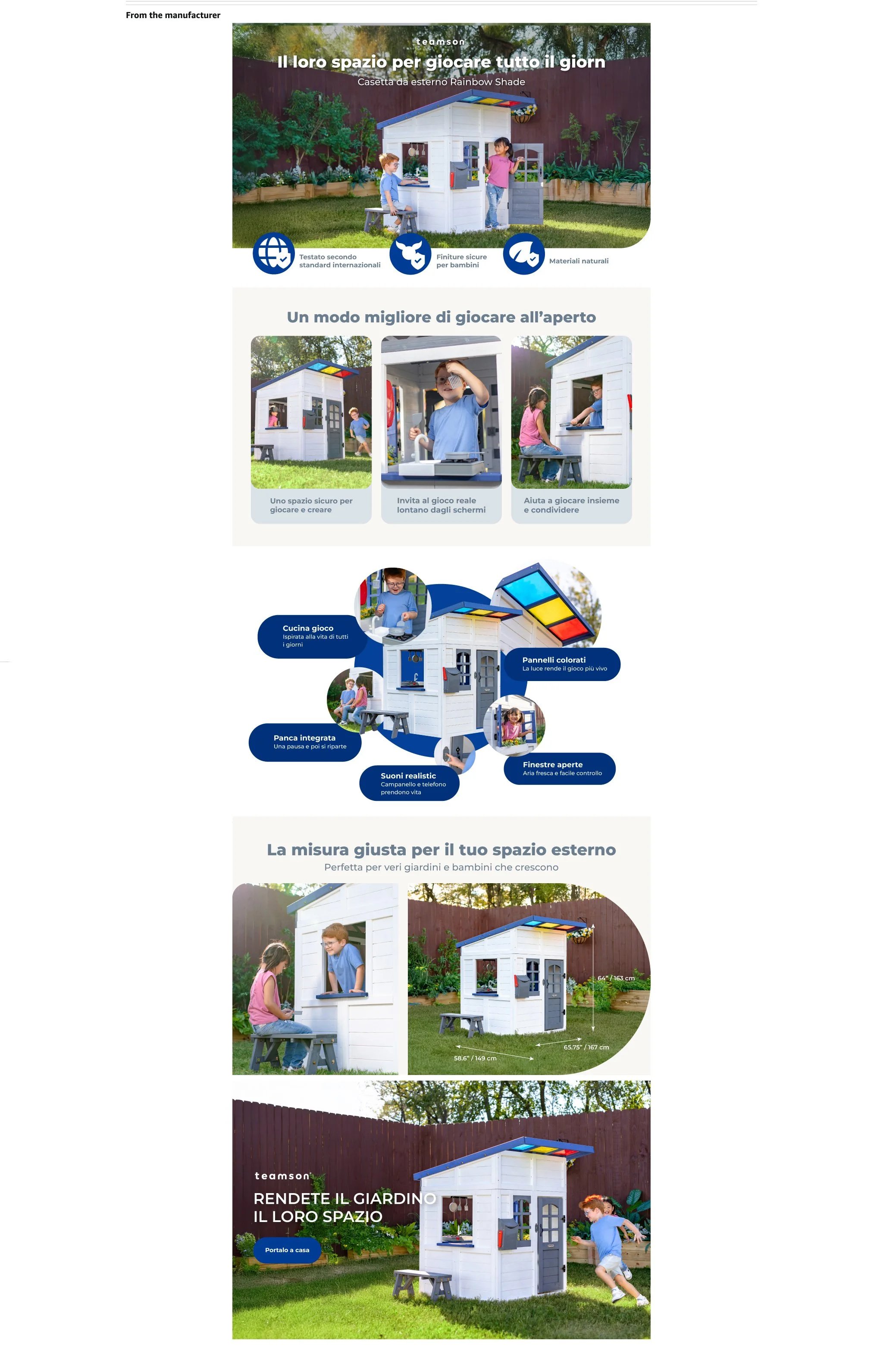
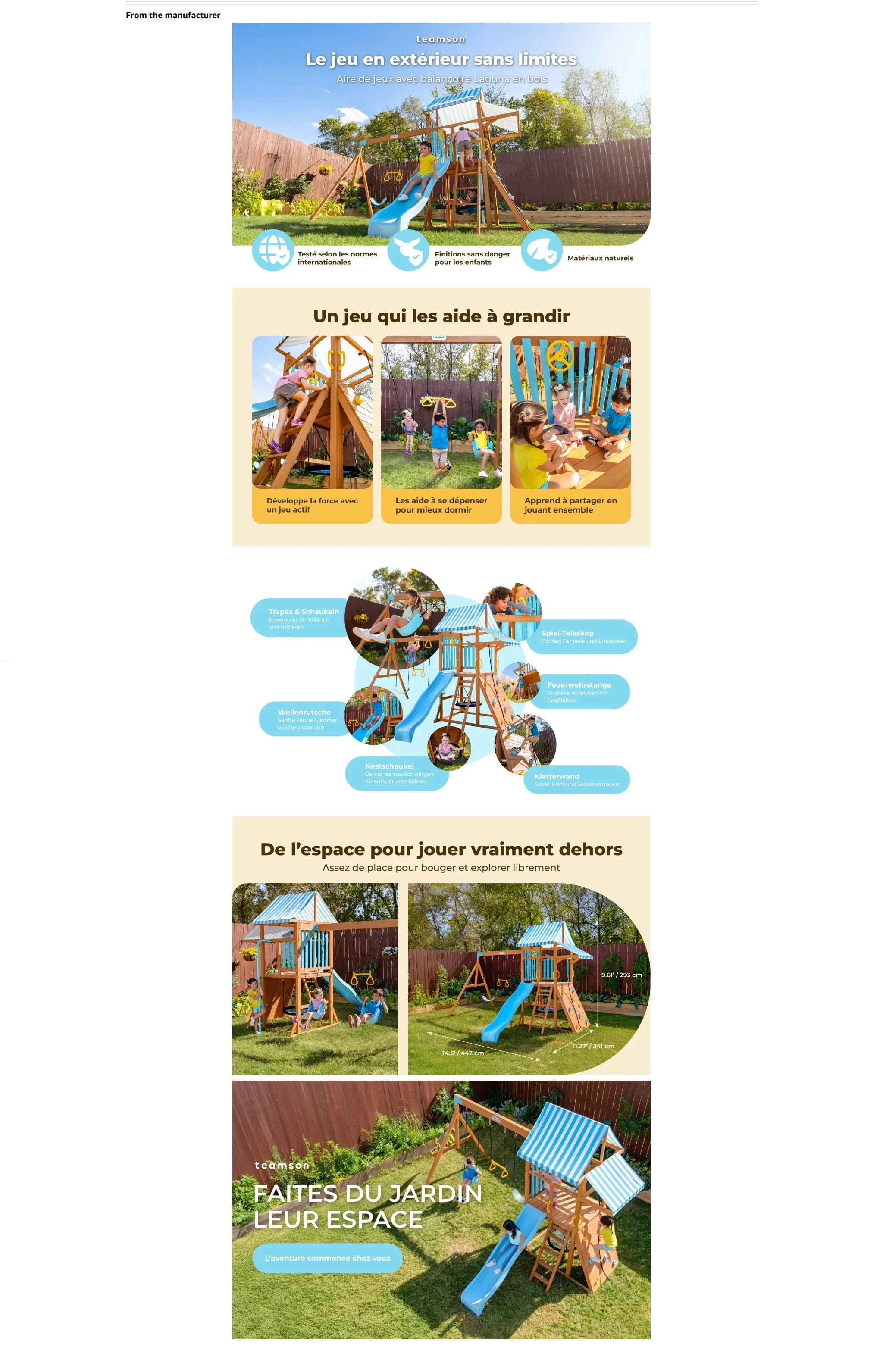
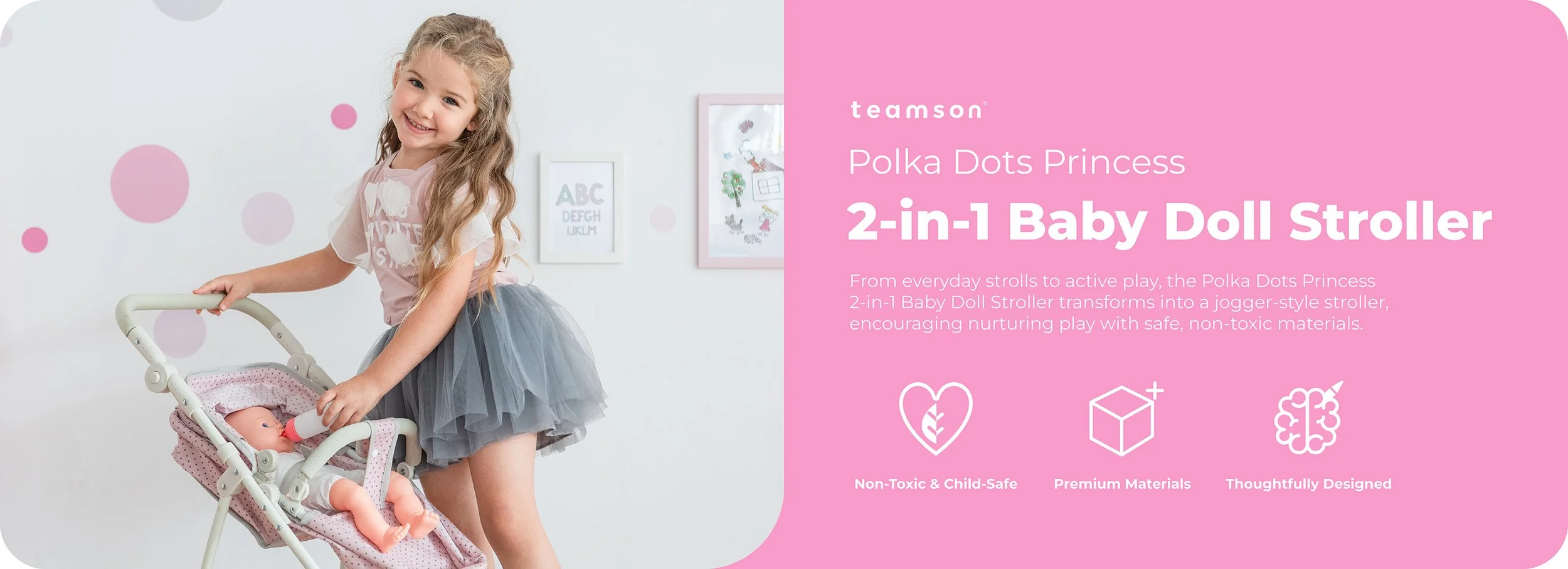
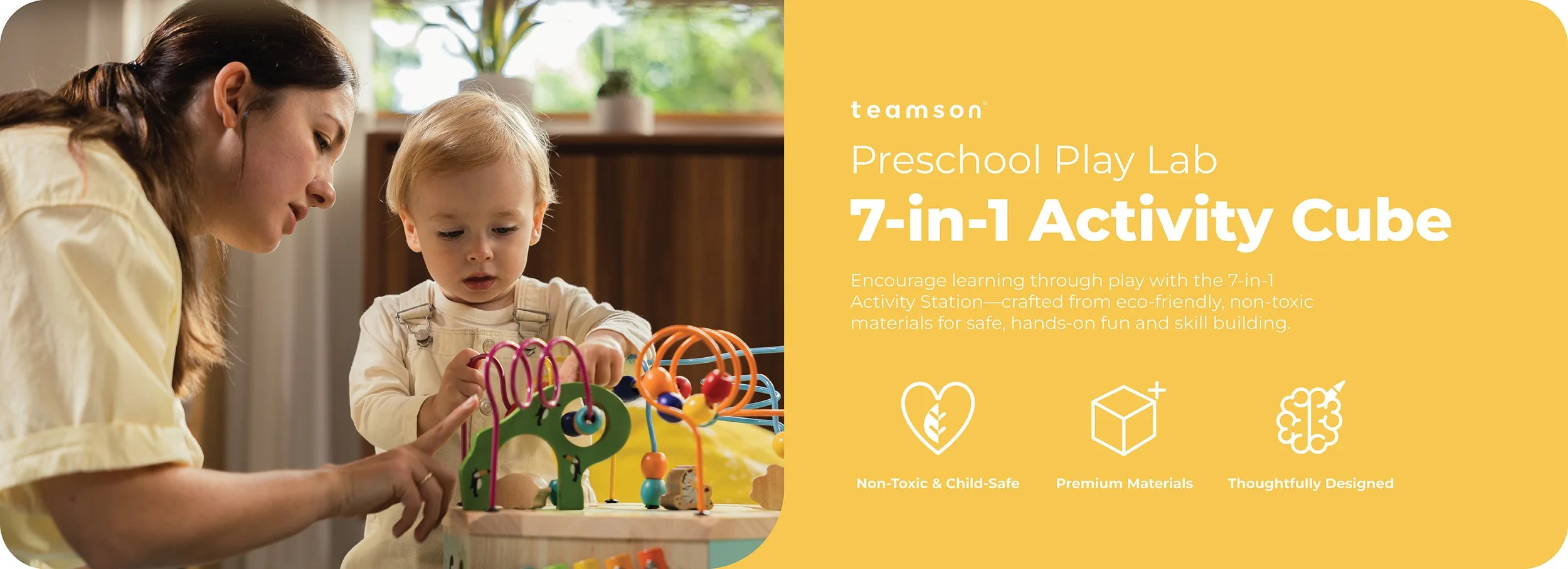
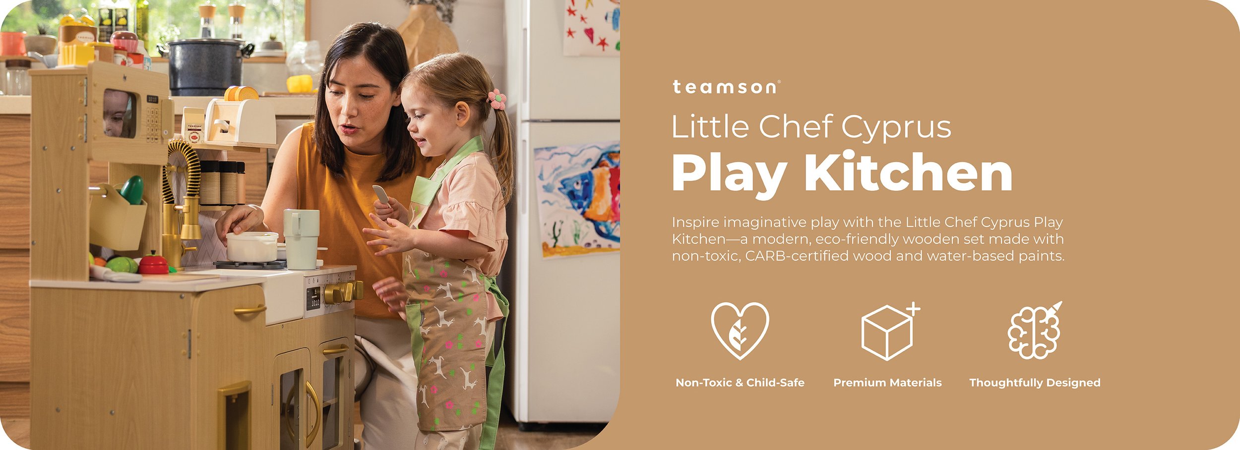
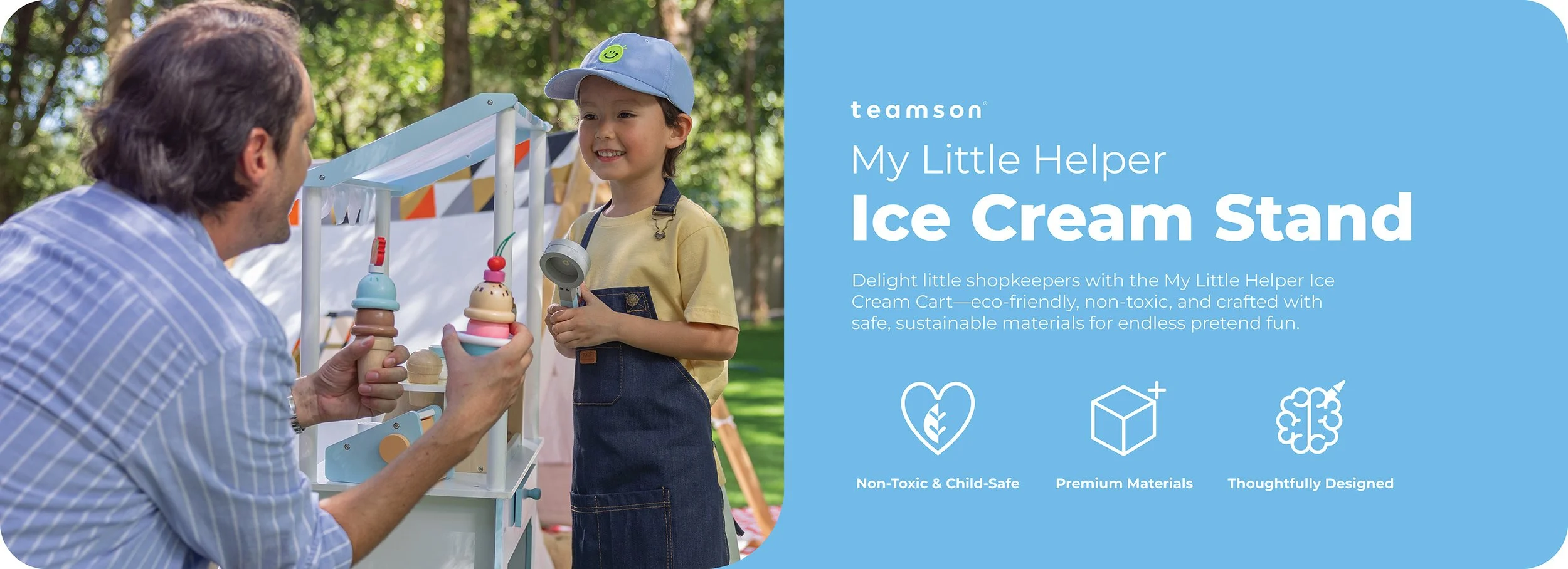
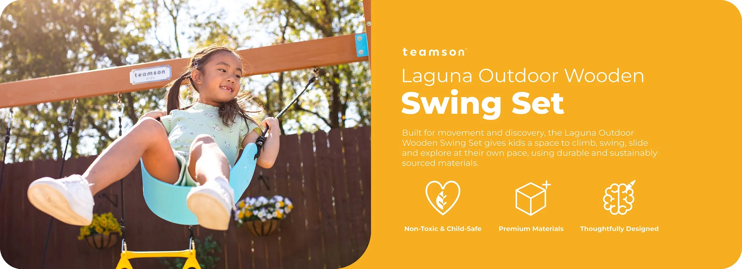
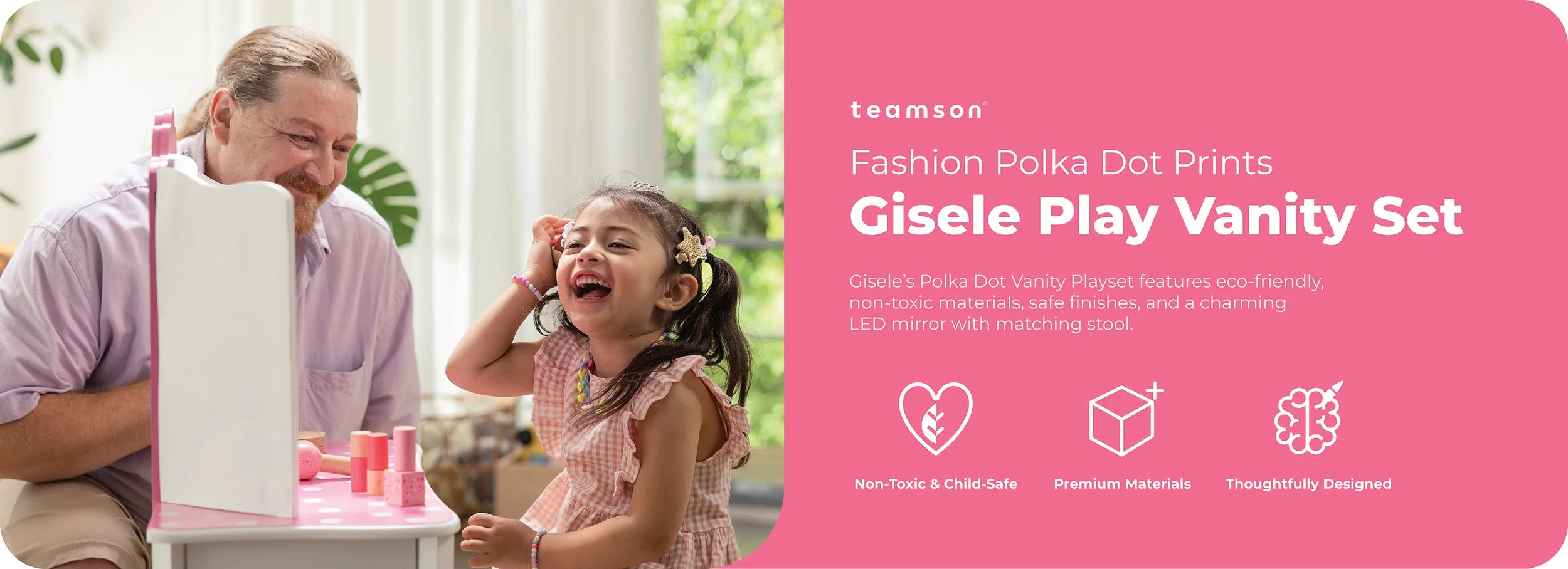
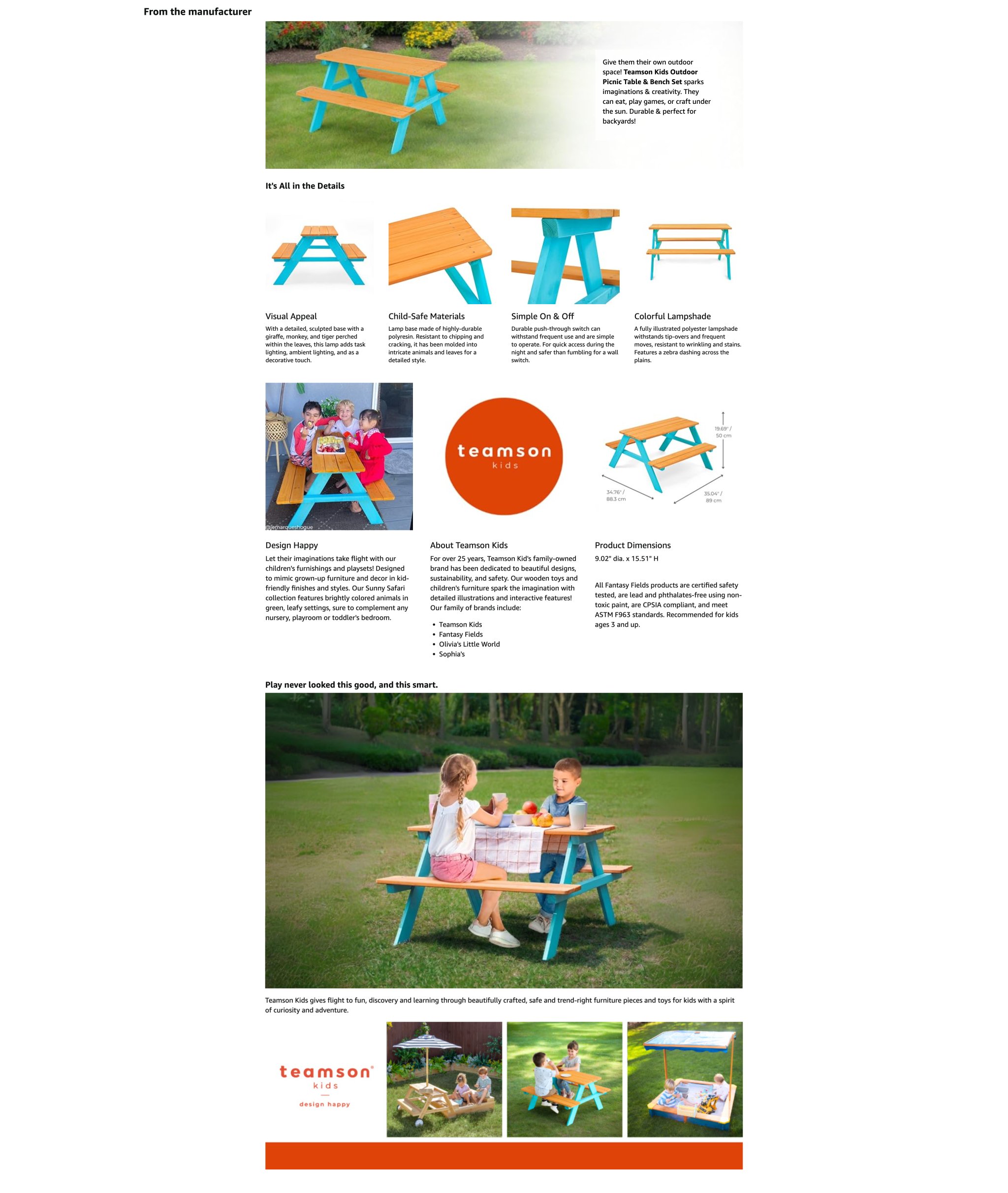
FROM THE MANUFACTURER SECTION
For the Amazon A+ section, I also updated the From the manufacturer section to create a better visual experience for customers and align with our company's values. This layout was designed and updated by me for our company's 6 global brand stores (US, UK, Germany, France, Italy, Spain)
BEFORE
AFTER
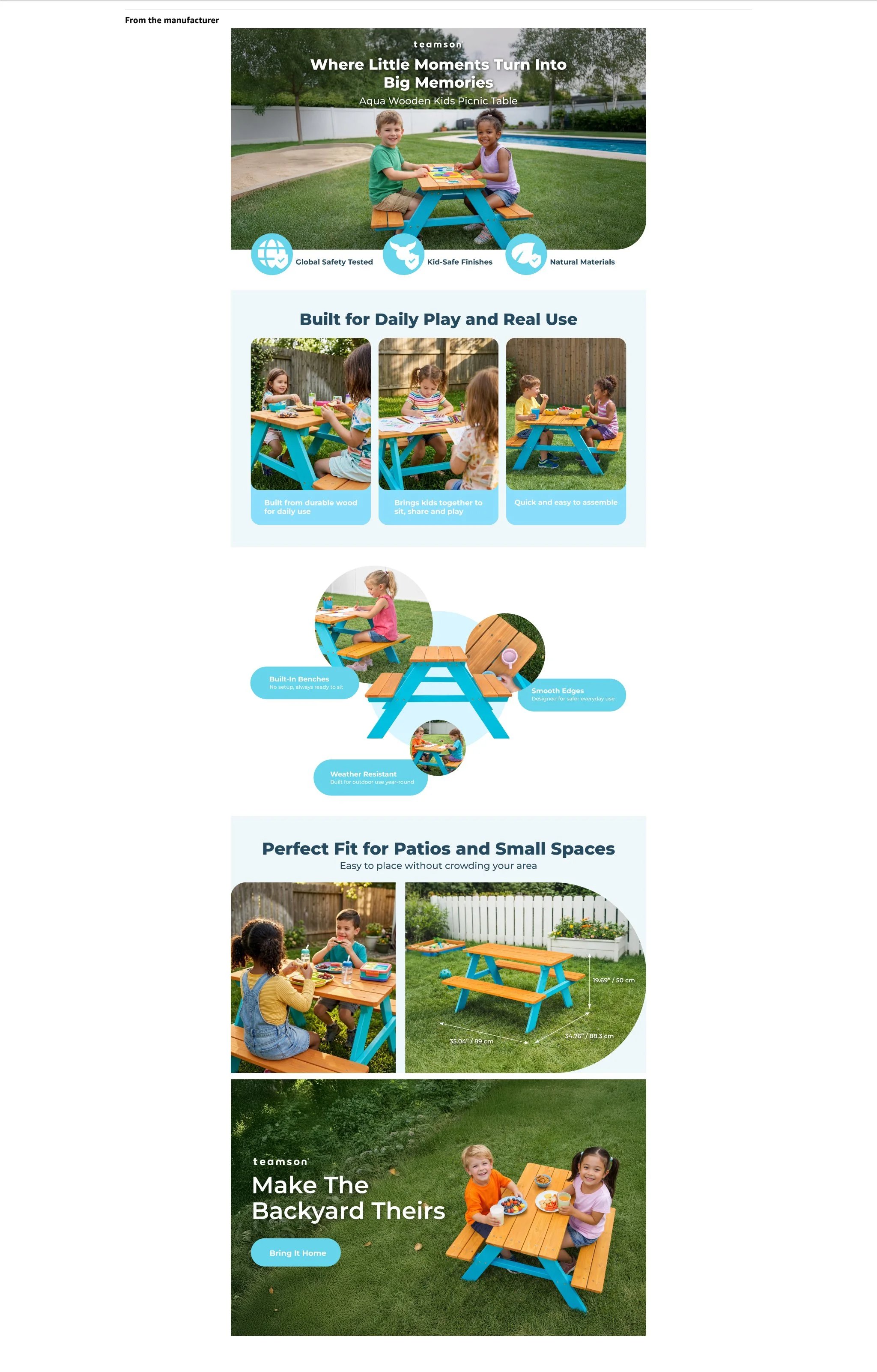
Replaced low-quality visuals with real photoshoot imagery and upgraded AI-generated assets
Structured content across Amazon's five-slide limit into a clear, purposeful sequence:
Slide 1: Engaging hero image with product quality icons
Slide 2: Key selling points
Slide 3: Product features
Slide 4: Product dimensions
Slide 5: Call-to-action with strong closing imagery
Generic layout with no clear content hierarchy
Poor AI-generated and photoshopped imagery, made more apparent at hero scale
Disorganized content mixing brand introduction, company values, and product specs into a single unfocused section