RETRO REPLAY
SJSU BFA GD THESIS PROJECT
SKILLS
BRAND DESIGN
3D MODELING
PACKAGING DESIGN
TOOLS
ADOBE ILLUSTRATOR, FUSION 360, PRINT MEDIA
This thesis will explore the different aspects of retro video games, examining their visual aesthetics and the culture of old-style gaming. By investigating how gameplay mechanics, gaming hardware, and user interfaces shaped the gaming experience of past eras, this study aims to shed light on the enduring appeal of retro visuals and their significance in contemporary game development practices.
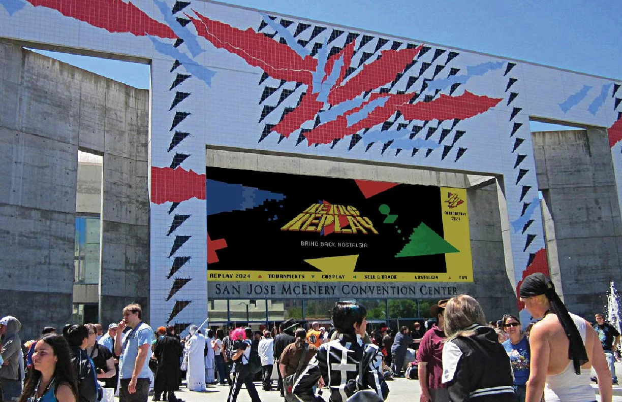
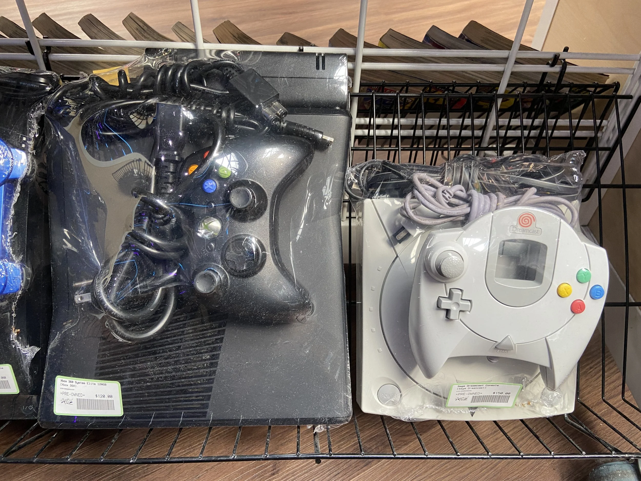
Retro Replay is my thesis project, a convention design inspired by a retro video game store. The goal was to celebrate the nostalgia of retro gaming and explore the design elements that bring that feeling to life. As part of the process, I interviewed people from the video game and exhibition industries, as well as gaming enthusiasts, to understand their perspectives. These are some of the inspirations I gathered from the store that helped shape the visual direction of the convention.
WHAT IS RETRO REPLAY
Retro Replay is a video convention inspired by retro video game elements, and we invite people of all ages to come and share and celebrate the history of video games
BRAND IDENTITY
SKETCHES AND IDEAS
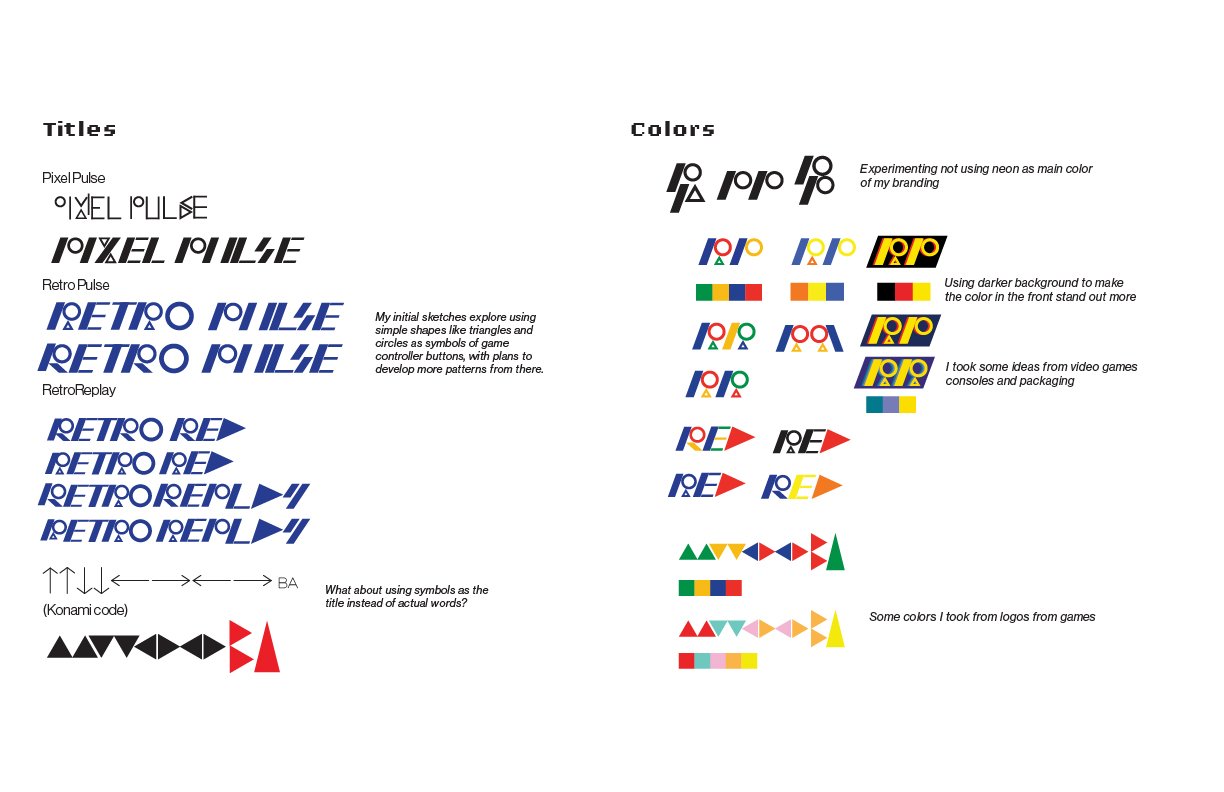
From my research and interviews with gamers, I found that primary colors are deeply embedded in retro gaming's visual identity, not by coincidence, but by constraint. Early print and screen technology favored bold, high-contrast hues that held up at small sizes and low resolutions, and red, yellow, and blue were the most legible under those conditions. That limitation became a language. Nintendo, LEGO, and classic arcade graphics all built their identities on primaries because those colors had to work fast, in crowded environments, against competing visual noise. Over decades of repetition, the palette became inseparable from the era itself.
FINAL DESIGN
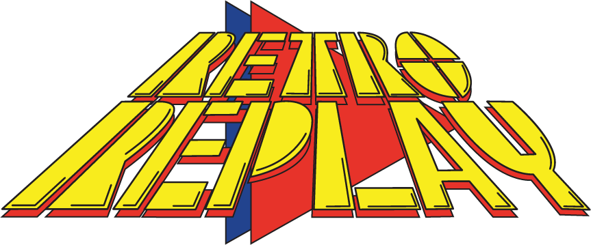
For Retro Replay, the choice to use red, yellow, and blue in the logo isn't decorative. It's the most direct way to speak the visual grammar of a generation. Primary colors don't just reference retro culture. They are retro culture.
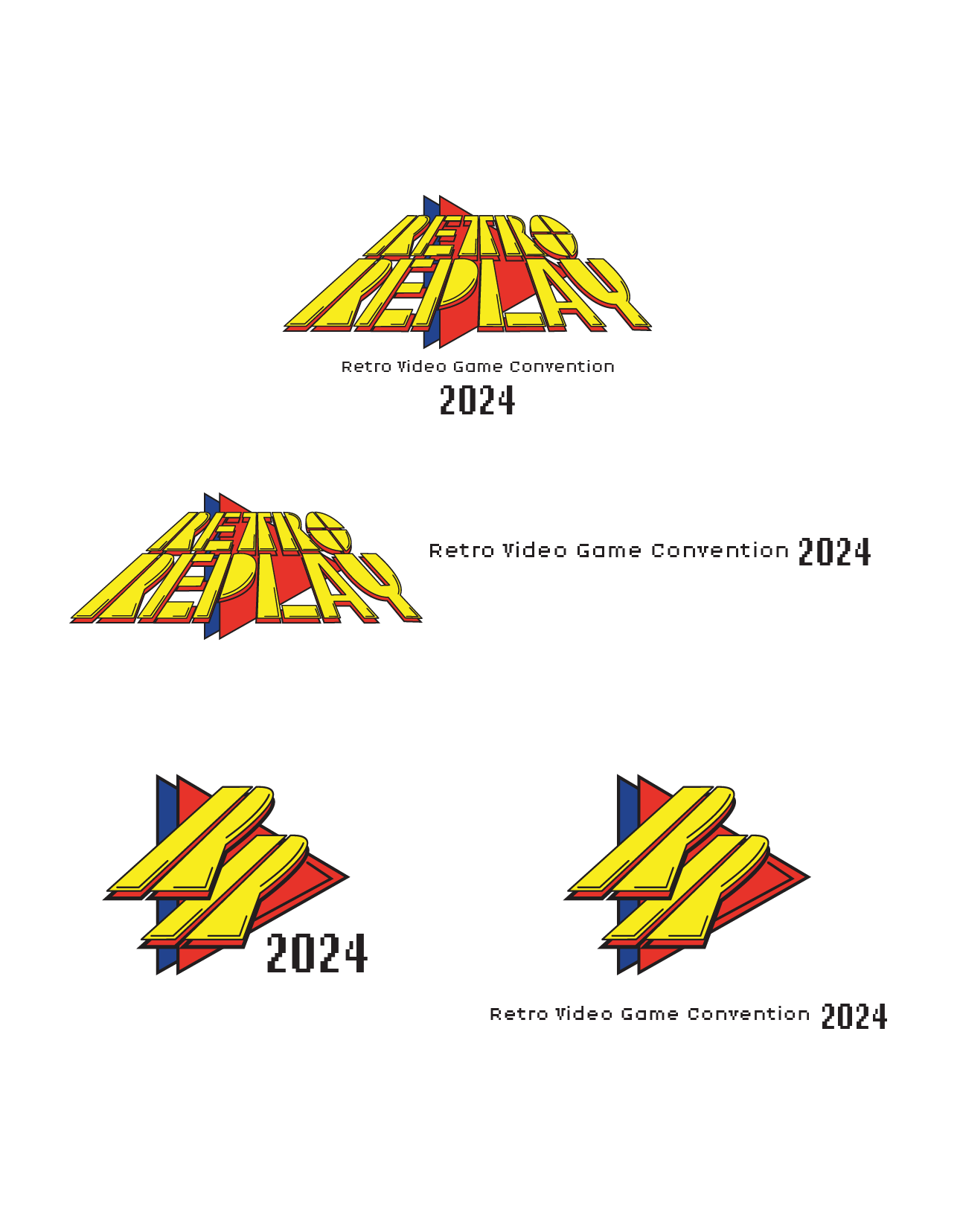
Simplified version
The simplified version stacks two Rs together and keeps the triangles

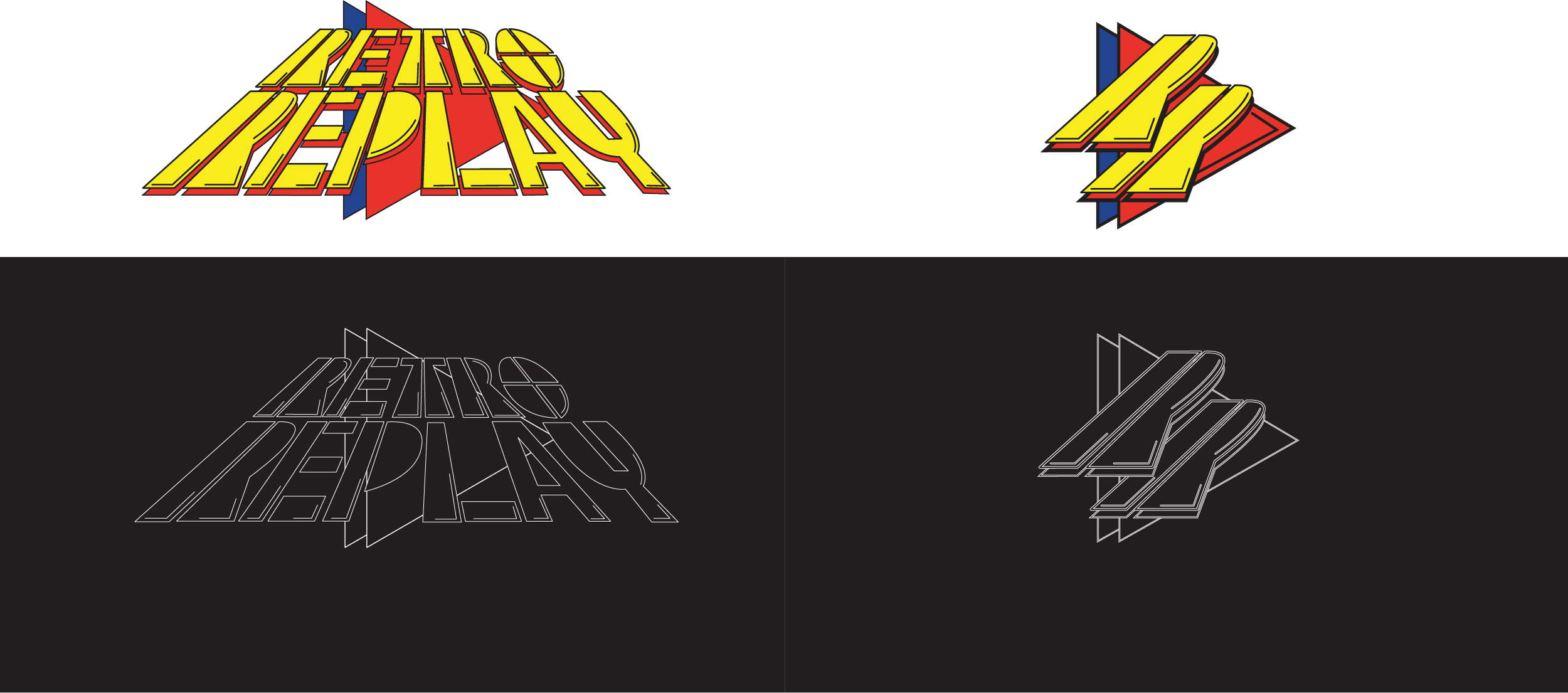
Full version
Changing the typeface to a bolder style, adding outlines to give a hand-drawn feel, and using triangles as the play button
CONVENTION TAKEAWAYS
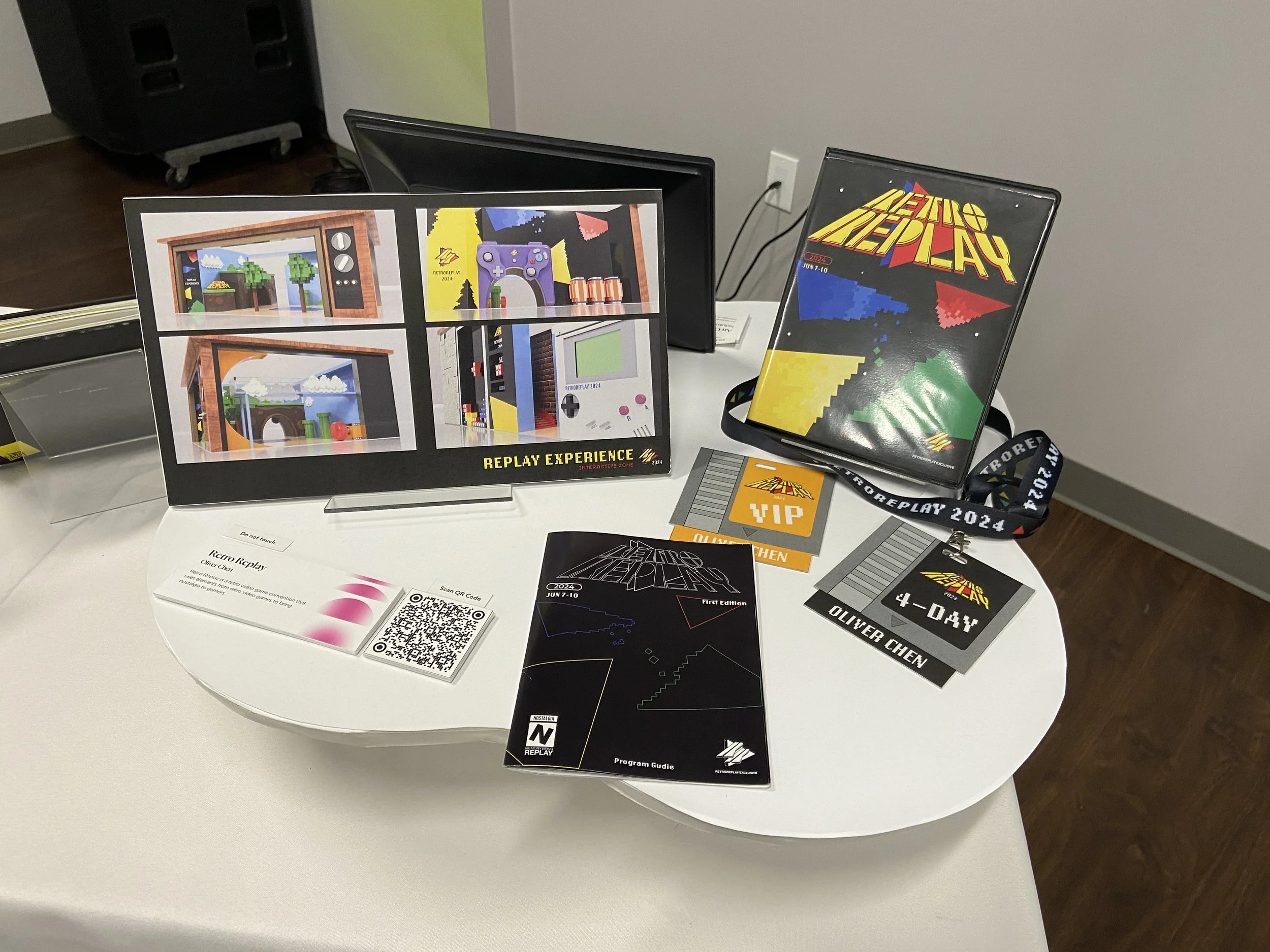
Retro Replay's identity is nostalgia. The takeaways were designed to stretch that feeling beyond the convention floor, evoking retro gaming culture before the event begins and giving attendees something worth keeping long after it ends.
BADGE DESIGN
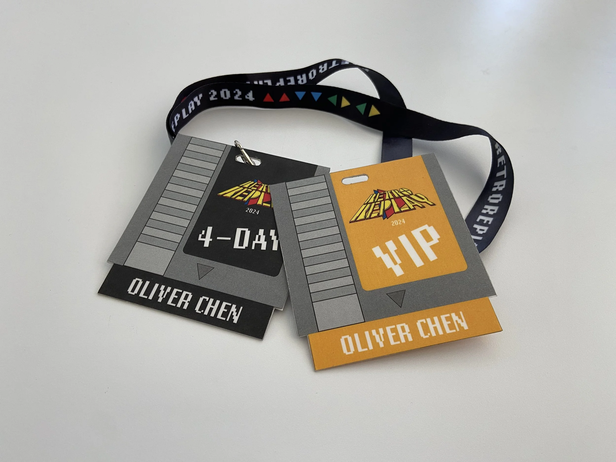
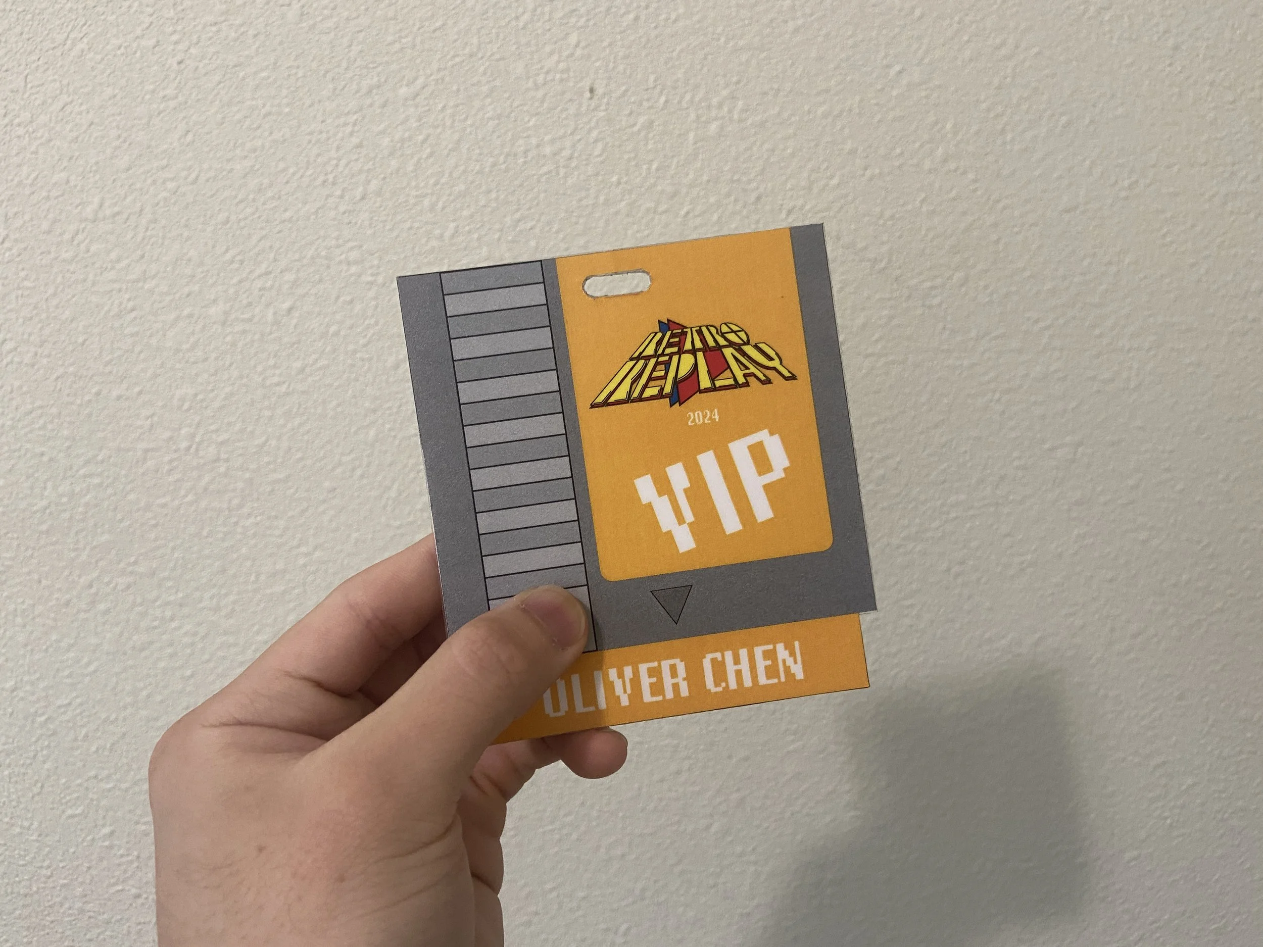
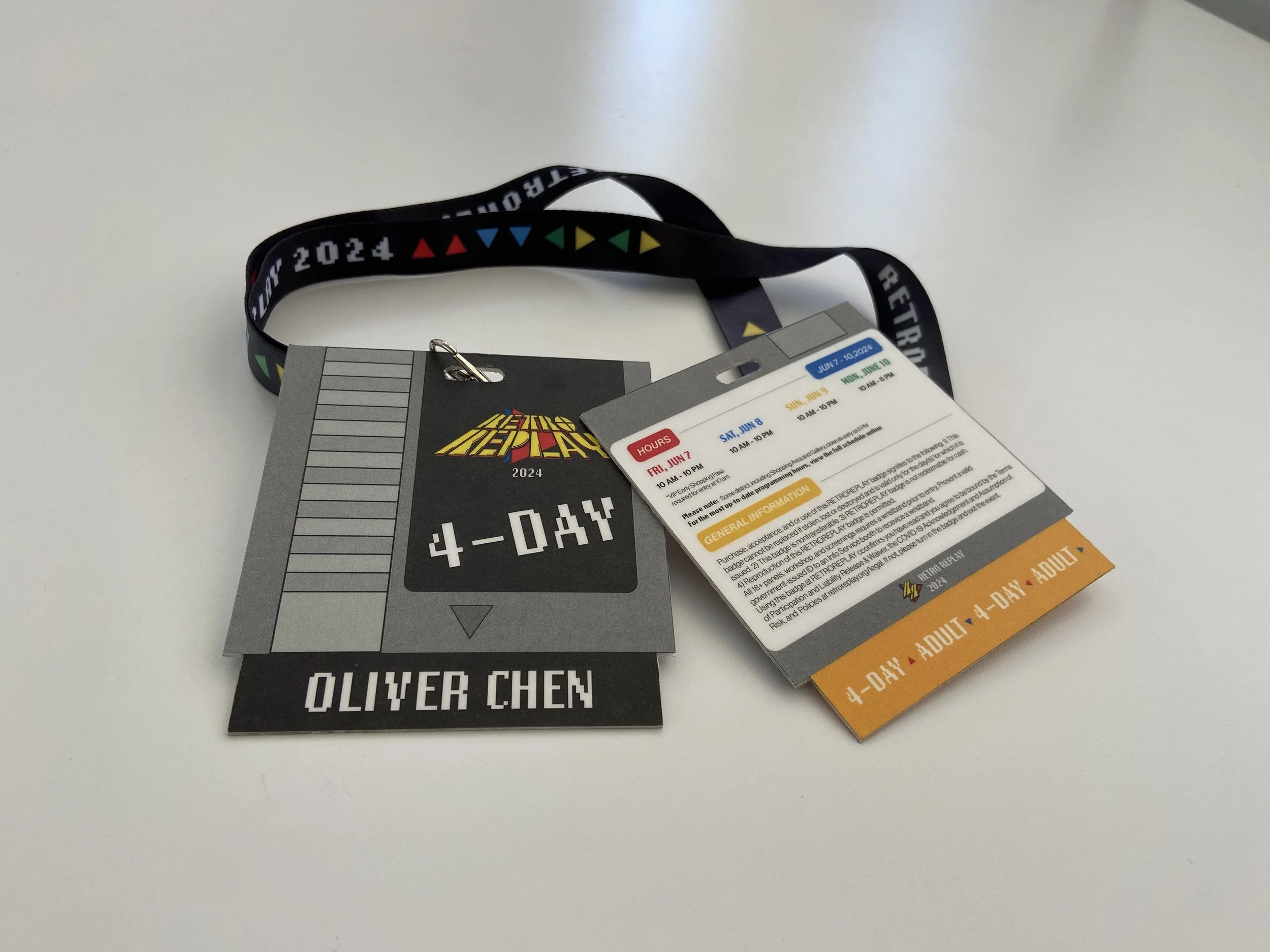
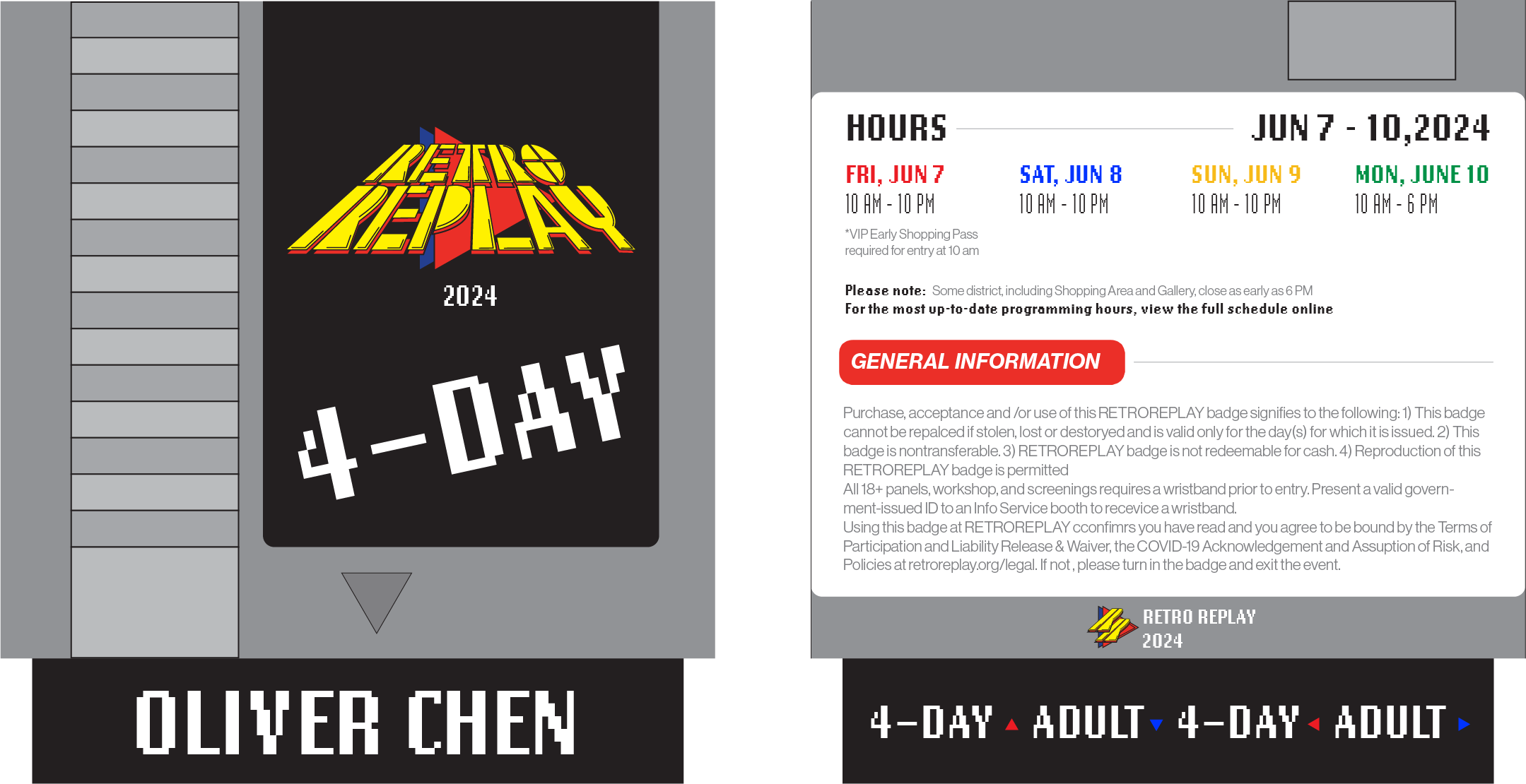
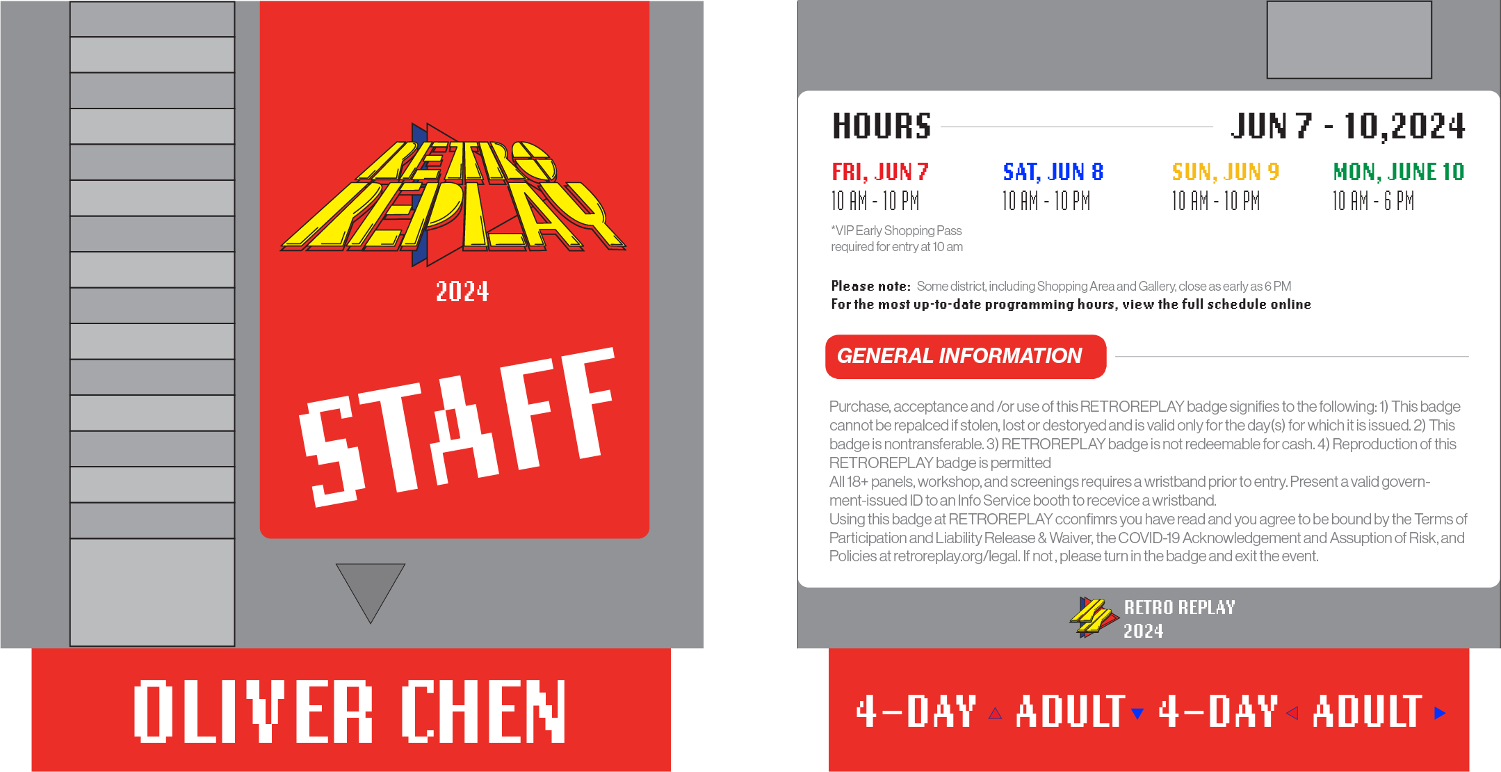
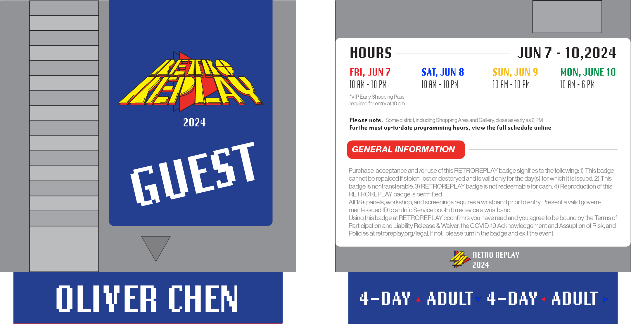
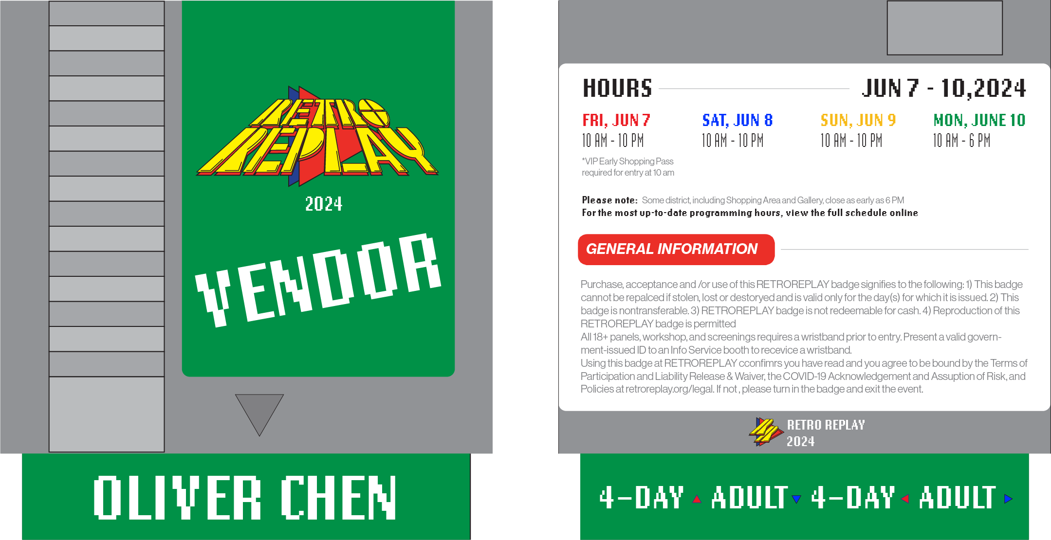
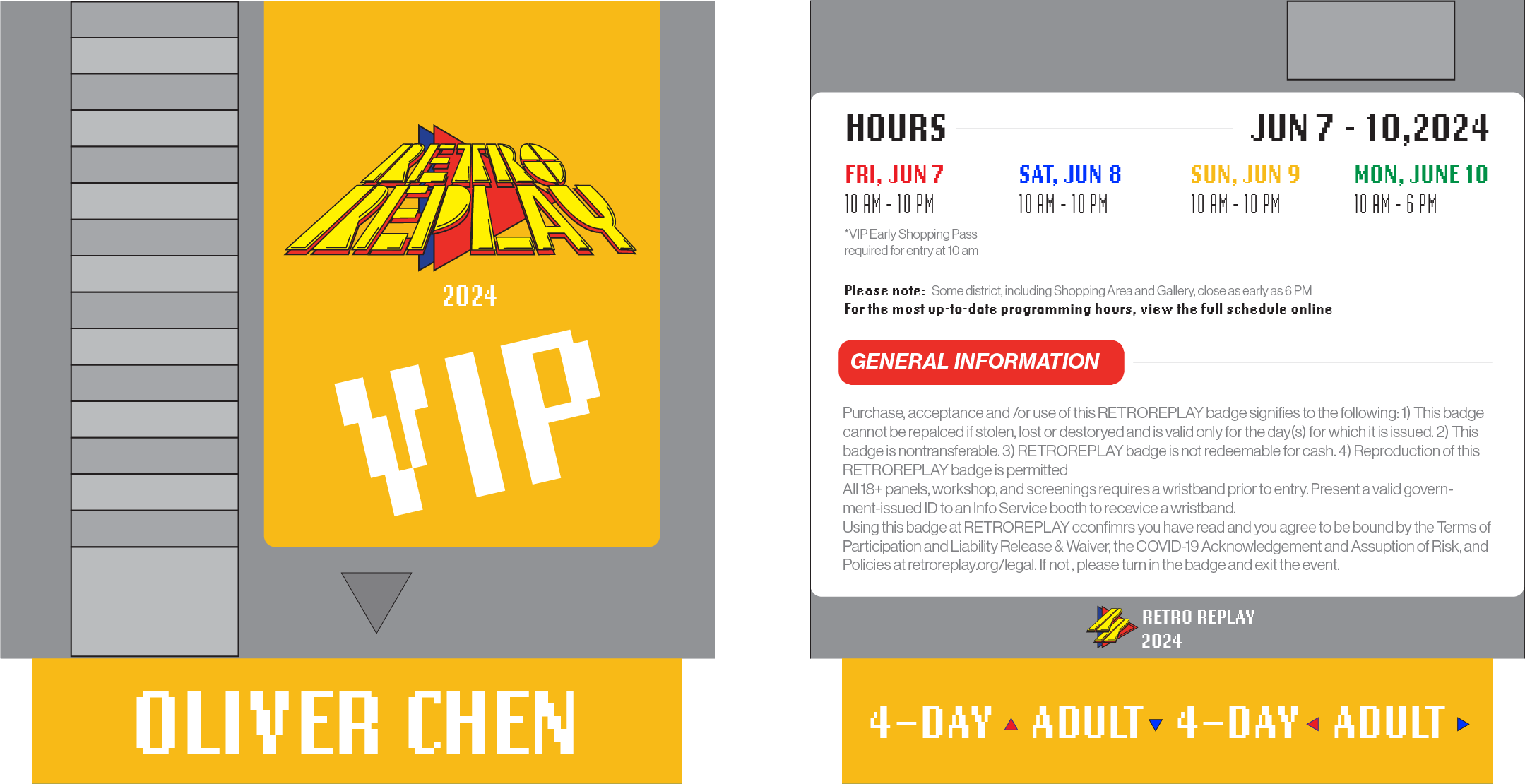
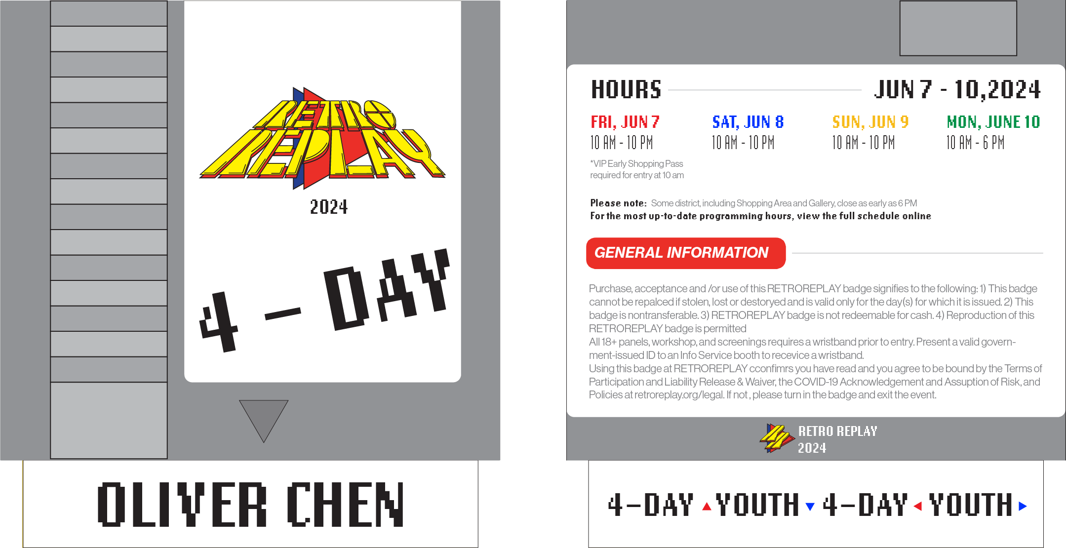
The idea of the badges comes from me thinking about what gamers have to bring when going to their friend’s house to play video games
RESEARCH FINDINGS
IDEA SKETCHES
FINAL DESIGN
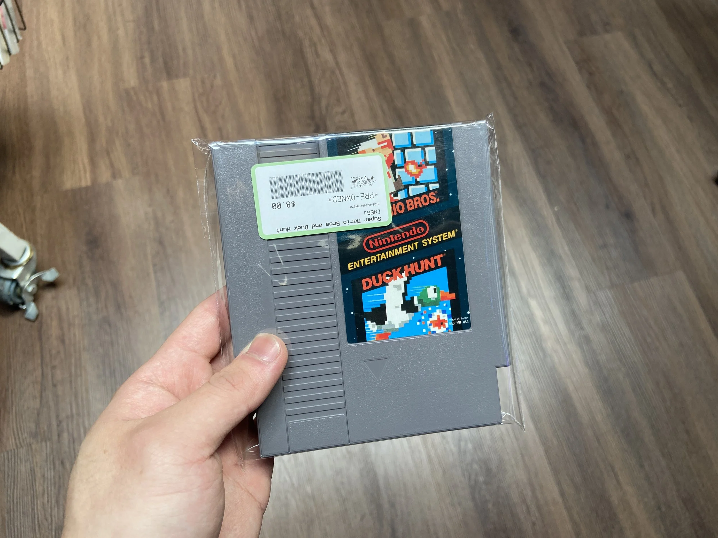
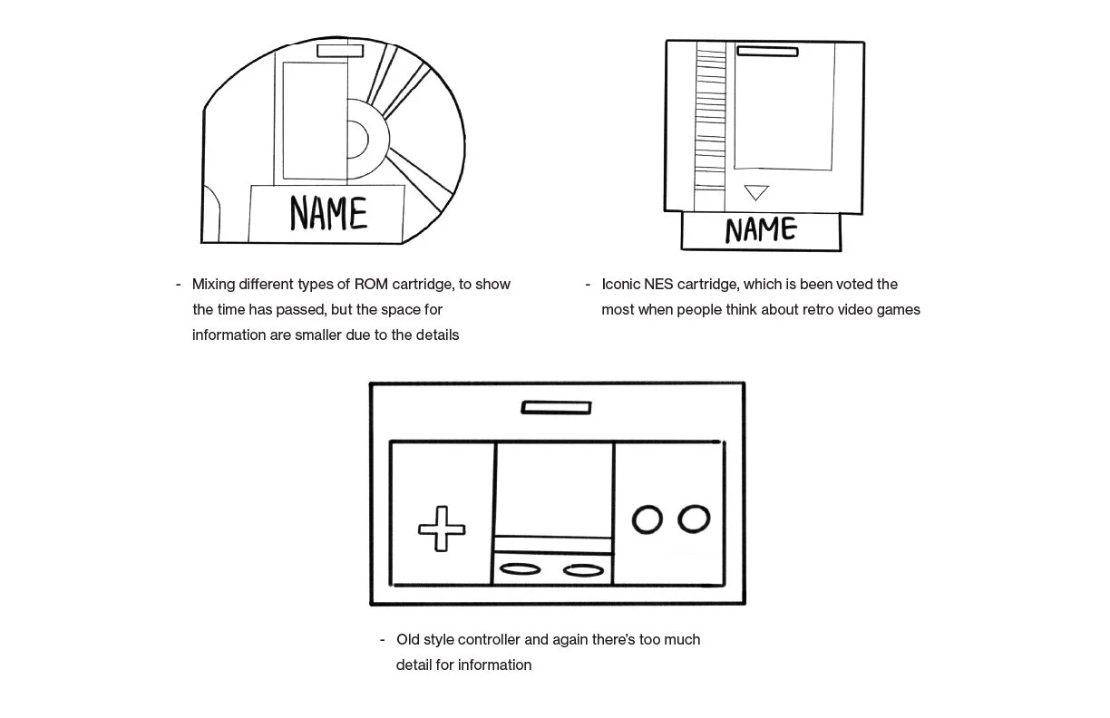
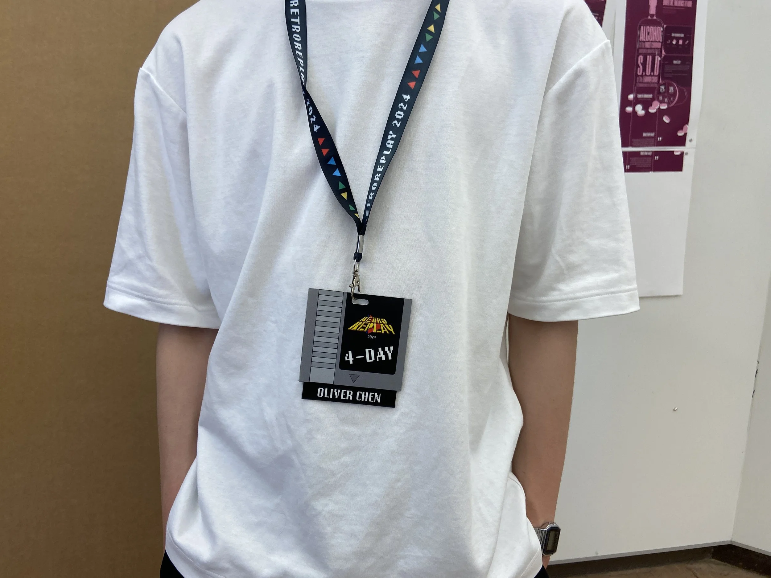
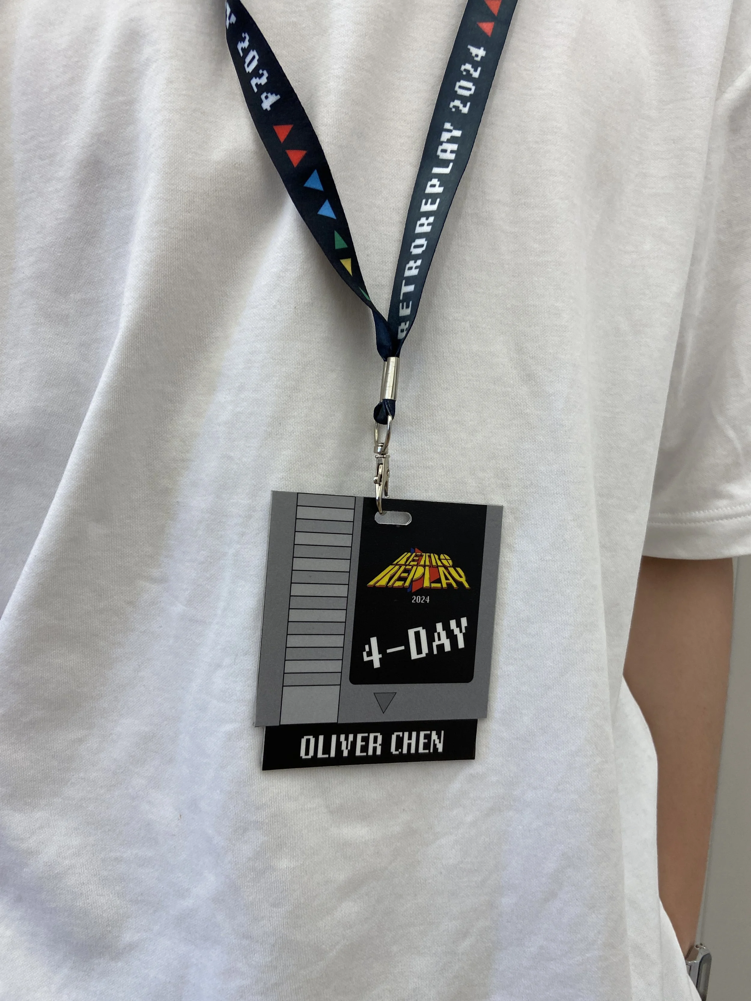
Early explorations looked for a form that carried meaning beyond identification. The game cartridge kept surfacing; it's the physical object that grants you access to the world of retro games, which is exactly what the badge does at a convention. The retro reference wasn't decorative; it was the concept.
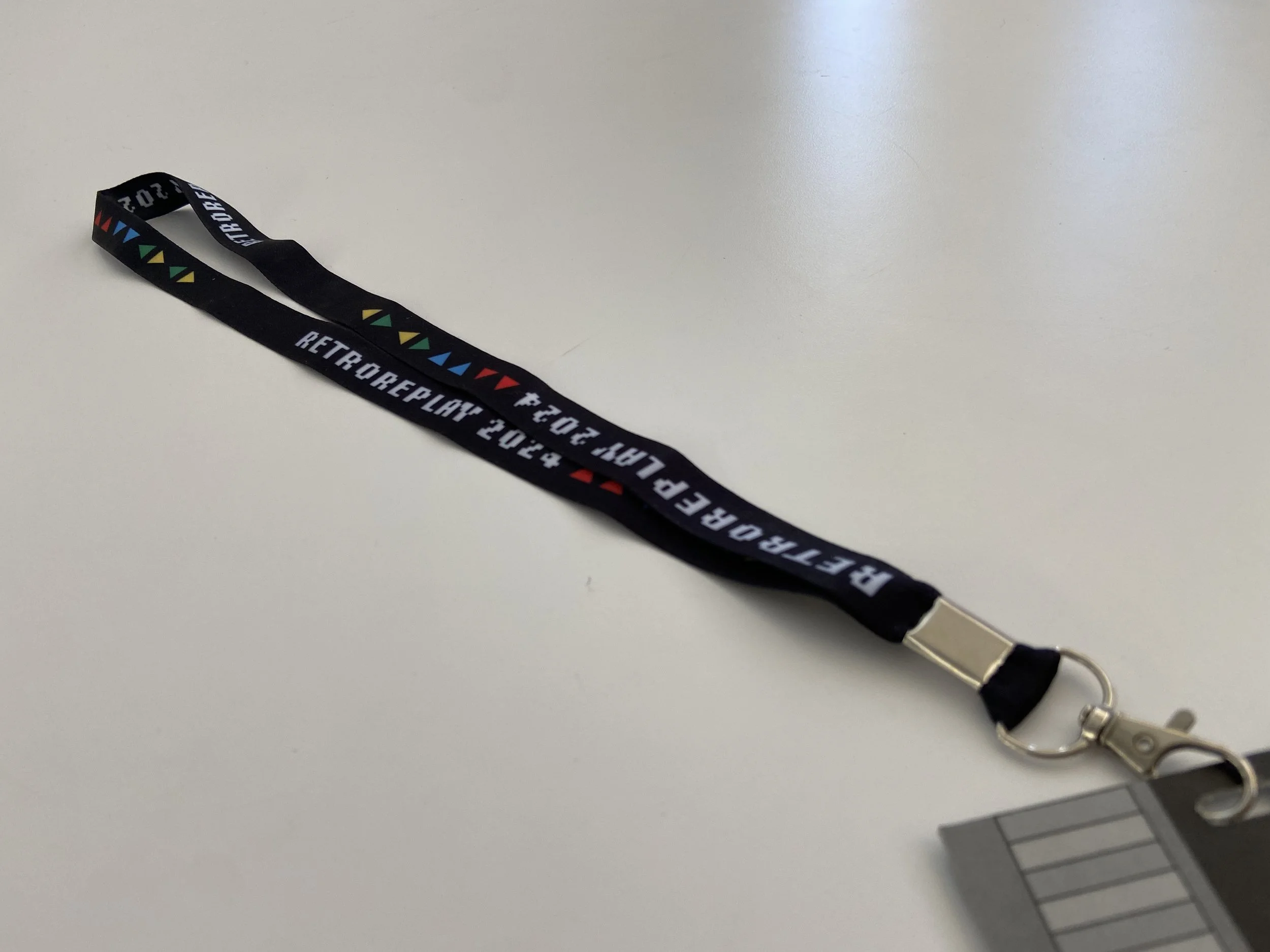
LANDYARD DESIGN
CONVENTION GUIDE BOOK DESIGN
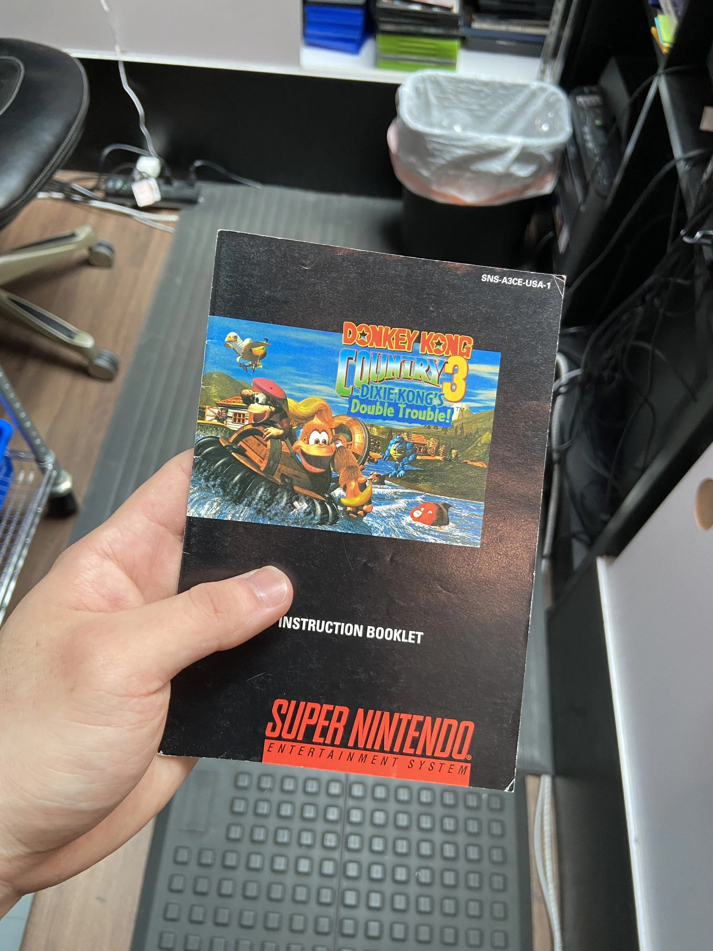
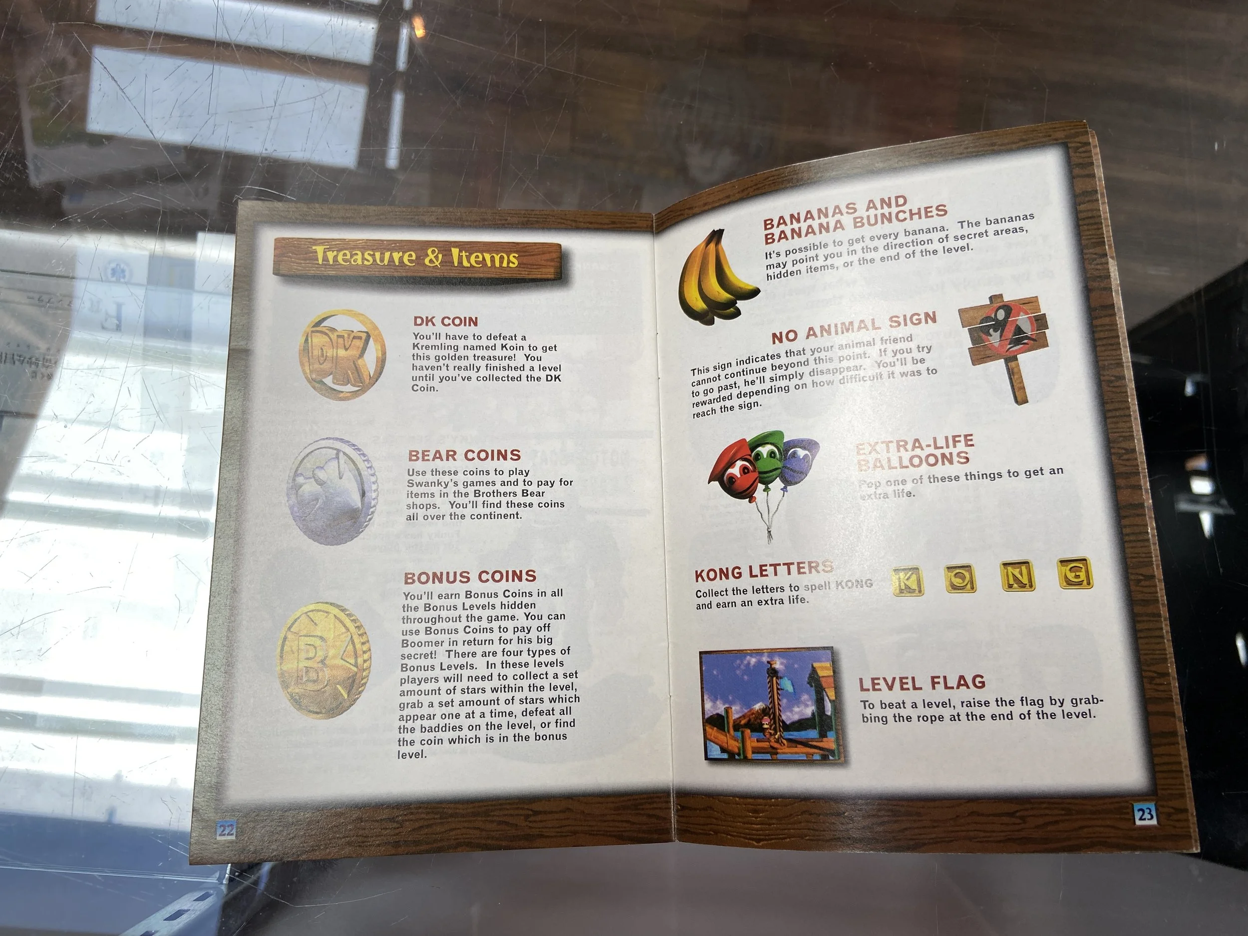
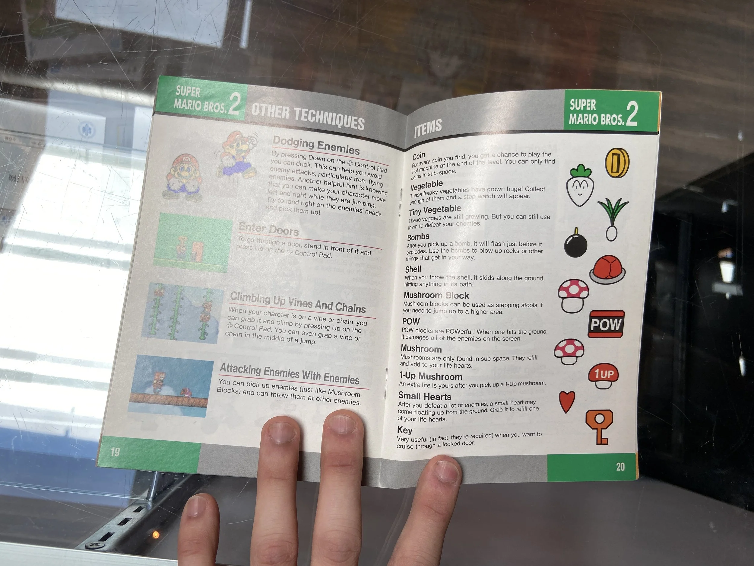
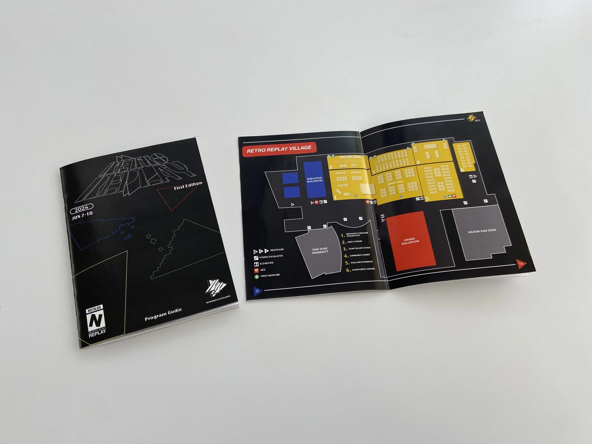
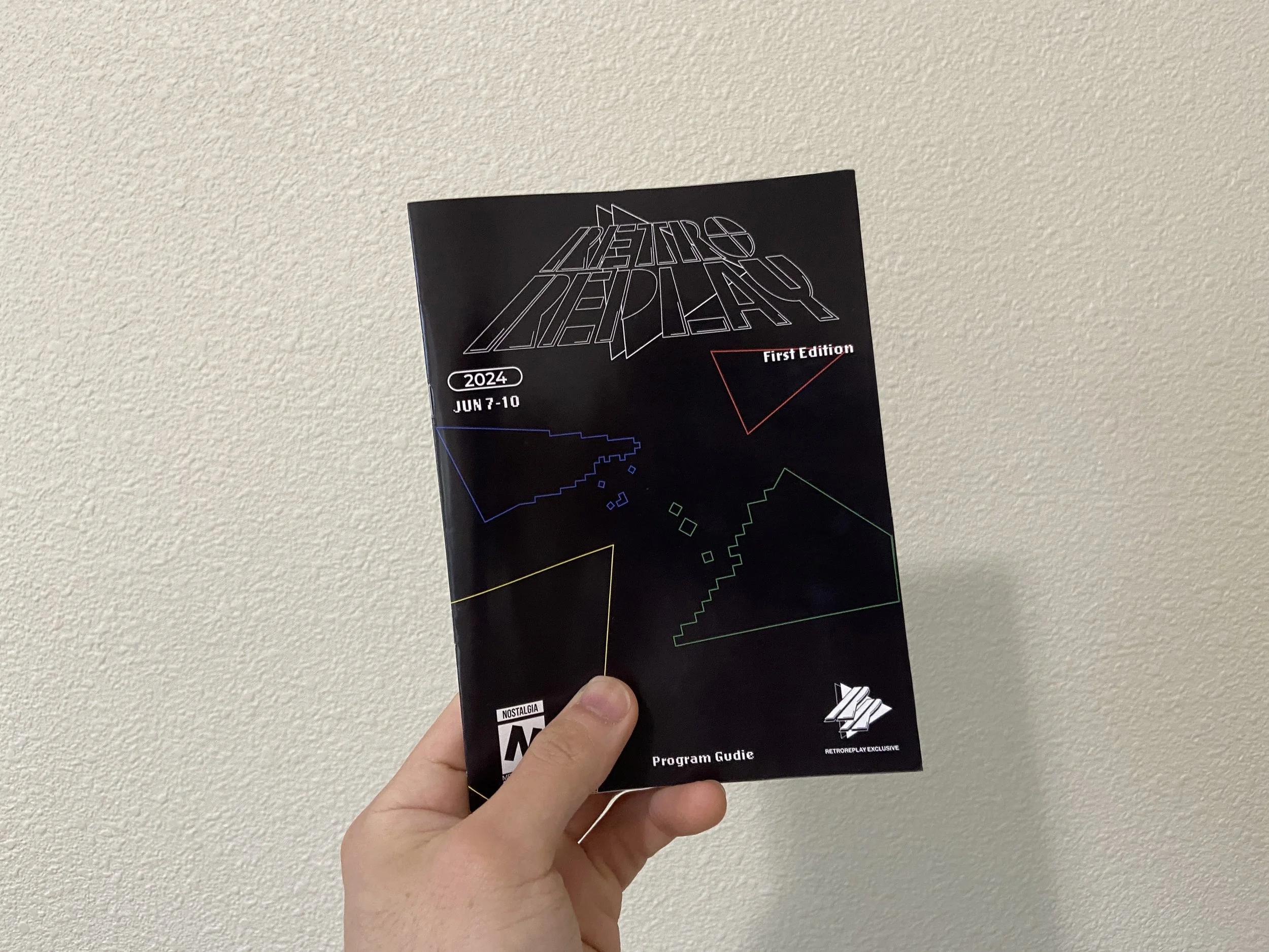
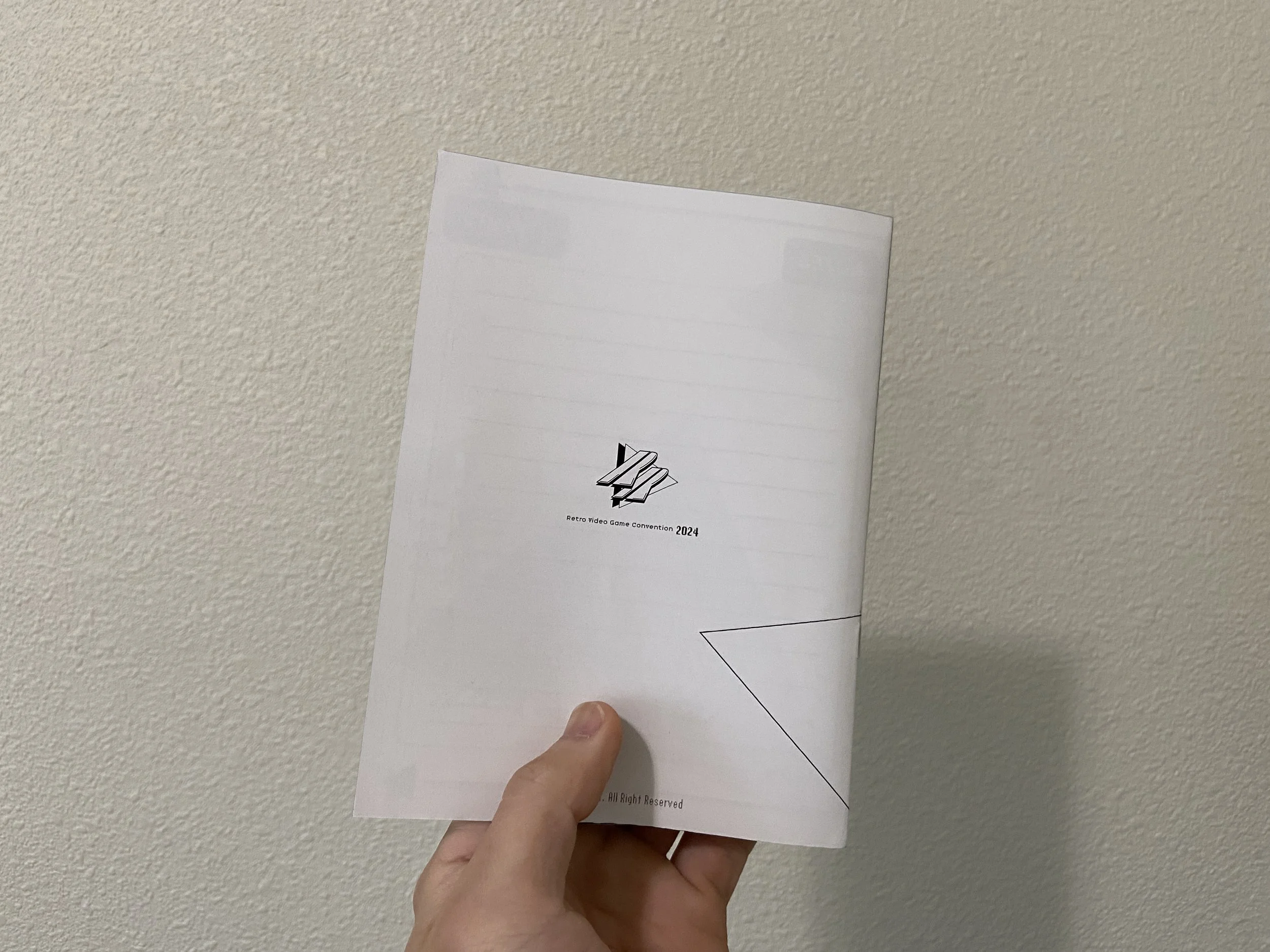
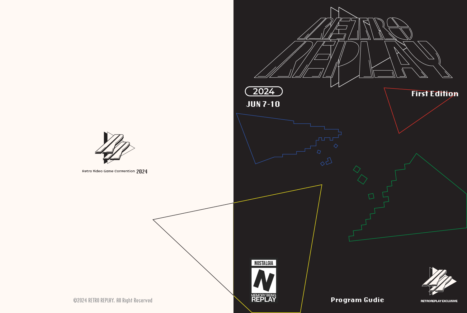
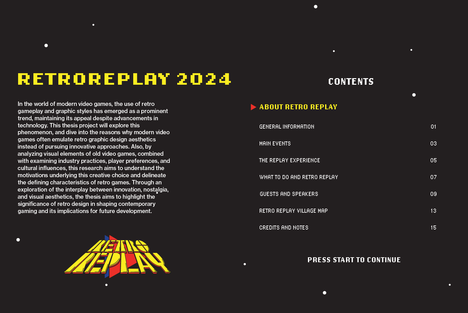
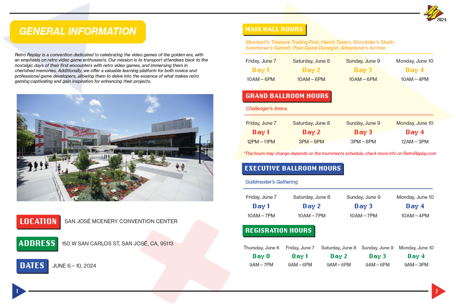
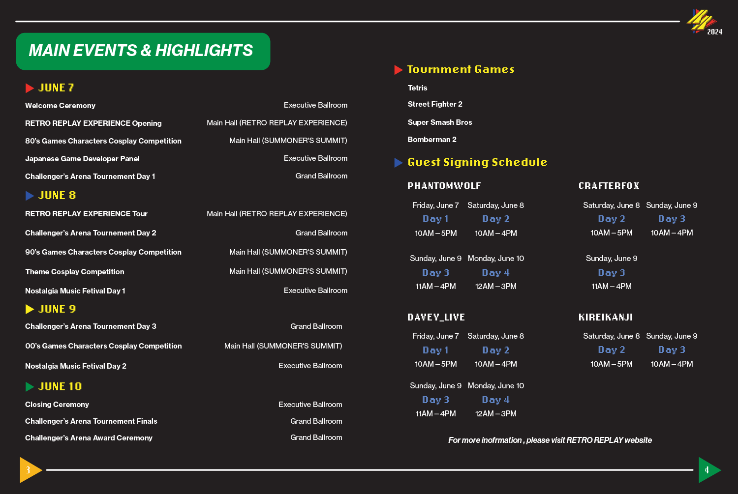
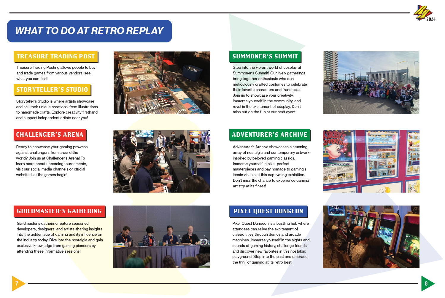
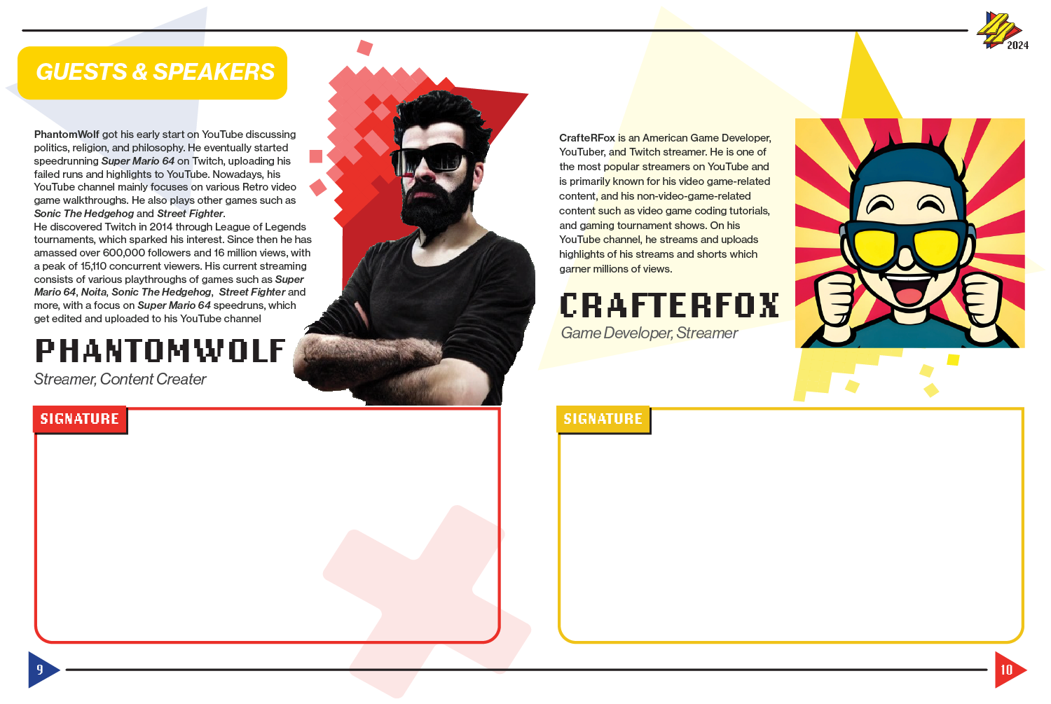
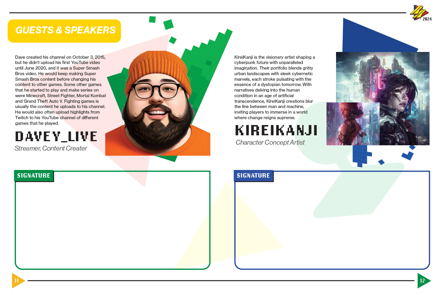
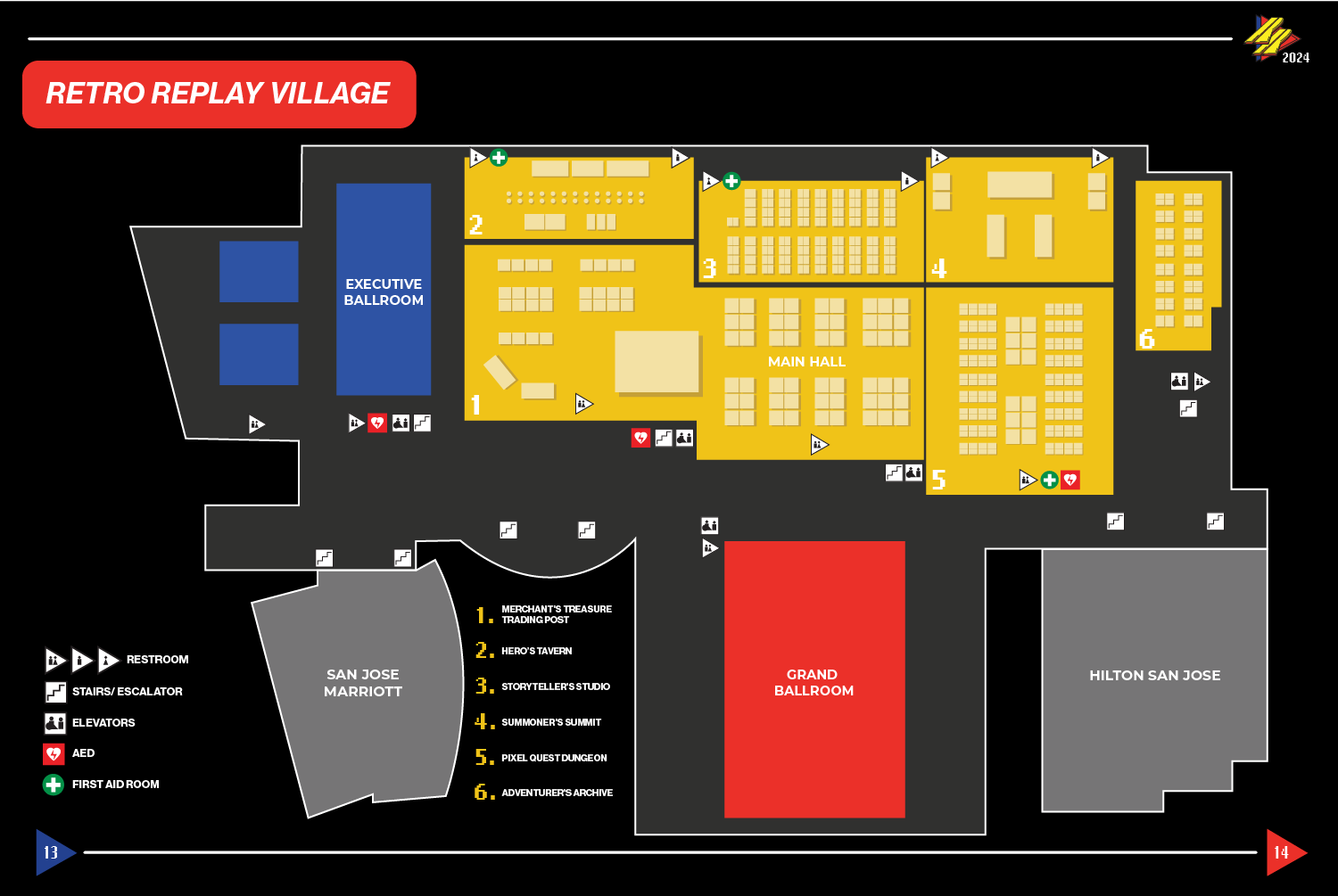
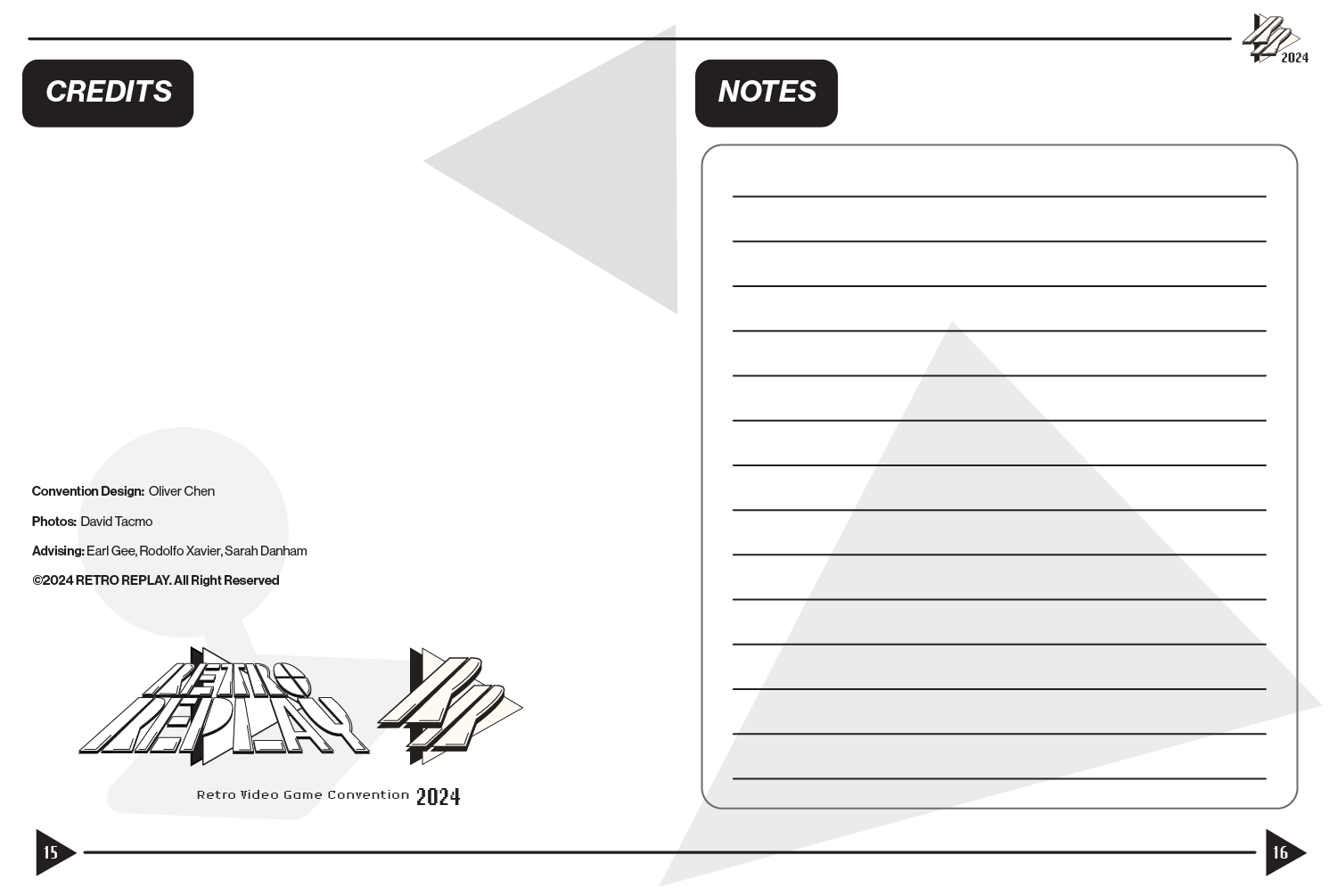
When designing the guidebook for the convention, I think about the importance of game manuals in the video game world. Nowadays, games are usually digital, meaning that this type of media and design becomes digital as well, sometimes implemented in the game. In a retro video game world, a manual is crucial for players to understand the instructions and details that the developers put inside the game. It is a perfect fit to design the guidebook like a game manual, which makes the whole convention into a game.
FINAL DESIGN
RESEARCH FINDINGS
The property of the old video game manual is that it usually feels soft and thin indicating that these are mass-produced and supposed to feel less expensive. The paper material is usually glossy to enhance the variety of colors that were used in these manuals. The size of these manuals could depend on the containers that the company uses, but most of them are a little bit bigger than the palm of a hand for easier reading.
CONVENTION GOODS BOX DESIGN
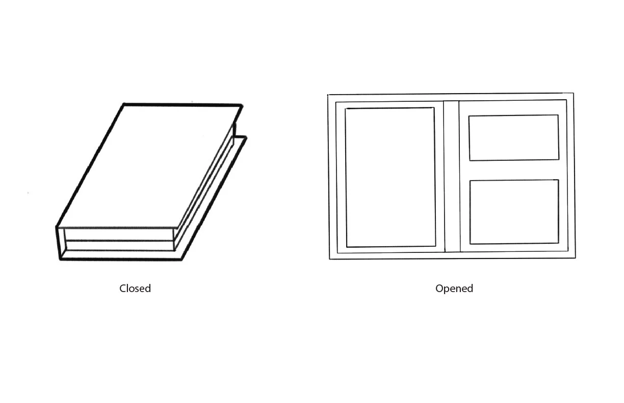
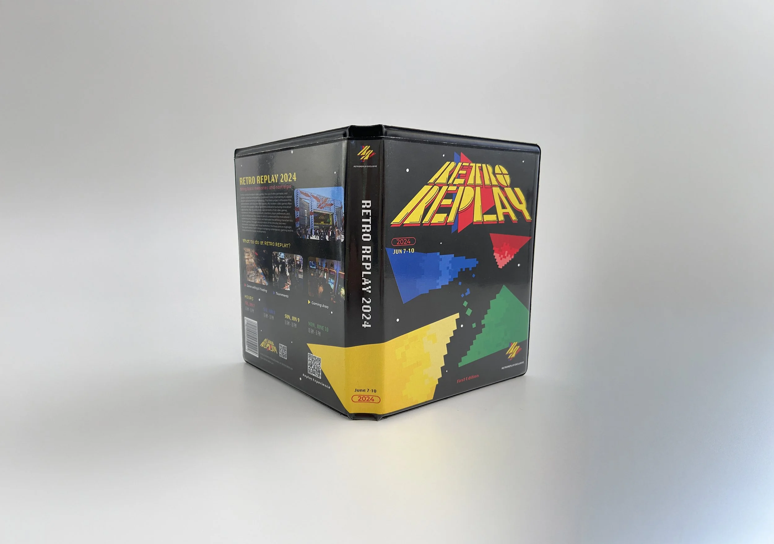
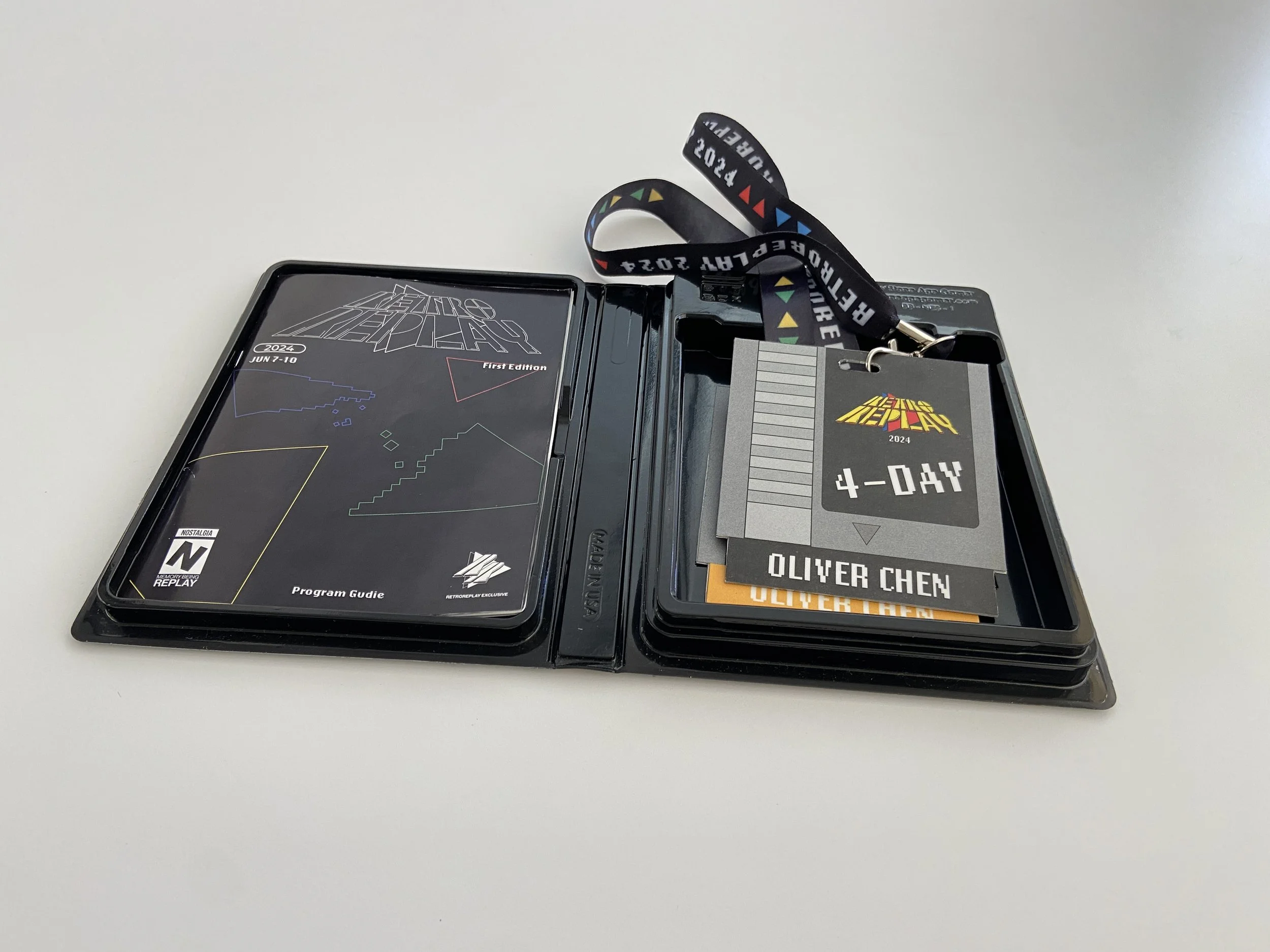
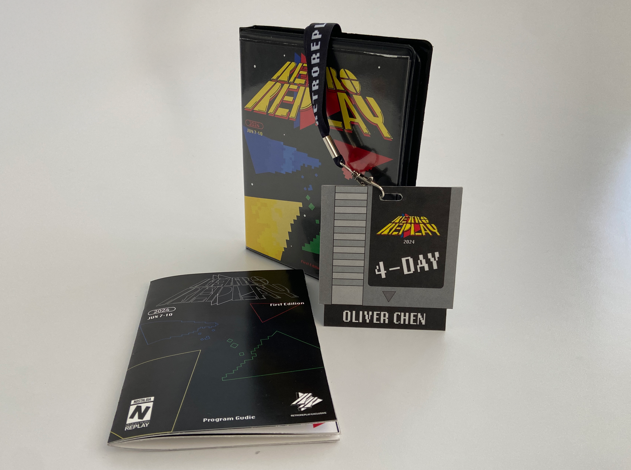
Drawn from my own experience attending expos and conventions, I noticed the moment of arrival often felt transactional. The gift box concept reintroduces ritual: like the back-of-box copy on a game you've been waiting for, it sets the stage before the experience starts. Contents include a personalized badge, convention guidebook, and lanyard, each piece designed as part of a cohesive unboxing sequence.
FINAL DESIGN
SKETCHES
THE REPLAY EXPERIENCE
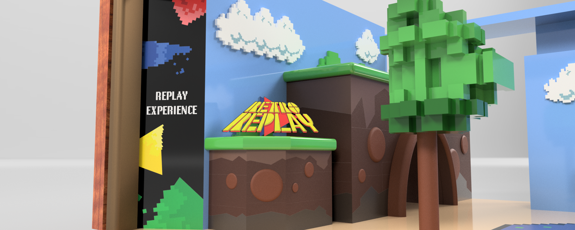
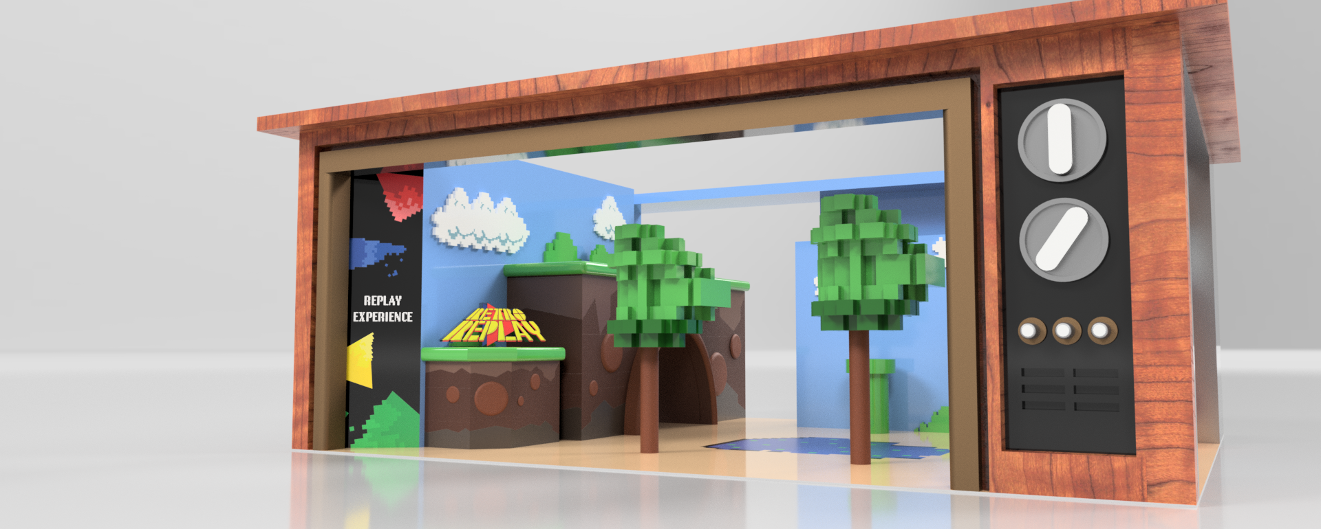
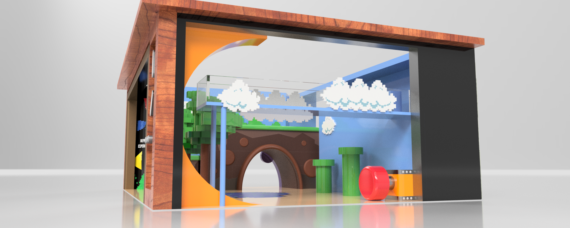
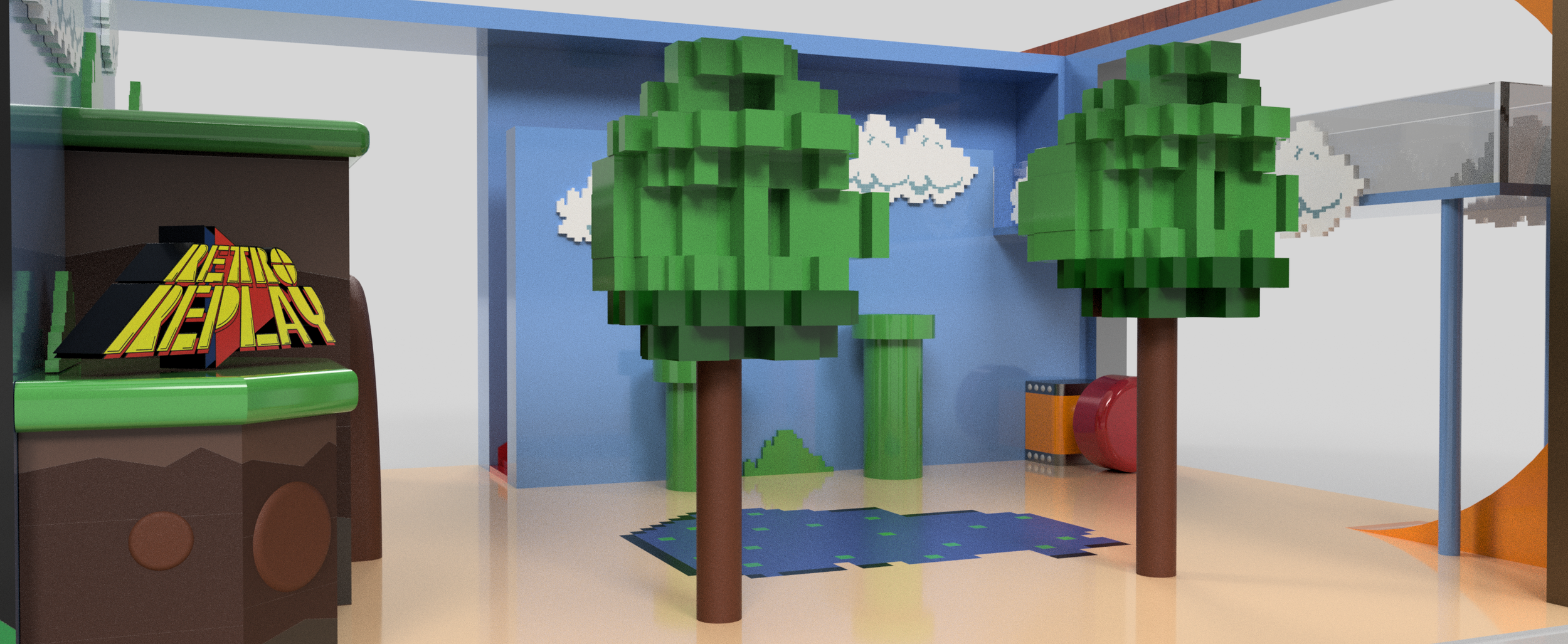
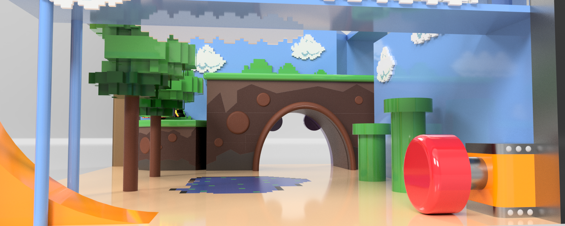
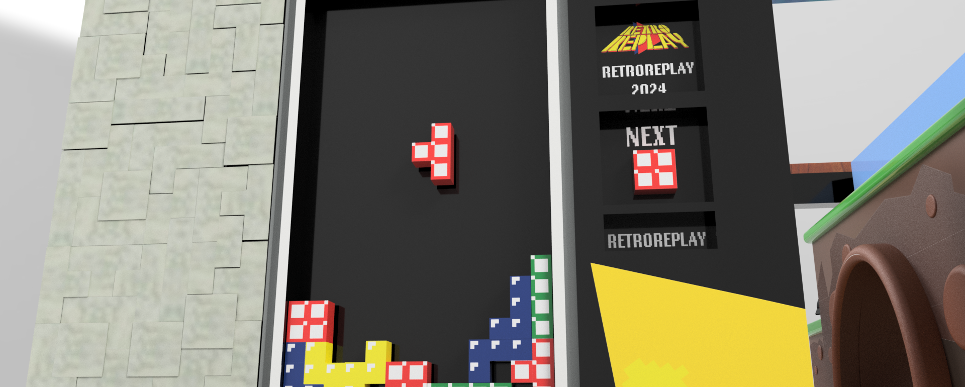
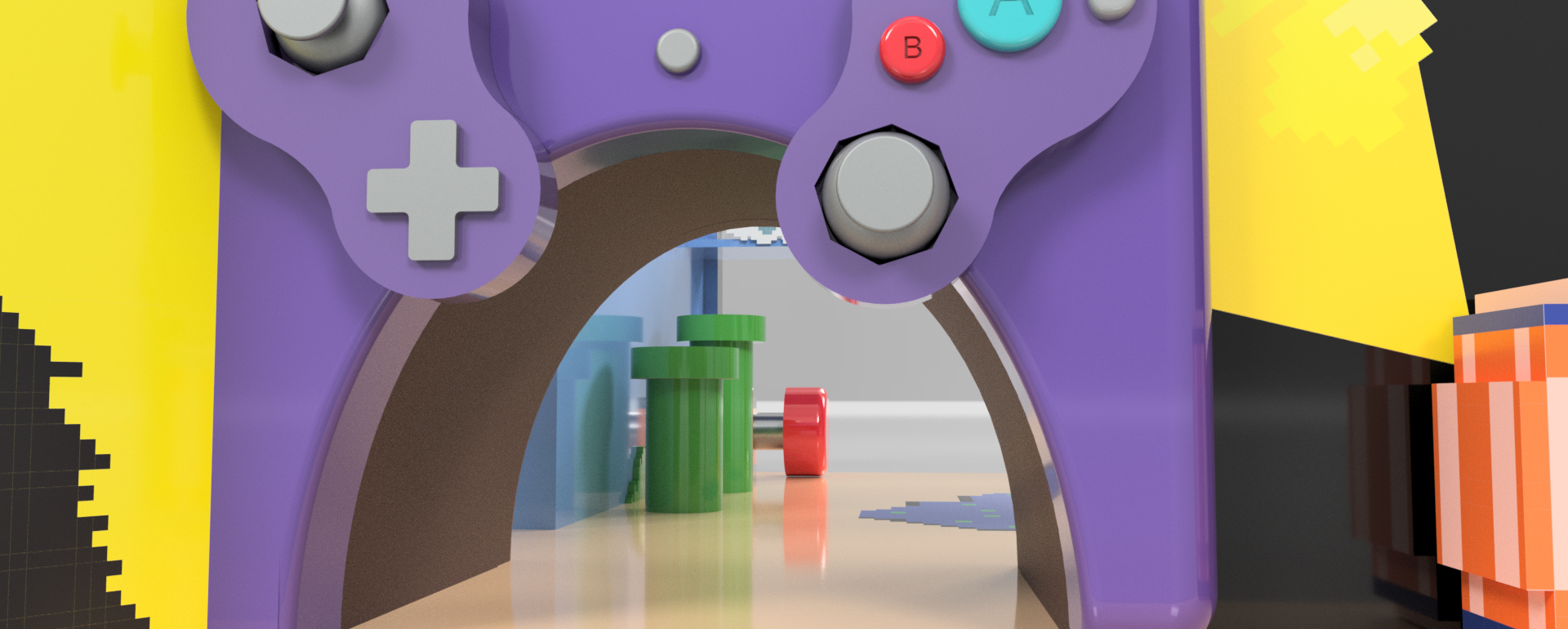
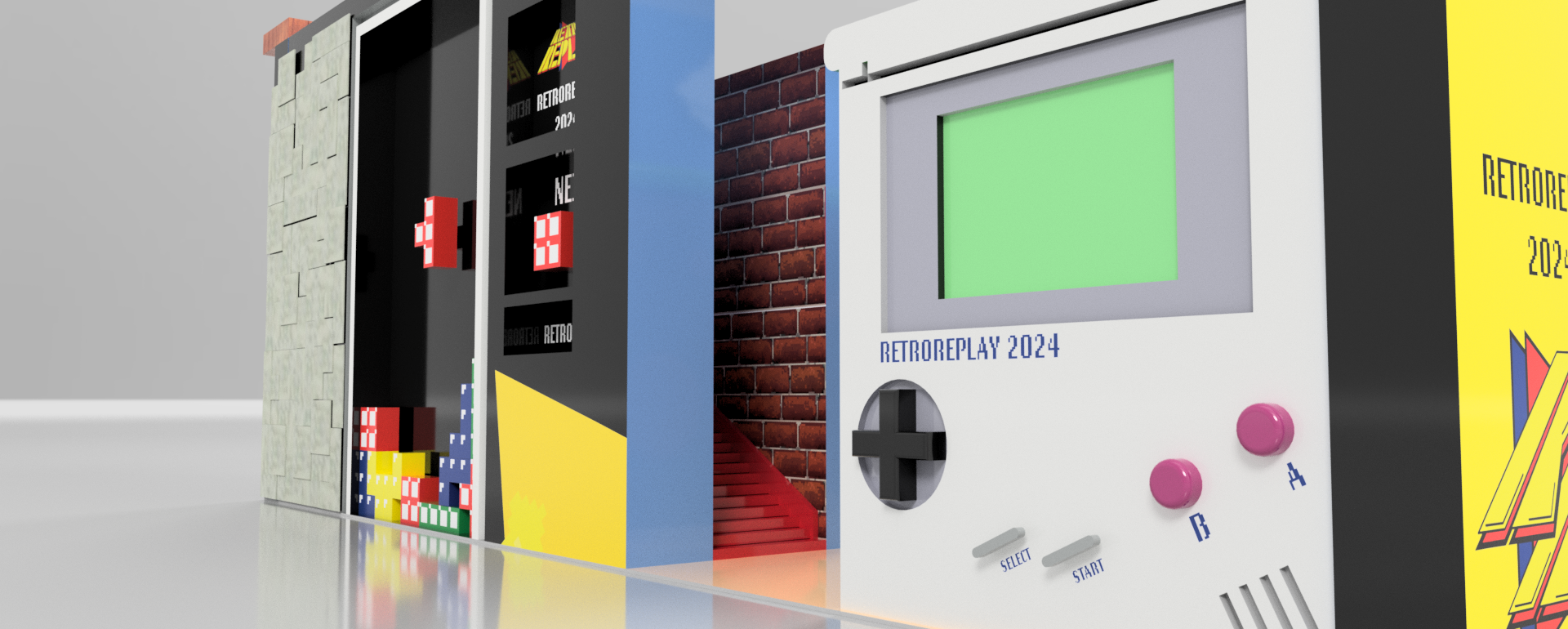
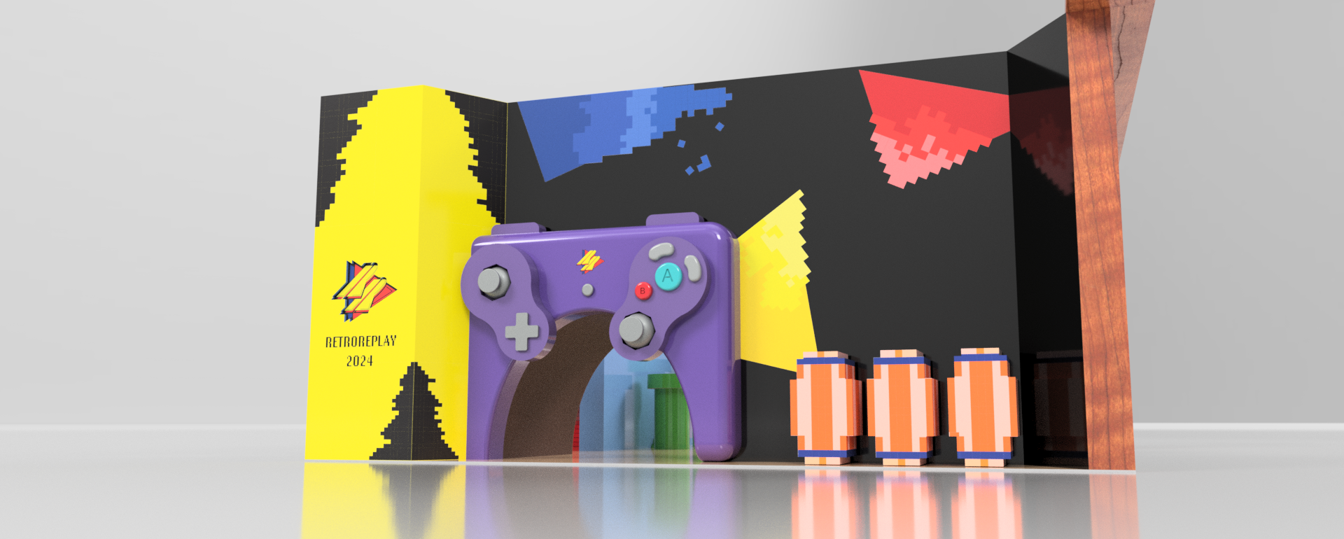
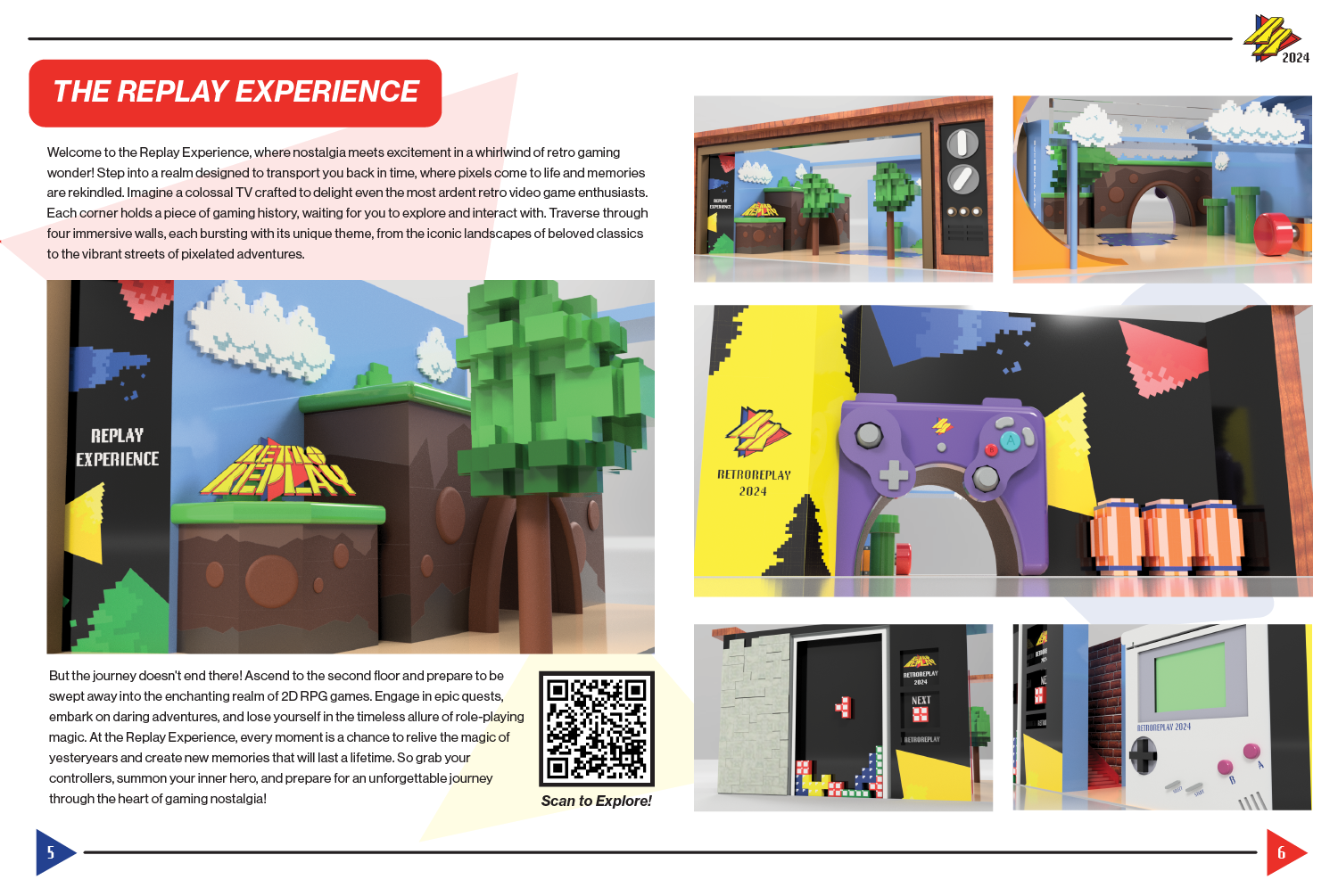
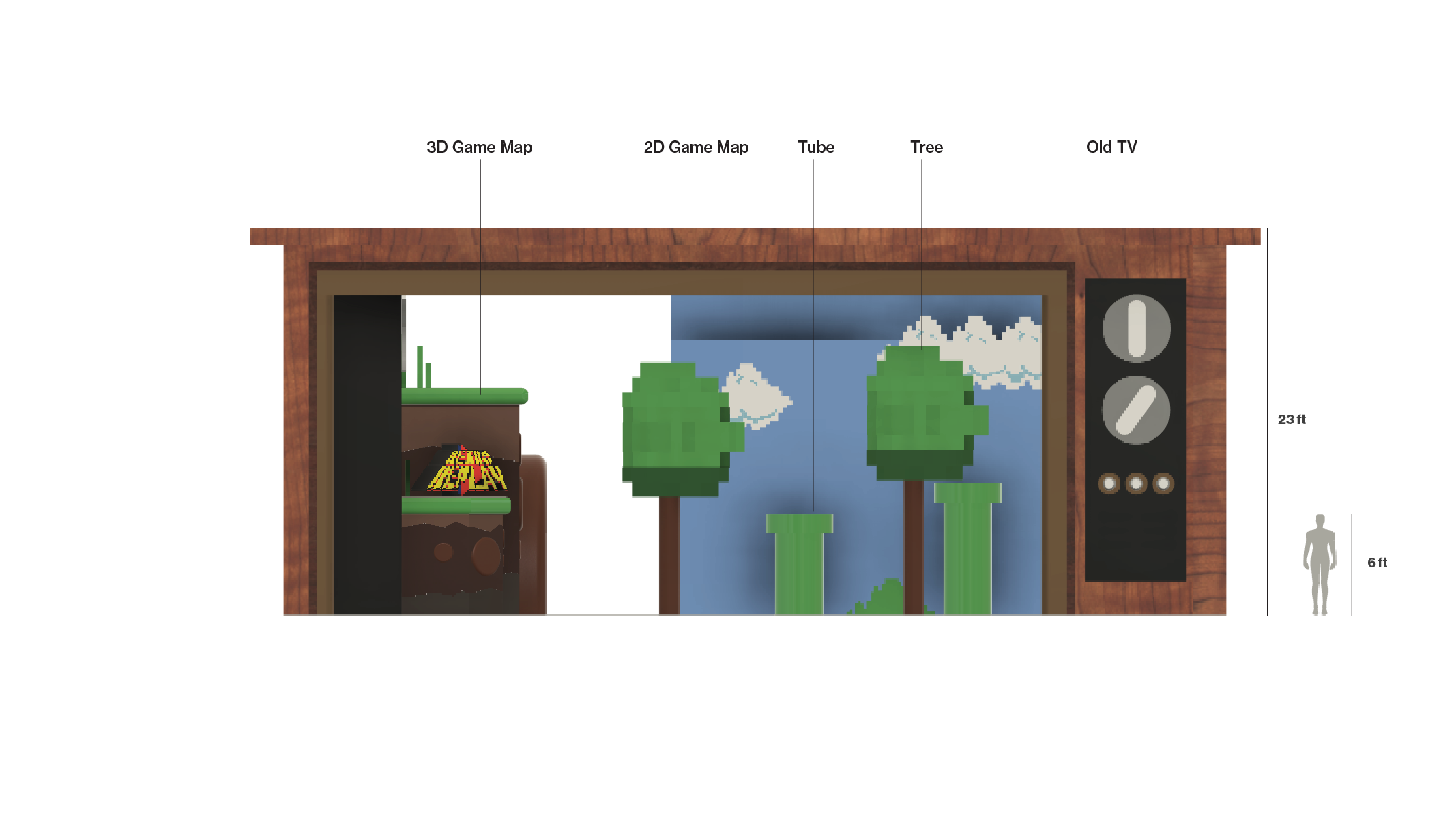
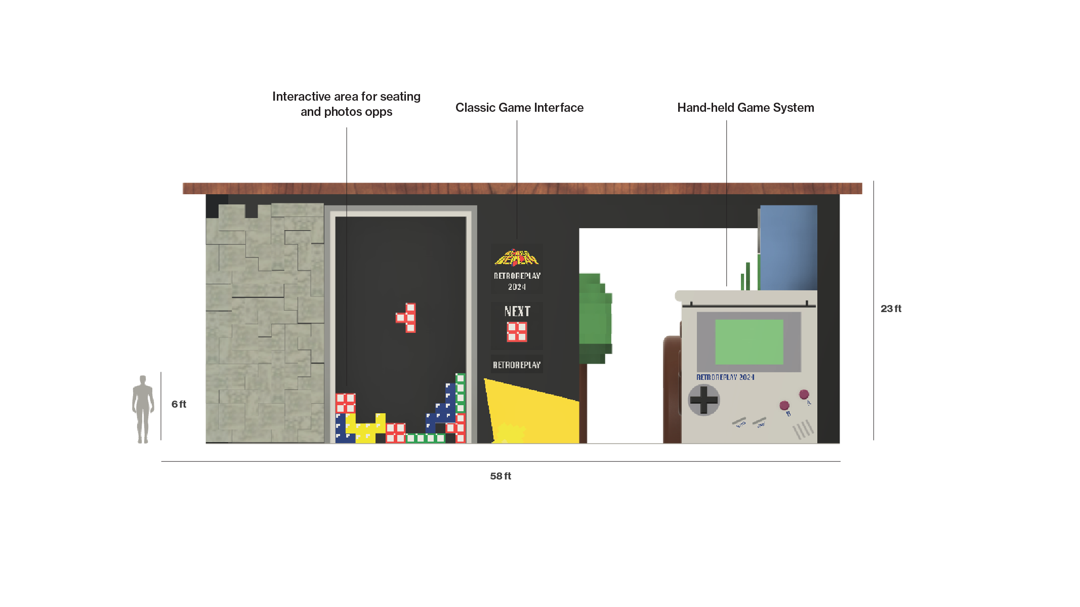
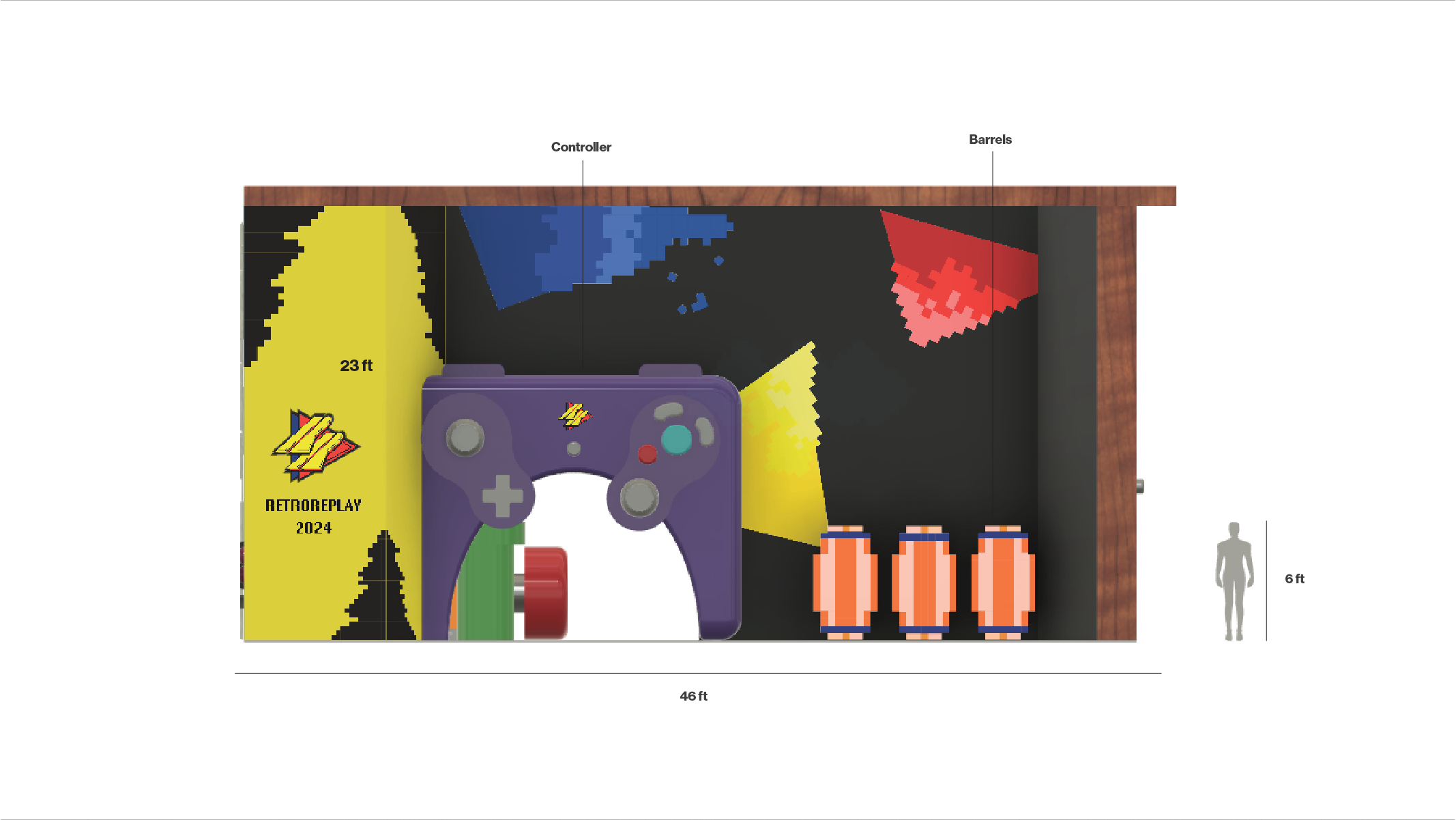
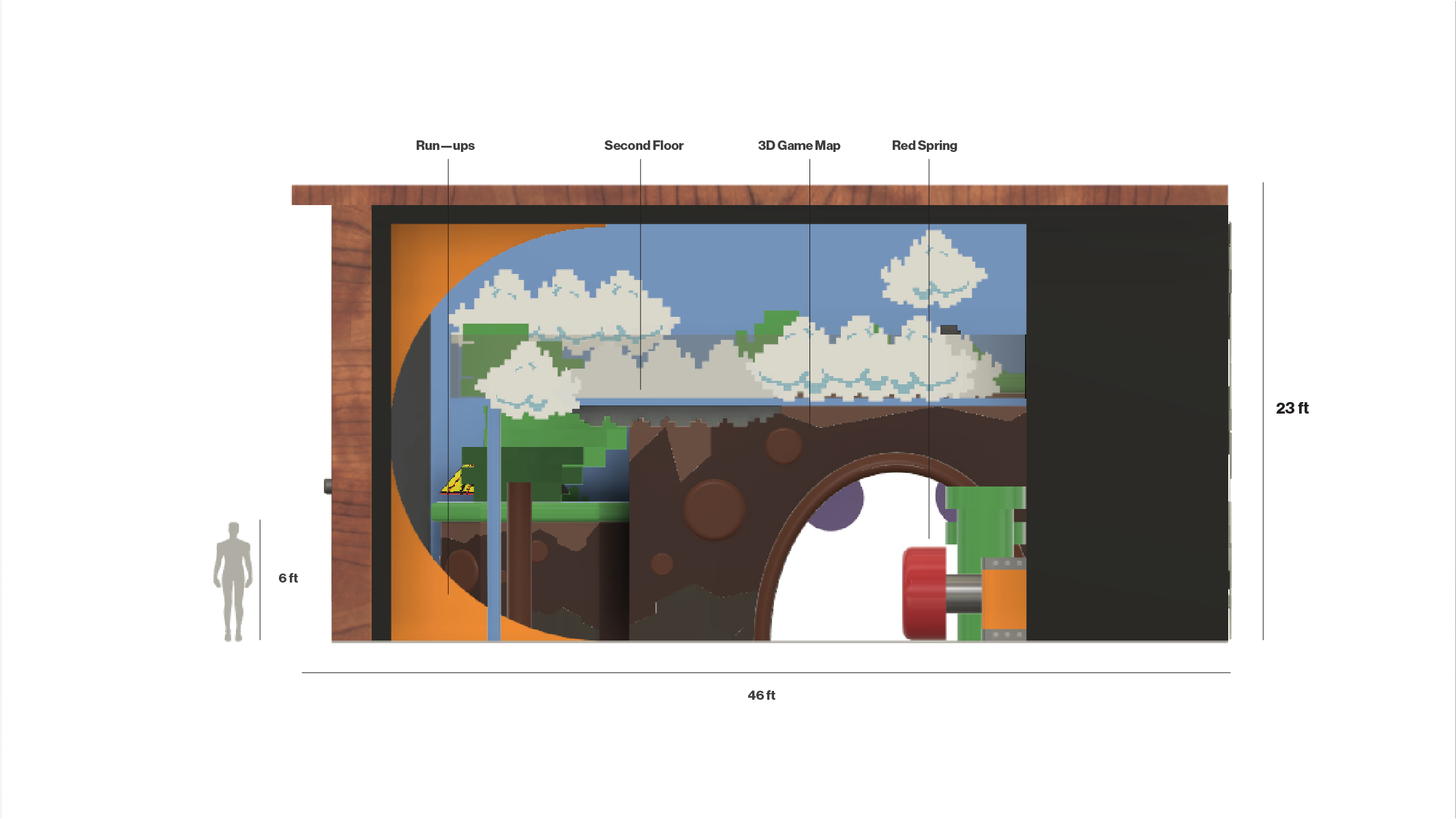
Designed as the convention's anchor moment, the Replay Experience takes the objects of retro gaming: CRT televisions, classic consoles, controllers, iconic game scenes, and blows them up to room scale. The scale inversion is intentional: what once fit in your hands now surrounds you.
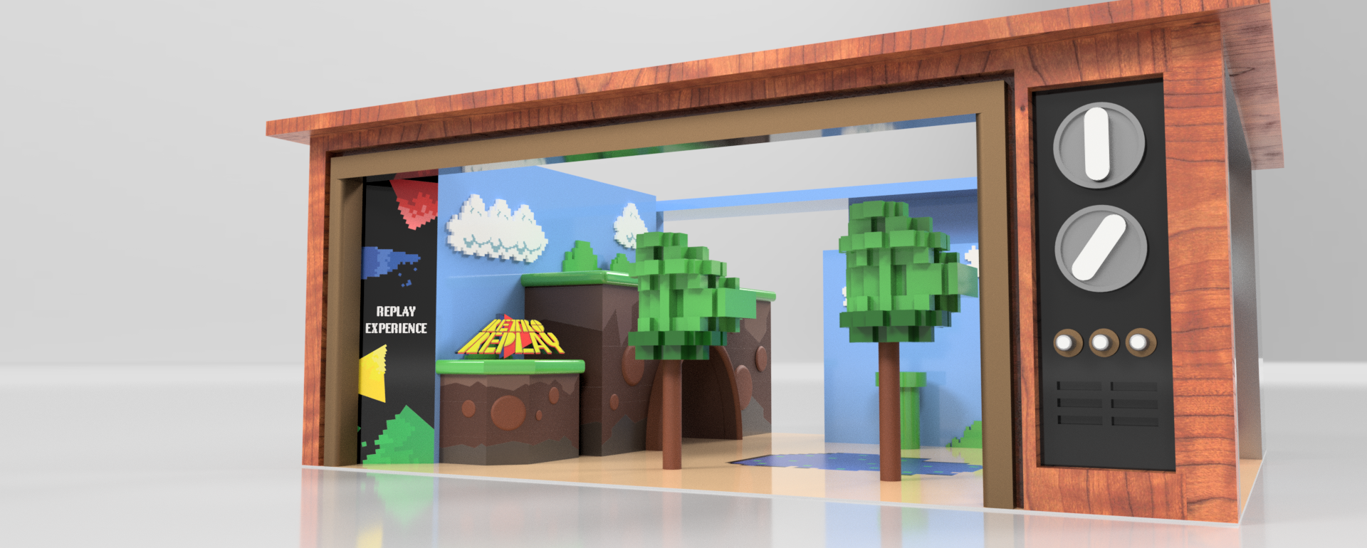
THE REPLAY EXPERIENCE PROTOTYPE
From the front, the installation reads as an oversized CRT — the facade becoming the screen, displaying 2D game scenes in frame. On the left, an elevated stage pulls from the tiered level layouts of retro platformers, giving attendees a platform to inhabit rather than just observe.
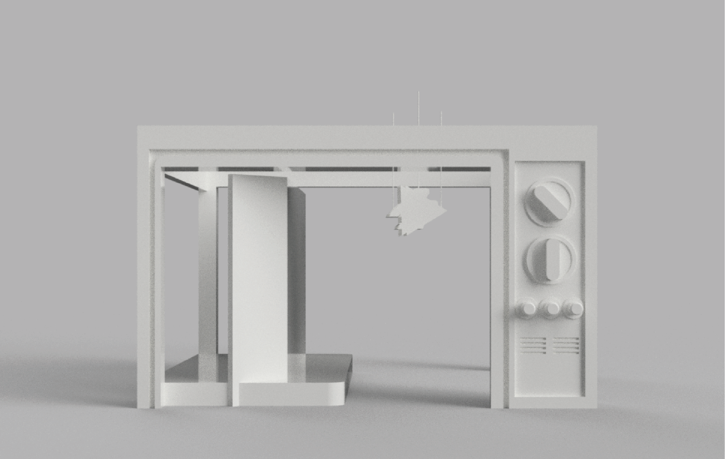
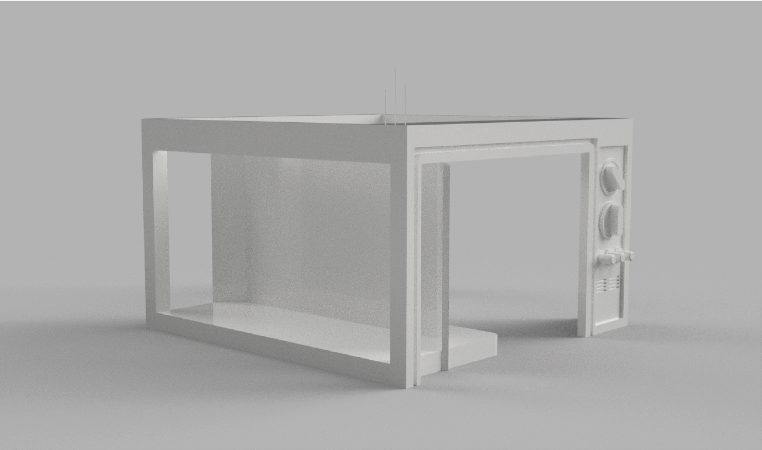
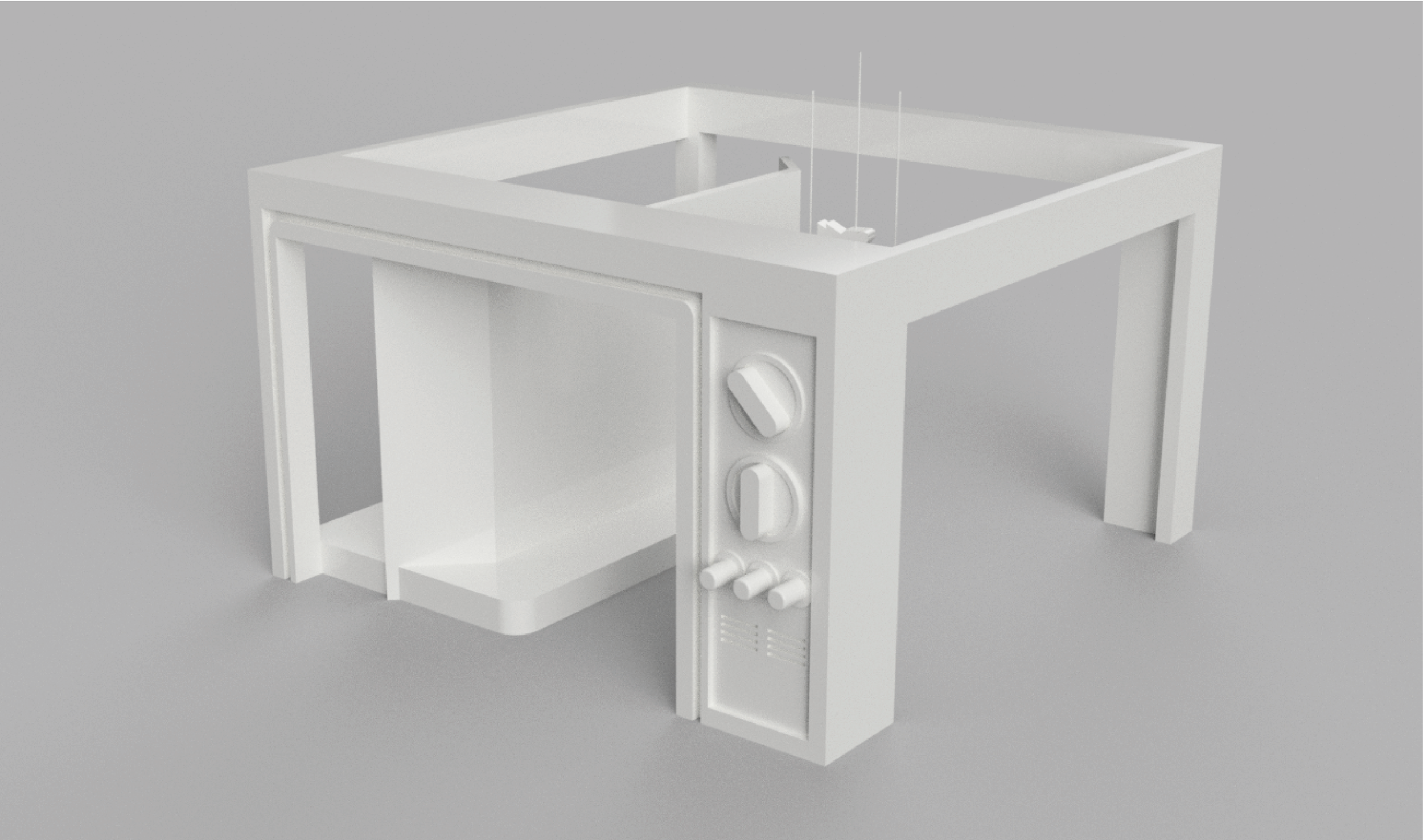
THE REPLAY EXPERIENCE FINAL DESIGN & FLOOR MAP
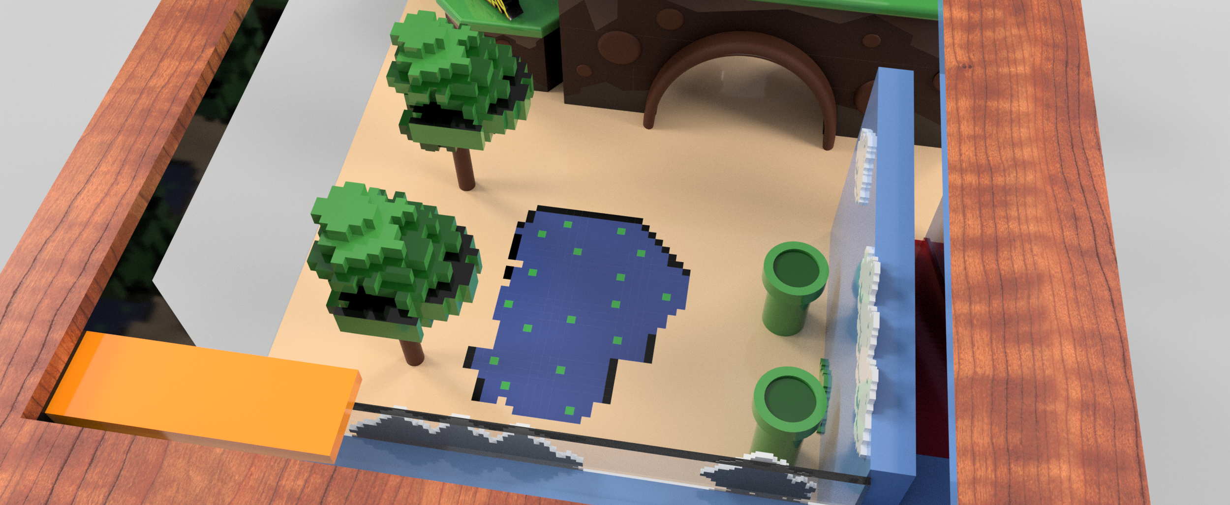
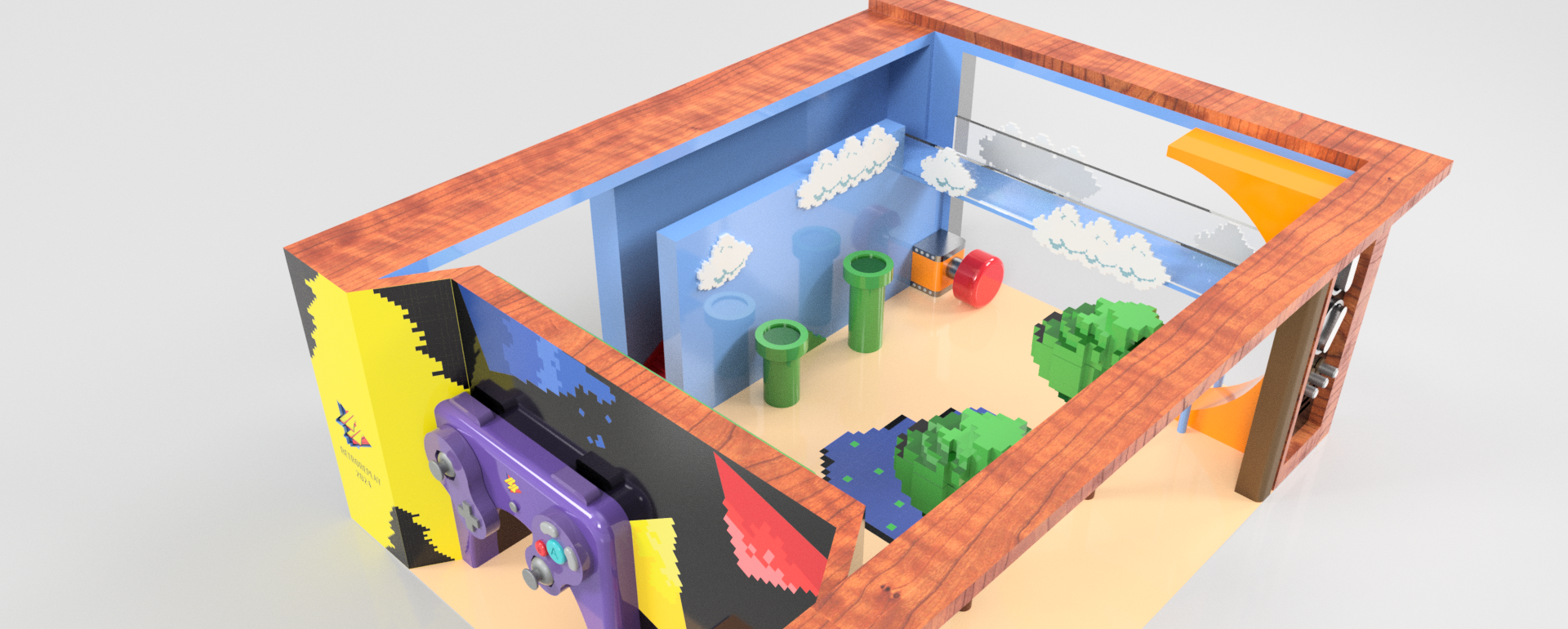
The final iteration added depth in two ways. More game references enriched the surface details, widening the nostalgic range. A second floor was introduced a new perspective entirely by being designed around the bird's-eye-view of classic top-down games, so the installation offers one scene at eye level and another from above.
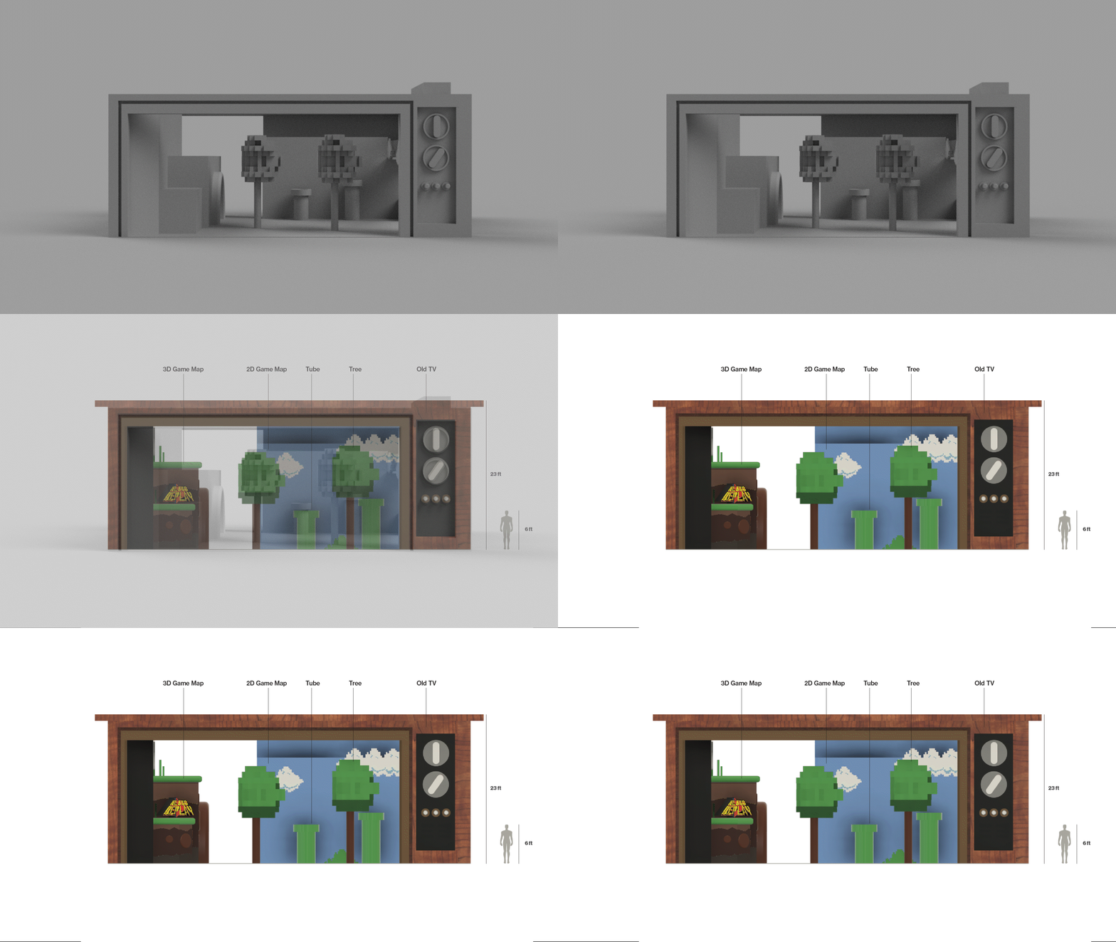
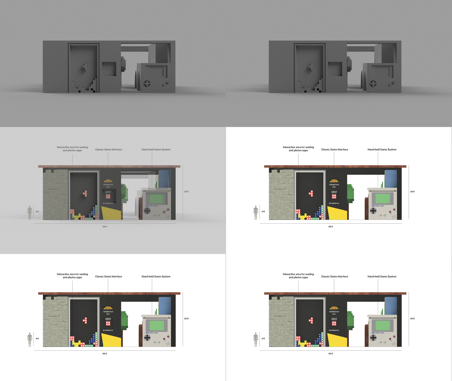
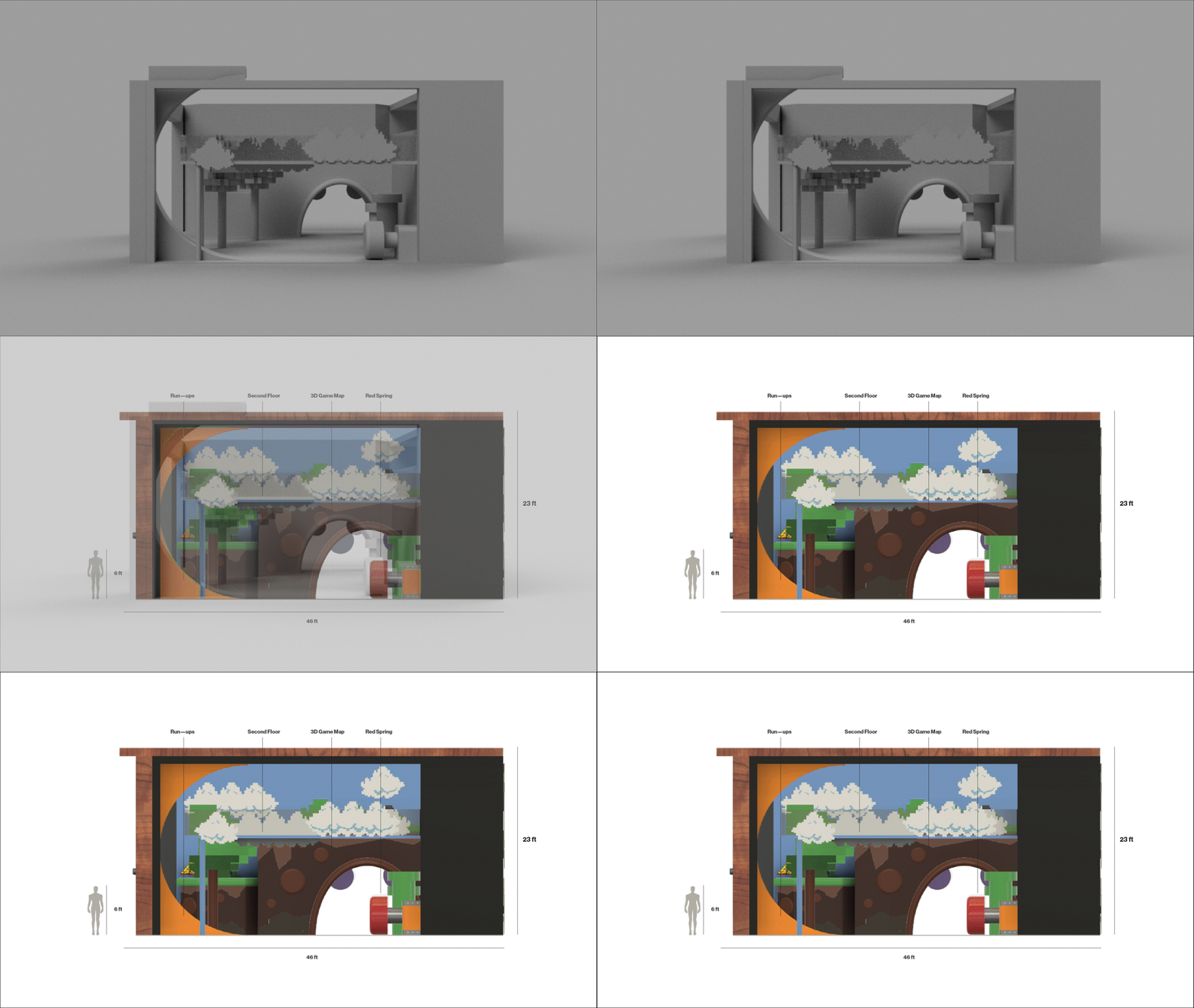
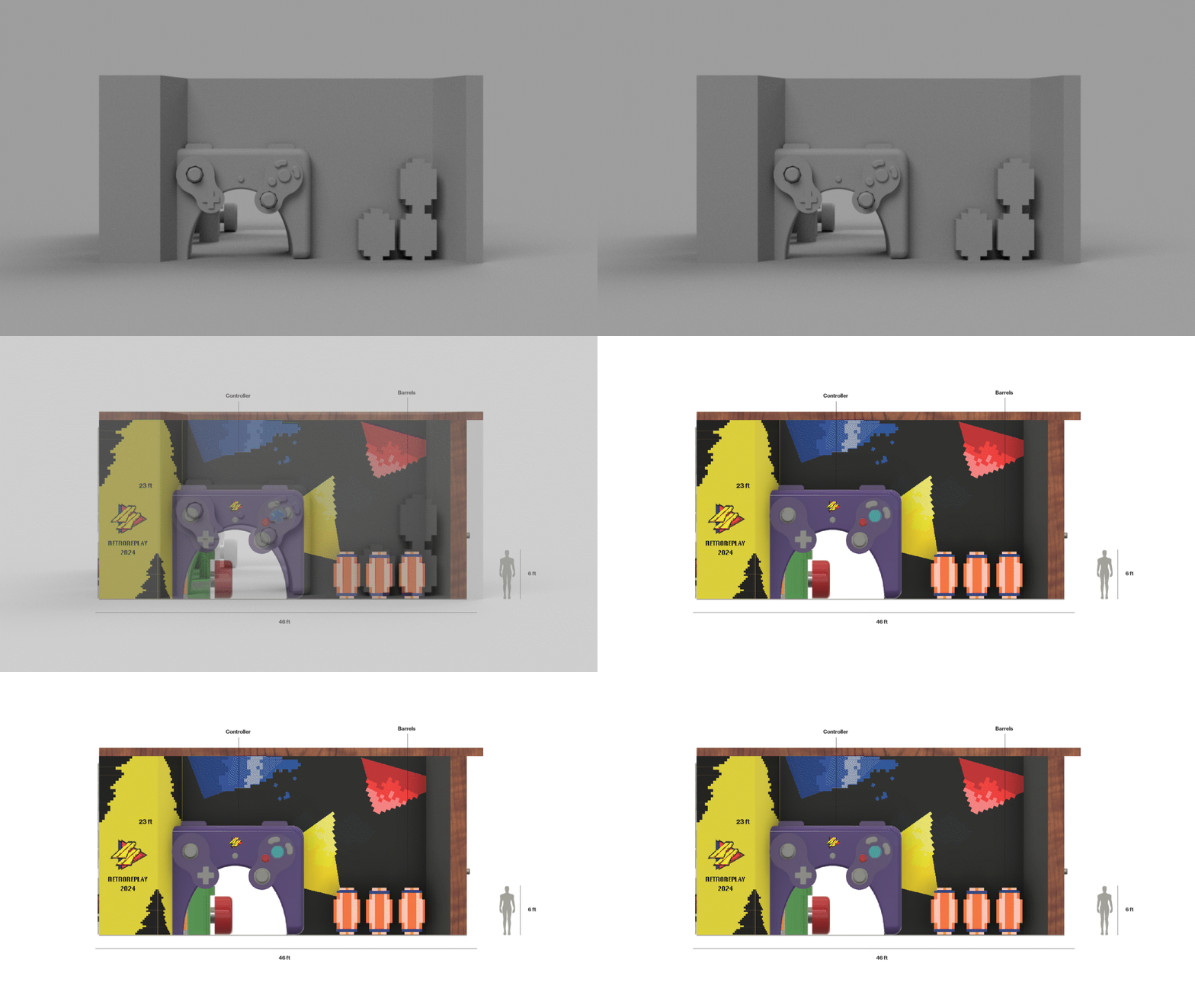
THE REPLAY EXPERIENCE RENDERS