FORMOSA SKEWERS
SJSU BFA PROJECT
SKILLS
3D KIOSK DESIGN
BRAND IDENTITY
PACKAGING DESIGN
TOOLS
ADOBE ILLUSTRATOR, AUTODESK FUSION 360
Formosa Skewer is a kiosk concept designed for Taiwanese international students at SJSU — a way to access the street food of home on campus. The idea extends beyond the meal: a shared table as a reason to connect with others from the same community, and an introduction to Taiwanese culture for everyone around them.
The name draws from history. Since the 16th century, Taiwan has been known in the West as Formosa — derived from the Portuguese Ilha Formosa, meaning "Beautiful Isle," first recorded in the logs of a Portuguese ship that sailed past the island in 1542.
BRAND DESIGN
IDEAS AND SKETCHES
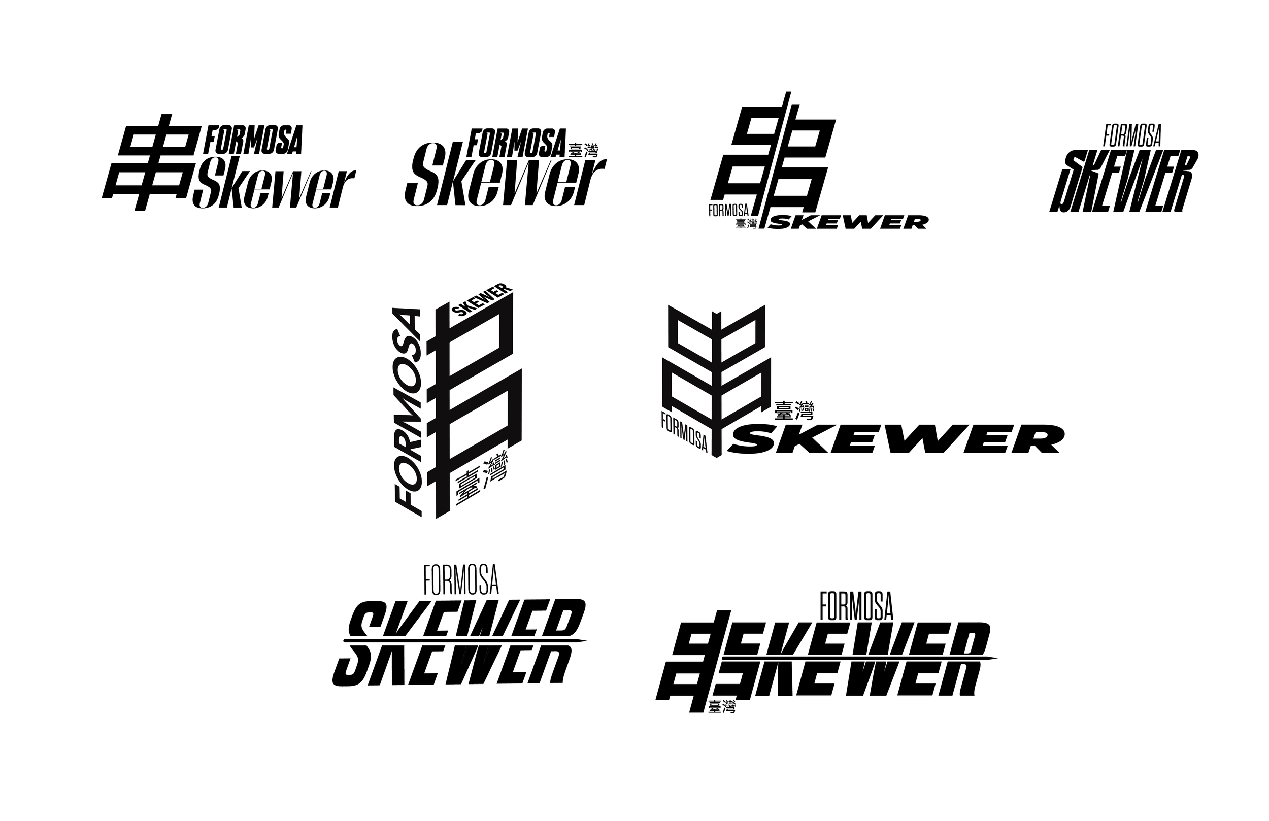
The logo process began with exploring how skewers and letterforms could combine: testing English text, Chinese characters, dimensional shifts, and negative space between the two scripts.


Yellow was the clearest choice for Formosa Skewers. It's environmentally accurate: warm bulbs and fluorescent lighting dominate Taiwanese night market stalls. It's appetite-stimulating, which is why food brands have leaned on it for decades. It evokes heat and open-flame char, tying directly to the cooking process. And in a busy campus kiosk, it's the most visible color on the spectrum, cutting through noise before customers even read the name. Joy and energy were the starting point, but yellow earns its place on every other level too.
BRAND DESIGN FINAL
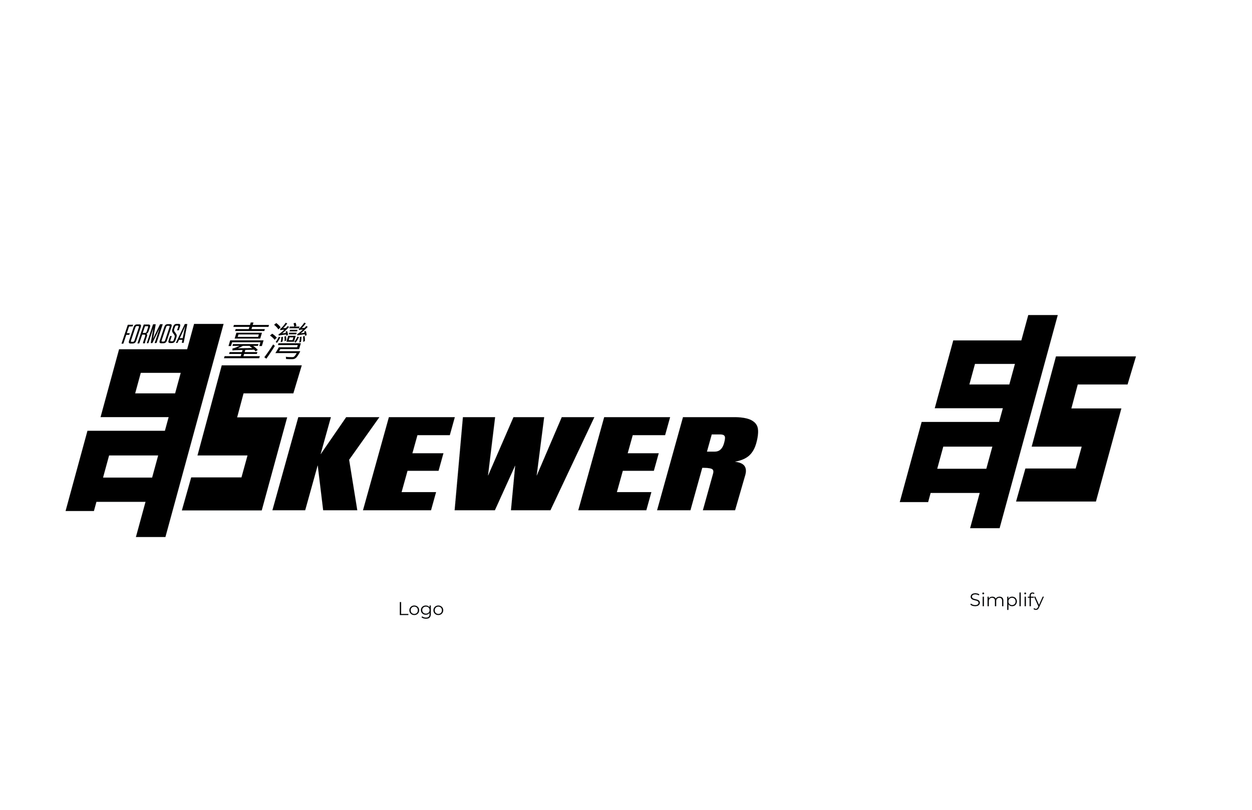
The final mark came from an unexpected structural find: the S, in certain typefaces, mirrors the architecture of 串, the Chinese character for skewer. That overlap became the logo.
KIOSK DESIGN
KIOSK IDEA SKETCH
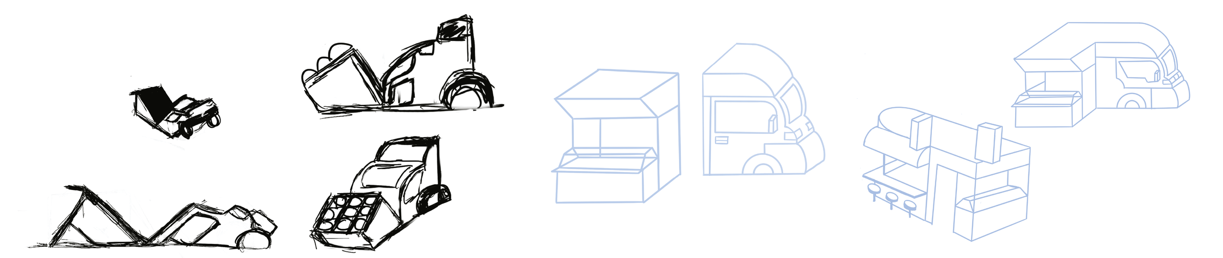
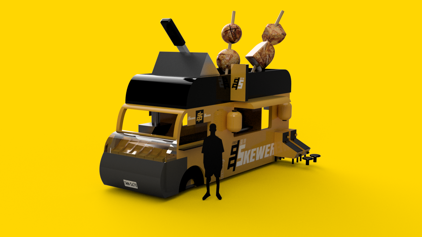
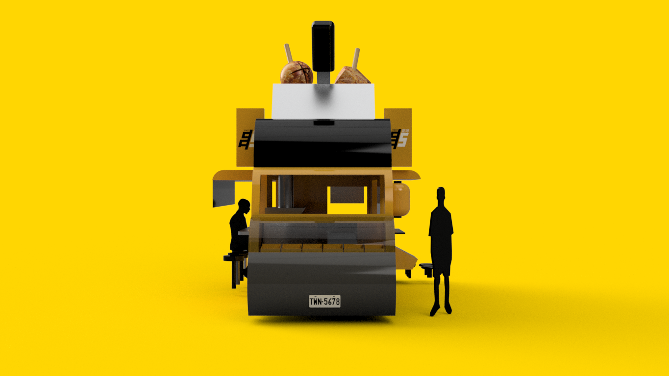
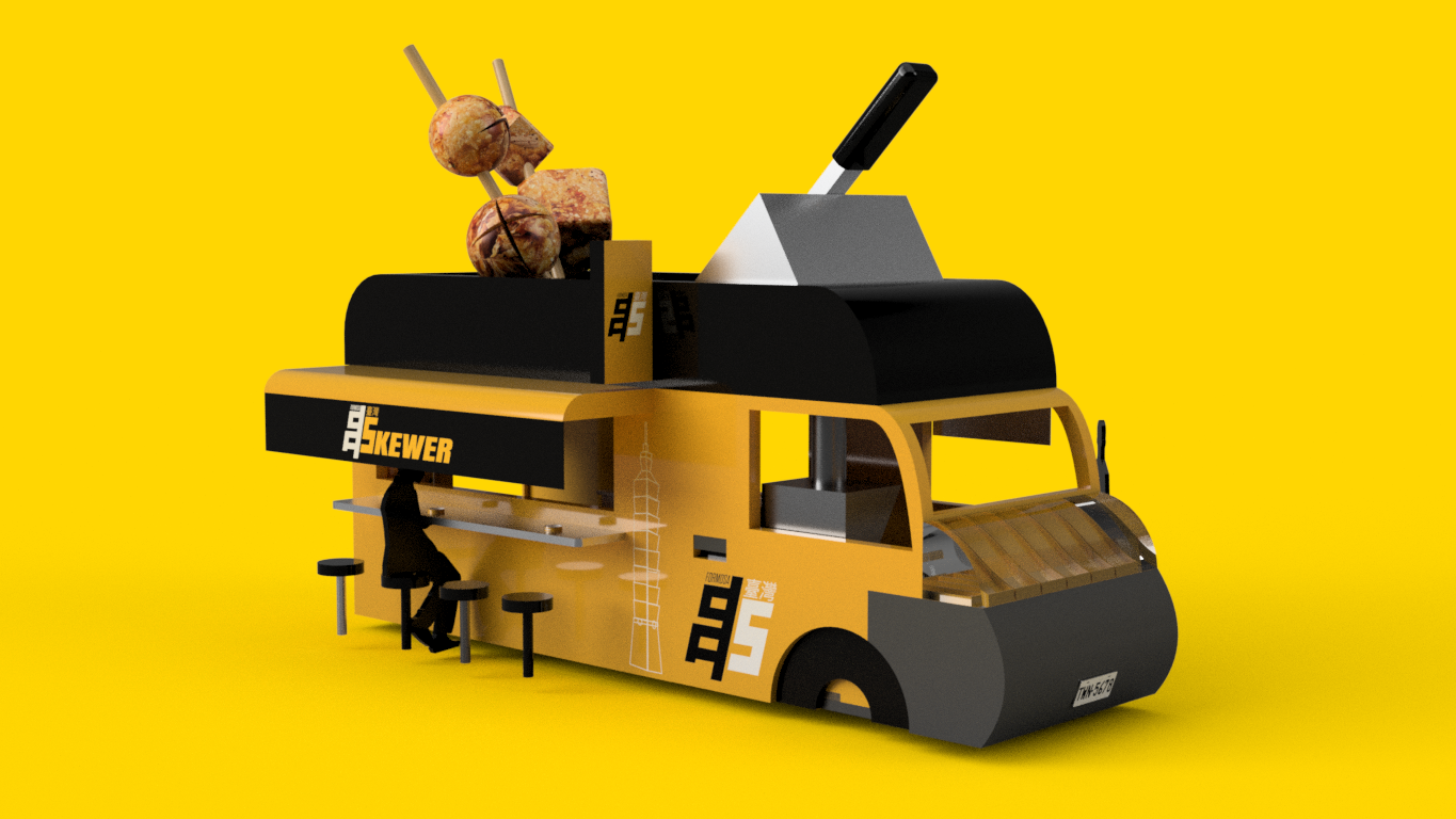
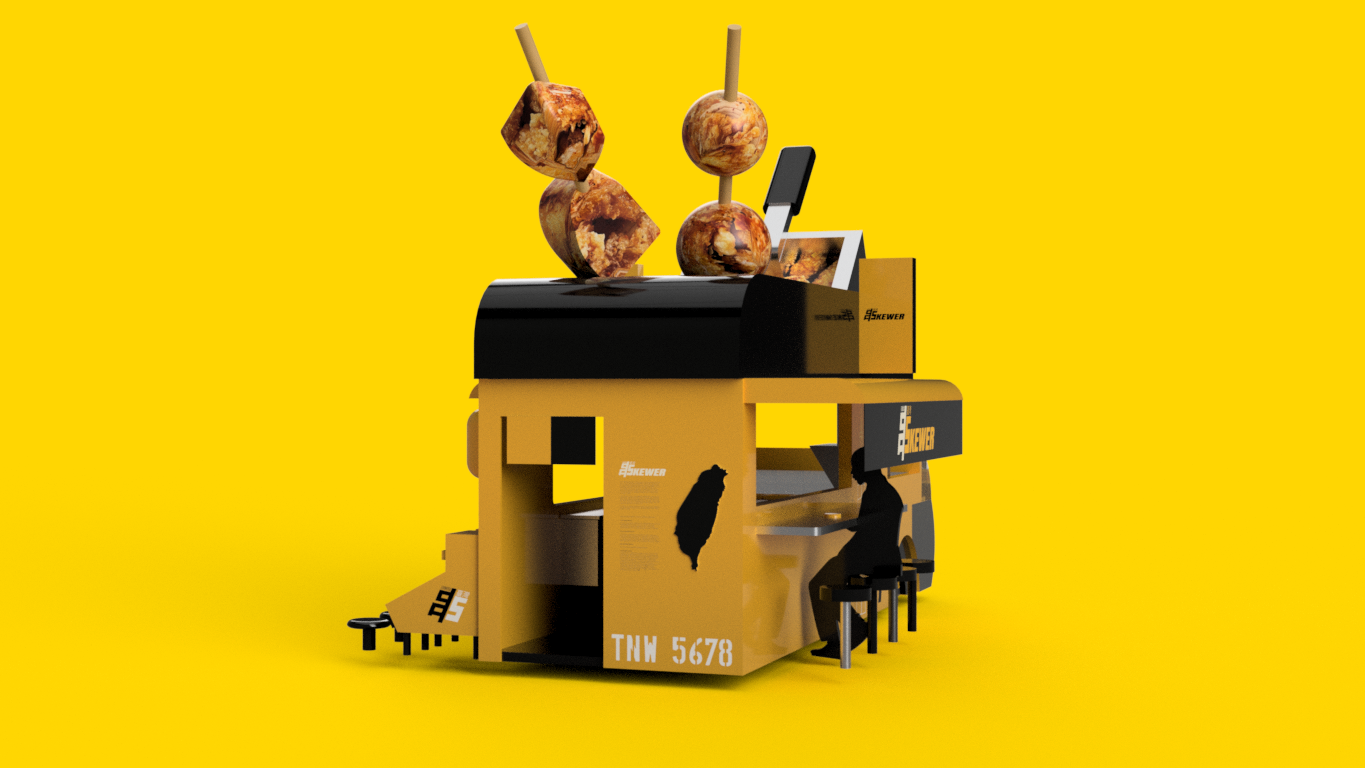
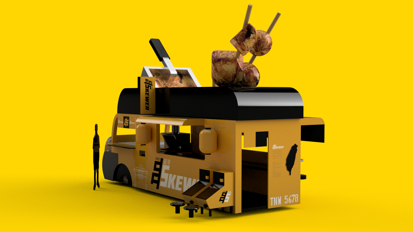
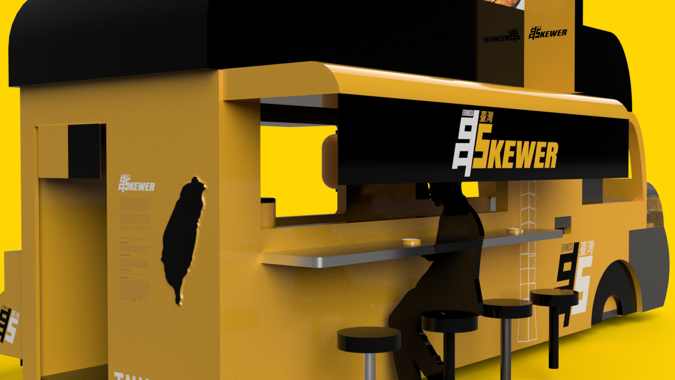
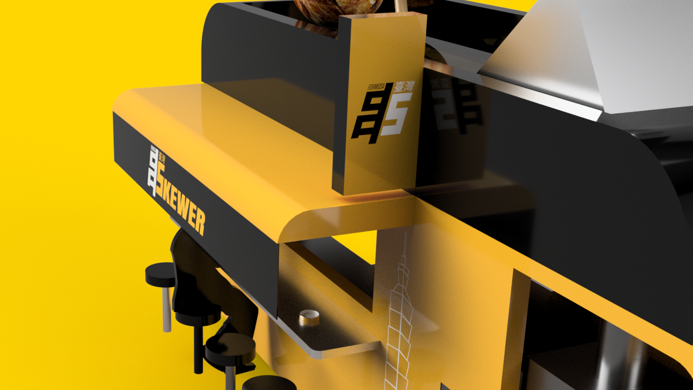
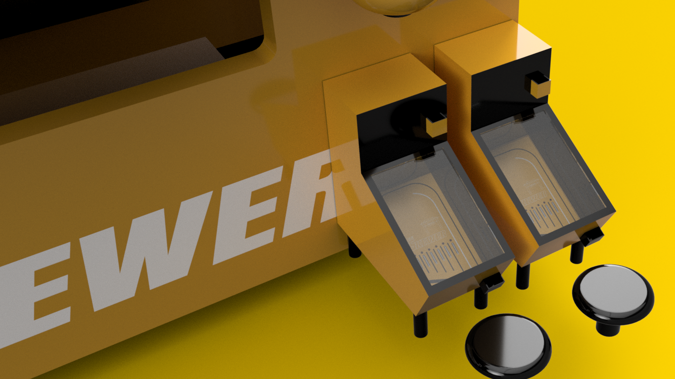
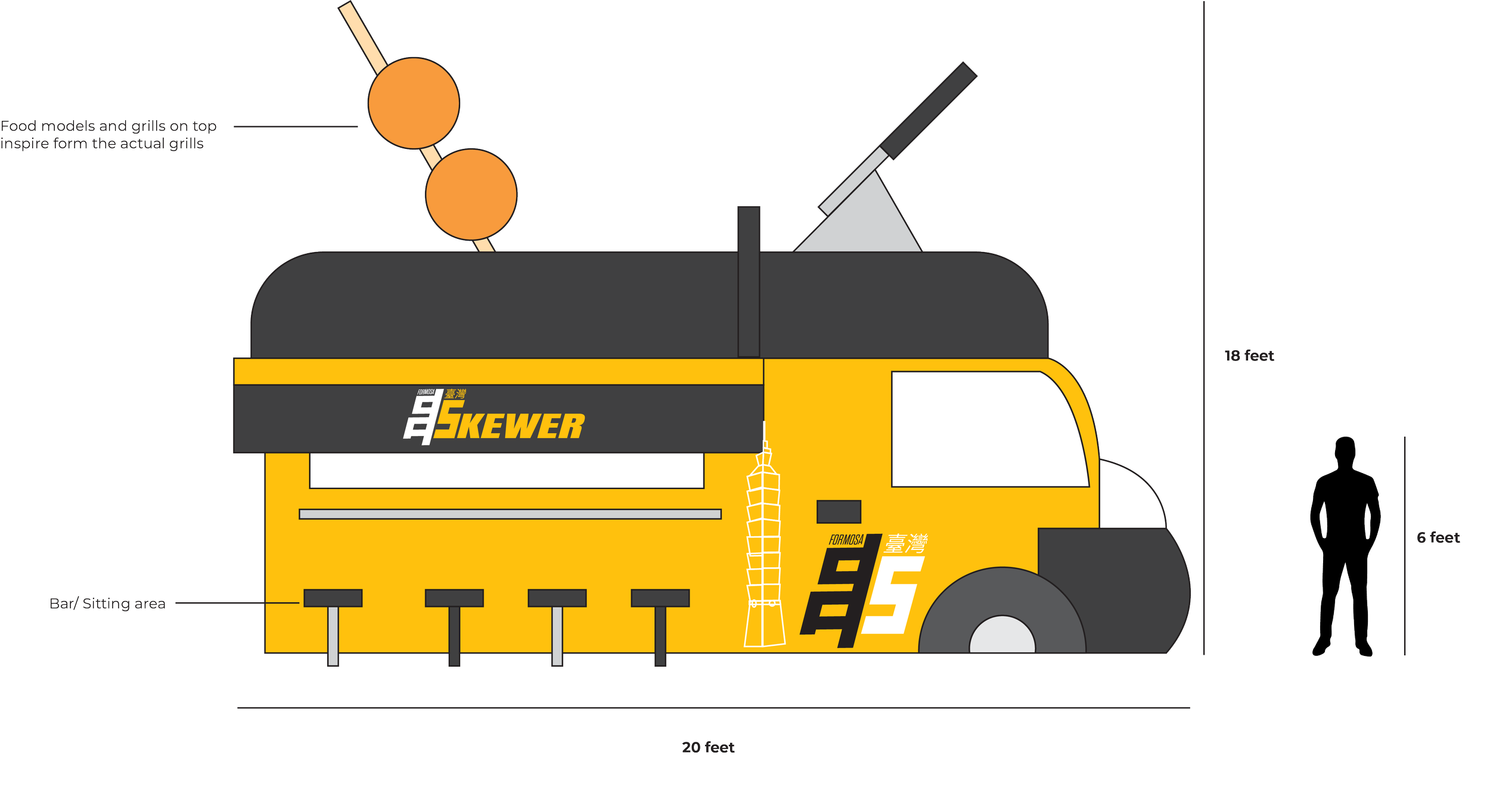
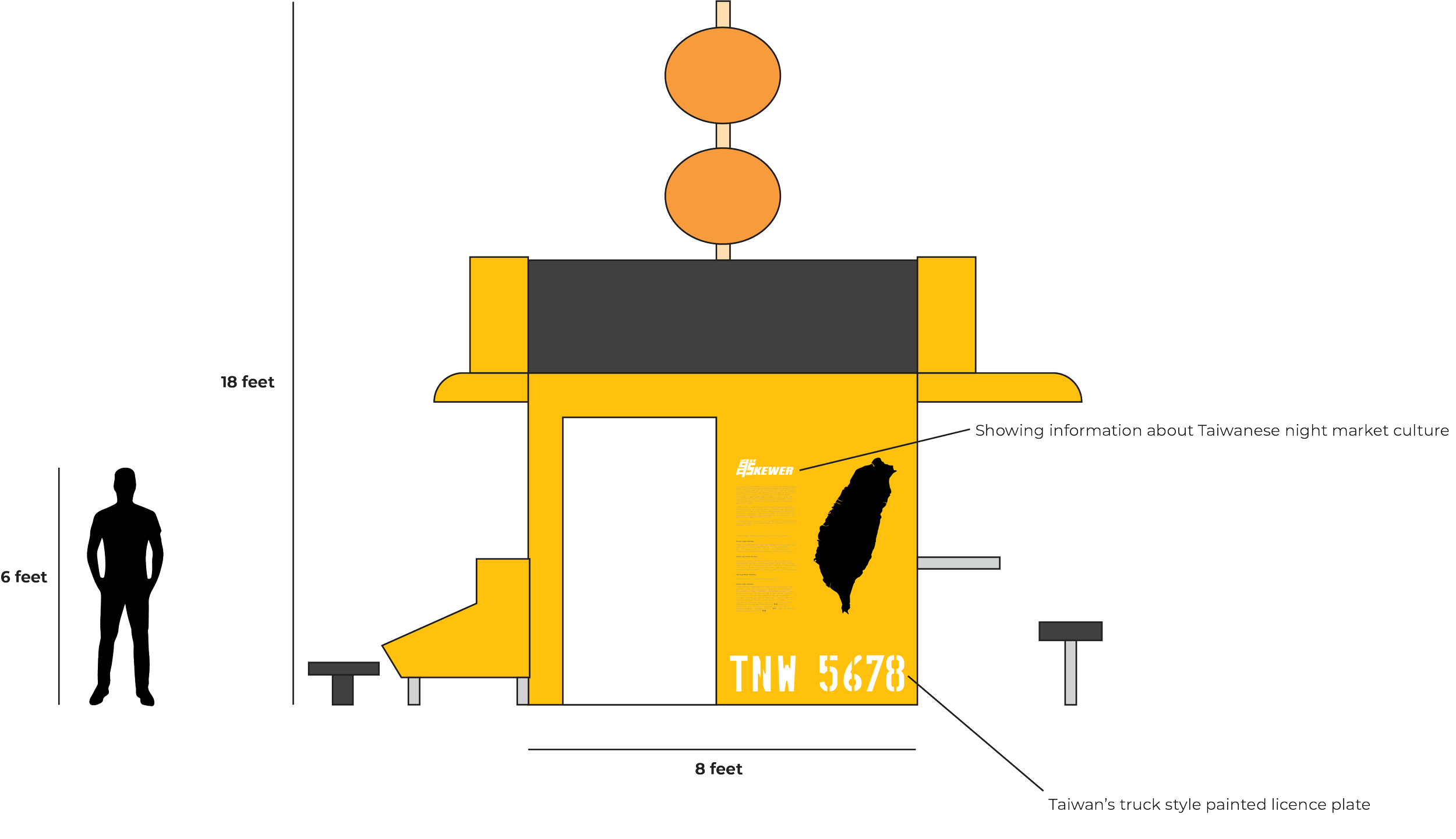
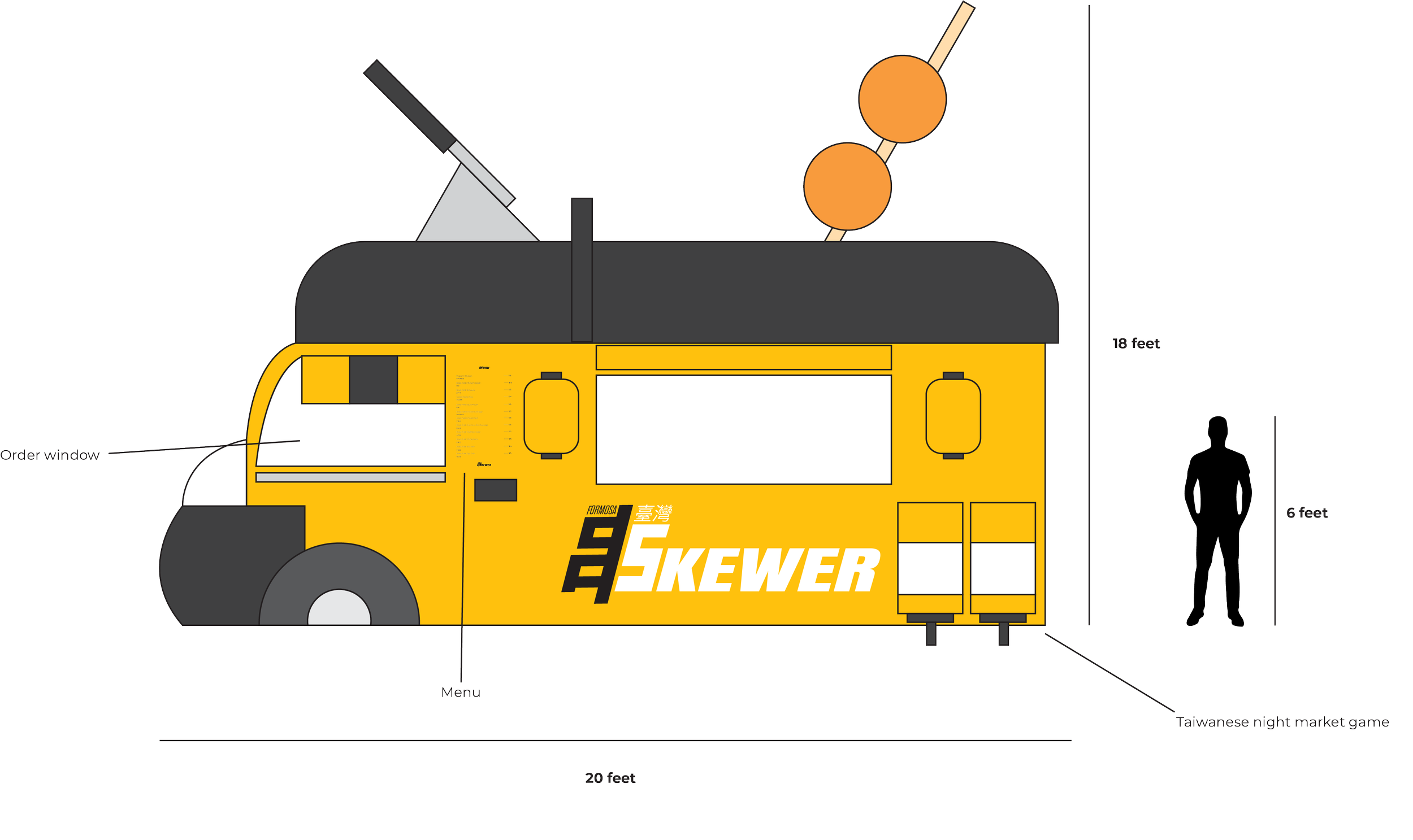
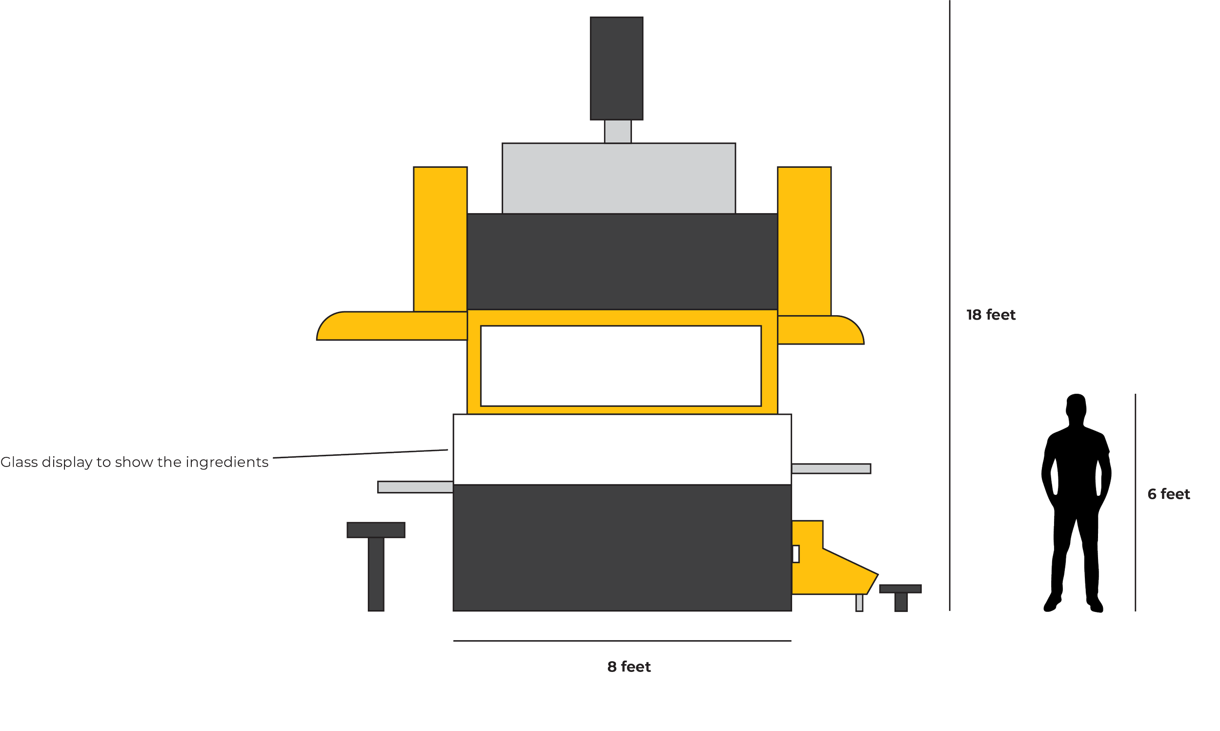
A bar-style seating area wraps the exterior, giving students a place to stop quickly or linger and share a meal, keeping the communal spirit of the concept intact.
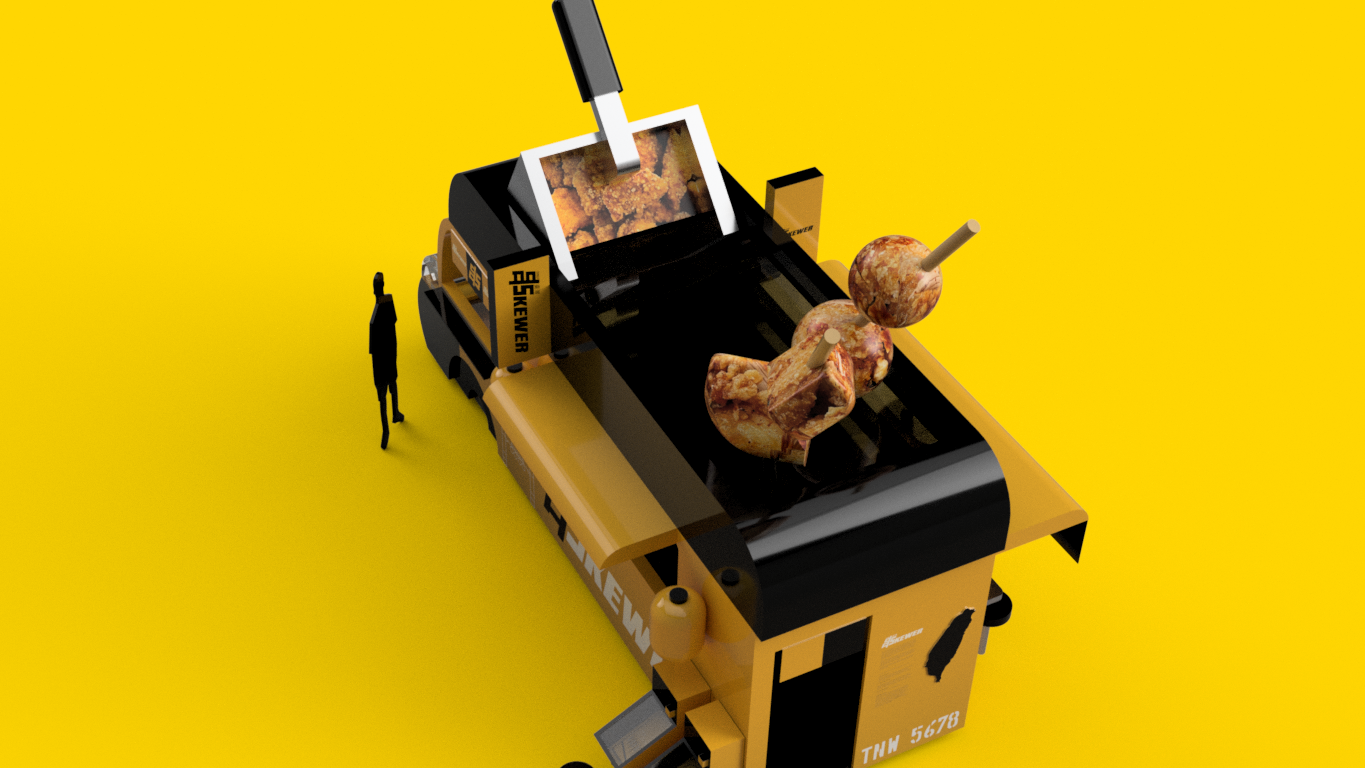
The kiosk draws from the classic blue food truck, a form familiar to Taiwanese international students and legible to anyone encountering it for the first time.
KIOSK FLOOR MAP
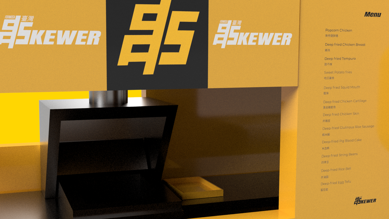
KIOSK MODEL RENDERS